Mindmapping to improve the structure of your web content
When working on structural changes to your website, mindmaps are one useful method to help plan your way forward.
When people are using a website, they are normally unaware of its entire structure. This makes navigation a challenge.
The same is true even when we are working on improving an information architecture. We may have a sense that the structure is too complex. But it can sometimes be difficult to explain where that complexity has come from, and how we can begin to solve it.
This is where I have found mindmapping an effective technique.
Getting started
There are lots of mindmapping tools out there. The University has a site license for MindGenius, which is perfect for the job.
Download and install MindGenius.
You can use this software to literally map out the full hierarchy of your website page by page. This can seem like a laborious process. But you can speed it up by copying and pasting text from navigation menus or other lists. It is also possible to import data from an OPML file, a text file or even a Word document.
However, I often find it useful to manually work my way through a website anyway. This way, the mindmapping exercise also works as a form of content audit. If you document what you discover as you go along, you can kill two birds with one stone by integrating your audit into your mindmap. MindGenius gives you the ability to add a note to each branch for this purpose.
I have found that it is possible to fully map out complex websites containing hundreds of content items in just a few hours.
Providing the impetus for change
The most powerful function of mindmapping an information architecture is the ability to visualise even the most complex of site structures in one document. This way, you can begin to literally see the problem.
In my experience, this is much more useful than presenting your findings in a dry spreadsheet. Visually seeing the structure often provides the impetus for the change that’s needed.
You can export the mindmap to PDF to easily share it. If you prefer to work with a spreadsheet, you can also export the mindmap as an Excel file.

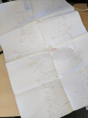
Printing out your mindmap is an effective way to show your stakeholders how complex their website structure is.
Even more powerfully, you can print the mindmap out and take it to a meeting. Often this will be the first time your stakeholders realise just how large and complex their website has become.
You may need to print the mindmap across multiple sheets of A3 to make it readable. But that only makes it all the more powerful.
If your website looks complicated when you have it all on a sheet of paper in front of you, imagine how your users must feel when they are trying to navigate their way through it to complete their task.
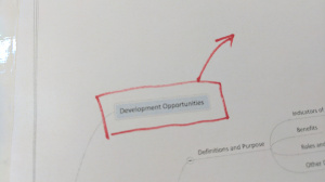
Another advantage of printing a mindmap is that you will find people start scribbling on it to plan their revisions. Not only is this a great way to collaborate on your plans. It is also cathartic to physically score out sections of the website as you plot your streamlining activities.
Other use cases
Mindmaps can come in handy for all sorts of reasons.
Mindmapping as a blueprint
As well as mapping out the current state, you can use mindmapping as a way of planning out your information architecture proposals. Again, this is a great way of explaining your proposals to stakeholders and making sure everyone understands the plan before you go ahead and build it.
Going into further detail
Sometimes it is useful to mindmap in further detail than just the webpages. You can also map out the document outline – the structure within an individual webpage – as well. This can be useful if your webpages contain complex structures or multiple links.
Integrating the document outlines as the final child branches in your information architecture mindmap is a great way of getting an all-in-one view of your full content hierarchy.
Planning content and homepage structures
Mindmapping can also be used to plan your content in a similar way.
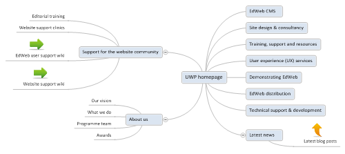
For instance, you can use it to plan what content should appear on a homepage.
This example maps out the homepage of the University Website Programme.
Mapping out different types of information by using categories
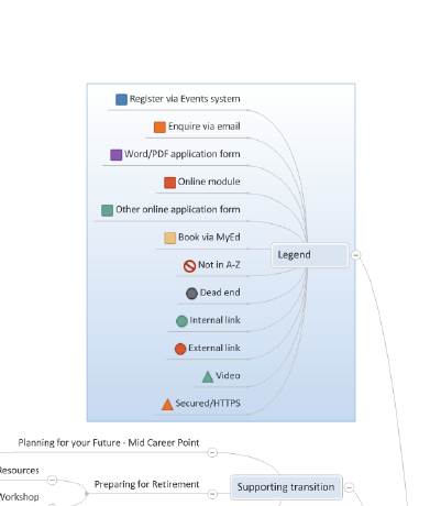
It is possible to assign different categories to a branch. Categories add colour-coded icons to items, a little bit like categorising your emails in Outlook. This is useful for highlighting different types of information.
You can use this as a colour-coding system to denote external links, or links to a different section of the University website, or any other distinguishing feature of the branch. I often add an extra branch called Legend to explain the meaning of the icons.
Find out more
If you are interested in learning more about mindmapping, or any other website topic, you can contact website support or book a support clinic session.


1 replies to “Mindmapping to improve the structure of your web content”