
How our community helped us make our component pages better
Make things open: it makes things better.
We really like this design principle from gov.uk. We use it a lot, especially when it comes to iterating upon our beta Design System.
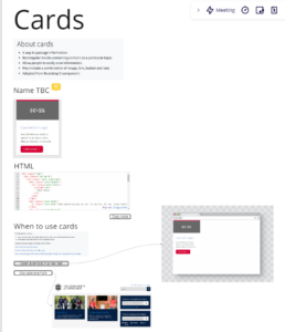
University of Edinburgh beta Design System
Including and involving our users in problem-spotting and solution-building keeps our thinking open and our design process transparent. At least, that’s the theory – and this strand of work has been very much about testing this out with our community.
Usability testing
We did a round of testing with 5 users as soon as the beta Design System went live. Any beta is your best guess and your first go. It’s a hypothesis you can test by putting it to users to see if the thing you made is usable, if it does what you expected it would do, and if there are any surprises. (Spoiler: when you test things with real people, there are always surprises – that’s why it’s so valuable.)
Usability testing in the University
Here’s what we found:
- A need for improved user interaction with the component examples
- A desire for open community contribution
- Repeated asks for visual examples and guidance for how components should work together
- A tendency to bypass the design principles altogether; users went straight to component pages, and expected design principles to be part of the guidance they found there.
Observing with just this handful of users was enough for us to see that our component pages were the most important, and that this was where our focus for development should be.
Playback session
With permission from our usability participants, we took extracts from the videos that focused on an undeniable problem; our component examples, and the way they did, or didn’t quite, work.
We put out an open call via our Web Publishers Community network to see if anyone wanted to join in with a playback session. The idea was that we would review the videos, take notes on what we saw going on, and then put our observations through the David Travis ‘Red Route’ framework, to rank our problems.
The idea of a playback session is from Steve Krug, author of ‘Rocket Surgery Made Easy’ and ‘Don’t Make Me Think.’ Playback sessions allow teams to immerse themselves with users, to see problems through their eyes. Regularly done, it helps teams to settle into an empathic and active mind-set, iterating a product with real people in mind.
The Red Route is a David Travis framework that helps workshop participants to interrogate and rank problems. This technique has been used many times before in the University as an effective way to involve stakeholders in the design process.
Playback outcome
Together we were able to identify 3 critical problems, and one serious problem.
Critical problems:
- Confusion with tabs looking the same but having different functionalities
- Too many interactions in the same thing
- A lack of further information on how palette colours should be adhered to
Serious problem:
- Uncertainty about who the component page was for
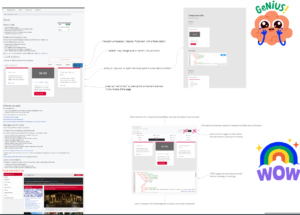
Collaborative sketching
Following the playback session, we gathered the same group back to sketch some solutions to the problems we had identified, using a collaborative sketching technique called ‘Crazy 8s,’ from the book Gamestorming.
In Crazy 8s, a group gathers around a problem to draw potential solutions, in a round of 8, then 4, finally coming together as a group to pool the best ideas and create 1.
Collaborative sketching in the University
The pandemic has changed the way we run workshops. In person, sketching sessions like this were done with paper and pen. Hybrid sessions used a Miro board, with online participants using paper and pen to draw, and a complex process of holding these hand-drawn sketches up to the computer’s camera for the facilitator to take screenshots to upload to Miro. This was less successful, as the sketches were difficult to see. Although sketching by hand is good for the brain and quicker than trying to learn a new platform, the end result was sketches that were hard to see, affecting the clarity of the ideas.
For this workshop, I wanted to try a different approach. I encouraged participants to use the drawing tools on Miro, starting with an icebreaker exercise to get people drawing their process for making a piece of toast. Toast comes from the book Gamestorming (because of course it does). It encourages people to have a go at drawing a process step by step, not worrying about their drawing skills, just focusing on conveying an idea.
I put some screenshot images of the component page on the Miro board to help sketchers pick things up and play with them. I also made it clear that if you wanted to, you could just use words to express your ideas.
Next we moved on to reminding ourselves of what we think is essential in a component example, what is nice to have, and what we can probably do without, before moving on to sketching our ideas out Crazy 8s style in two teams.
Collaborative sketching outcome
Both teams had similar ideas, opting for simplicity, accessibility, and context of real-world usage.
Accessibility is usability
In a previous sprint the Design System site was tested for accessibility. One of the issues raised was the way in which screen readers interacted with the component examples, in particular the card component, which contains many example links that JAWS and other screen readers read as real links – a confusing experience for users of assistive software. Before we ran the collaborative sketching session, the Design System team got together to understand more about how JAWS and mobile screen readers interact with our component pages and other design system component pages. We then followed this up with sketches of our own to work out how we could make our component examples as simple, and as accessible, as possible.
Learning about design processes
In response to the issue raised about who the components pages are for, I’ve been reaching out to staff across the University to learn more about design processes to understand where the Design System and it components pages fit in. Learnings from these sessions will help us iterate further on the content of our Design System and prioritise the things the community are telling me are most important to them.
Next steps
Thanks to the tremendous efforts of our community, (sketching is hard work) the Design System team can now consider our solutions for accessibility together with our collaborative sketch outcomes to make our component pages better.
The cycle of testing, identifying the most critical problems, and identifying the best solution, ready to develop it and test it all over again, is a classic double diamond design process. We’ll keep using this throughout our Design System sprints, releasing, testing, and developing with our community.
We’ll show you the next iteration of our component pages when we’re done.
Some reflections:
If you put out an open call for the community to come and spot problems in your product, the most interested, and able to spare the resource will help. This time, we got exactly the experts we needed. I know there are people in the community with quieter voices and just as much to contribute, but who can’t commit resource to take part in these sessions to help us. Next time, I would be interested to reach out to these community members to ensure all voices are heard.
Good to hear the outcomes of the round of testing.
One very minor thing is the statement “Accessibility is usability”, while I appreciate it’s meant to just be a catchy quick heading and is a nice sentiment, I disagree with what it implies.
Accessibility and Usability, while they are related are not the same thing, they are two very distinct things. This can be illustrated by simply saying that, while something can be accessible, that doesn’t necessarily mean it is usable; Accessibility testing focuses specifically on the use of assistive technology (such as screen readers), while usability testing is much broader and seeks to answer questions like: can our users actually use this. I worry that if we allow ourselves to think accessibility and usability are one and the same, then we may be doing a disservice to our users.
Overall though, some great work!
Hi Aaron, thanks for your comment and for spotting the danger of pithy headings. 🙂
Accessibility testing and usability testing are two very different disciplines. Although there are overlaps with usability when you run an accessibility test, the things you’re looking for are very different from a broad usability test. I would never suggest that an accessibility test could or should replace usability testing. However, as we did in this case, doing usability testing and accessibility testing early in the design has given us the clearest possible view of our problems. It’s been eye opening sketching solutions for accessibility, and sketching solutions for usability, because we can now bring these together for the next iteration.
In general, getting accessibility right goes a long way to making a product more usable – but usability testing is critical.