Evolving the website design and navigation
At last month’s Web Publishers Community session, I went through how and why the design and navigation of the University website was changing. The slides from the session are available as ever, but I thought it would be good to write a blog post to cover the main points for those that couldn’t make the session.
The slides are available from the website support wiki, but I’m dropping in key images throughout this narrative.
The work on the evolution of the design and navigation of the University website has been led jointly between myself and my colleague in Communications and Marketing, Steven Ross. Steven is a long-time collaborator with the University Website Programme (we were actually on the same team in the very early days of the Polopoly Service), providing the steer on brand compliance and playing a very practical role in the development of the website’s look and feel and management of cascading style sheets. Together we have worked with two design agencies – firstly to deliver a refresh of the existing site in summer 2013 and now a more fundamental overhaul with the introduction of a Drupal-driven replacement content management system.
The road to a new design has been a long one, involving consultation and research in phases since 2011 when it was first mooted that a new corporate content management system would be a likely move in the relatively near future.
The principles we’re working to are the same as we always have done. It’s just that we’ll be implementing them a little differently in the new design. We ratified our principles still stood in rounds of consultation with web publishers and business managers in 2012. The detail is in the slides, but fundamentally:
“Website visitors should always know where they are in the University web presence, regardless of how they arrived there. This orientation will help them understand the nature of the content and services they are accessing.”
Evolving the graphic design
We have a number of drivers for change:
- Business requirements identified during the consultation sessions of 2011-12 highlighted where improvements were needed and we began to address these with the 2013 refresh.
- Usability testing over a number of years had revealed that aspects of the current design’s usability & navigability could be better. But changes in the existing system would be costly.
- The changing nature of how people access the web meant we have a need for a small-screen friendly design. This required a complete review of how we lay out content.
- The new system provides the opportunity for us to rethink and test out new approaches.
But we didn’t have complete freedom to explore a new design for the University. There are a few constraints and considerations to be mindful of:
- We needed to plan the design, navigation and content layouts across different sized screens. What works well for one doesn’t necessarily work well for another. Given the trend towards smaller and touch screen devices, we prioritised these.
- We needed to harmonise as far as possible with the Polopoly-driven design, as we will have 2 systems delivering the website during the transition period and we want to minimise ‘jarring’ as visitors move between them.
- We will be migrating content and structures from the Polopoly system – not starting afresh – so everything needs a ‘home’ in the new layouts.
- We feel that it’s essential for the University to move away from ‘boom and bust’ design. Rather than launching a new look then leaving it for a number of years before a significant overhaul, we want to incrementally improve informed by user research. Evolution, not revolution.
On this final point about getting away from what I call a ‘print mentality’ – like we finalise a website like we send something off to the printers – this is a common problem in the world of website management which has been exacerbated in recent years with the uptake of new devices and the need for content to live beyond the website itself. The solution is one that’s in use on a number of world-leading websites and a trend that most are beginning to follow. And we are too.
To cope with change – which is only likely to increase in future – we need more semantically-rich content and more coherent structures. The days of dumping huge blocks of text into an editor interface are gone. And to express these semantics and structures, we need a flexible set of guidelines – essentially a toolkit.
So we’re introducing the Edinburgh Experience Language. It will be launched soon after the first websites to transparently express what a University of Edinburgh website should look like and how it should behave. It will contain code that website developers can take to reduce the design overhead in new websites.
Here are a few examples of experience languages already in existence:
So in future, our Experience Language will evolve based on the demands of new CMS functions, what we learn from ongoing user research, market research and brand reviews.
As the experience language evolves, so will the centrally supported website, along with anyone else using its codebase. If other systems and websites are following the guidelines in the experience language but not using the code, they will need to update themselves accordingly.
The Edinburgh Experience Language is based upon the open source design framework, Twitter Bootstrap, which compliments the open source approach we’ve taken with the Drupal content management system. This means we’re building on existing work done by others, and can contribute back to the community. This design framework basis is also being adopted by EUCLID and MyEd, and the whole process has been undertaken in consultation with these and other important central services. There has been a lot of support for this approach, and with colleagues in schools and departments so I think this bodes well for the future as we aspire to a more coherent and consistent user experience across the ed.ac.uk domain as a whole.
How things are changing
While we’re looking to harmonise with the existing design while we manage the move of all websites from Polopoly to Drupal, there will of course be a number of changes. Here are the key things you’ll notice:
Increased banner space for greater differentiation between subsites
Differentiation between sub sites under the University ‘umbrella’ is important, both from the perspective of each business unit wanting to distinguish themselves, and from the perspective of the website visitor understanding that they’ve left sub site A and are now on sub site B. The process of bringing greater emphasis to the sub site banner began last year with the design refresh and we’ve moved this on again this year.
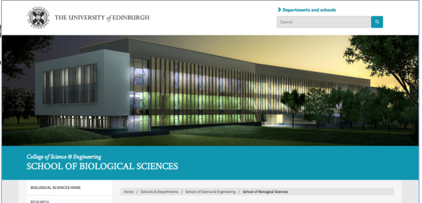
Sub site banner space has been enlarged to help differentiate across the University website as a whole.
Introduction of sub-palettes
In future website managers will be able to select a colour scheme for their website. The range of palettes has been devised by Communications & Marketing to compliment the University’s primary corporate colours and tested in focus groups with key target audiences.
Setting the colour of a subsite will not require any technical skill beyond the CMS site management knowledge provided in training sessions. Advice on which palette is best for a particular purpose will be provided when the functionality is made available in 2015.
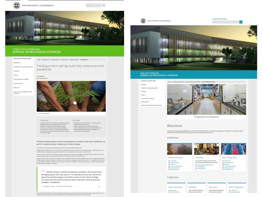
The colour palette selected permeates the design, and is not restricted to the banner. (Colours used here are for illustrative purposes only).
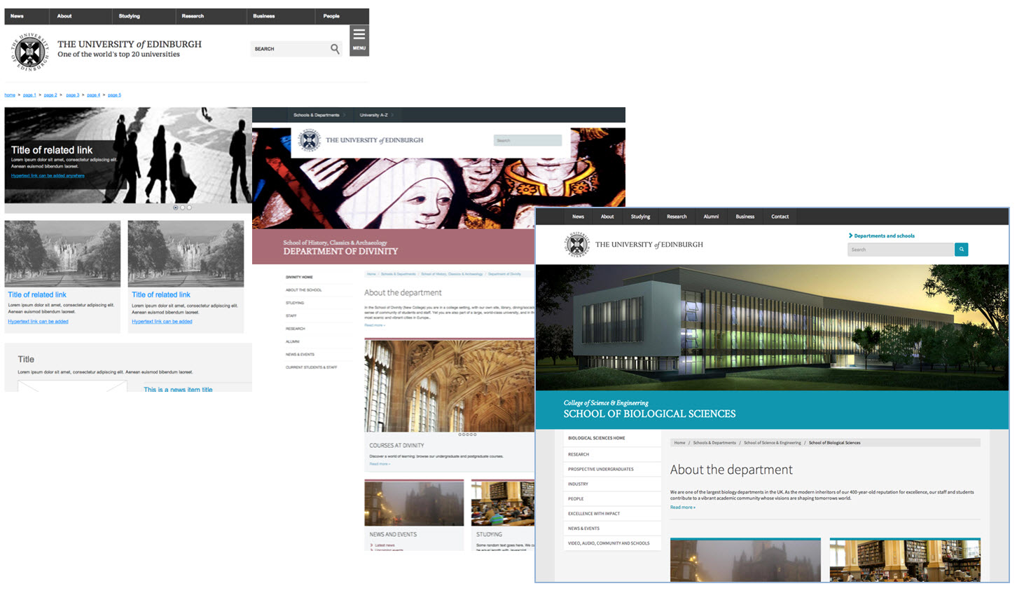
All subsite navigation in the left hand panel
To enable us to deliver a responsive design, and to address issues we’ve observed over the years with visitors navigating using the left and right hand panels, we needed to take a fresh look at navigation. I’ll explain the research and thinking behind the approach we’re taking below, but from the perspective of the graphic design, you’ll notice that from now on all navigation for a sub site will be presented in a single panel on the left hand side. The behaviour of the navigation, along with the layout of the page changes depending on the width of your browser window.
Here, the same page is presented on a desktop and on a phone.
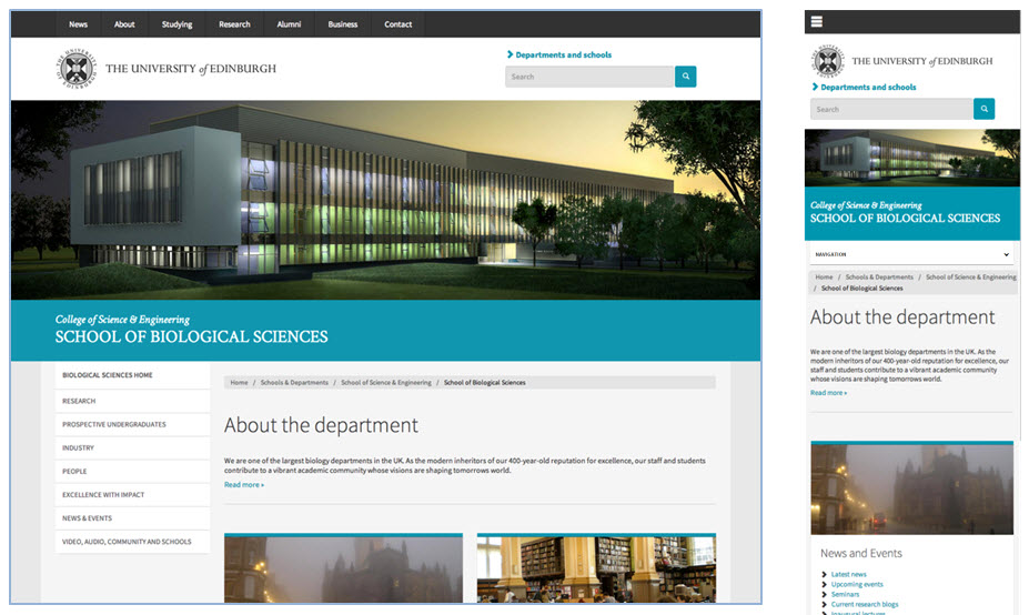
We’re introducing a responsive design that adjusts according to the size of the device you’re using
Single, flexible subsite homepage layout
At present in Polopoly, you have a number of templates to choose from to manage your homepage. If your circumstances change, you need to build again from scratch. We’re moving to a single, more flexible homepage template that will evolve over the coming year. Initially, it’s a single fixed layout. This will expand to a range of options and ultimately lead to a layout of panels that are pretty much in the hands of the website manager.
The new design has evolved through phases of wireframing and mockups; a collaboration between Communications & Marketing, the University Website Programme and the design agency Headscape.
A new approach to navigation
It’s important to bear in mind that fundamentally the layout and behaviour of the elements of the web page remain the same. The principles of navigation and information architecture we have worked to since the launch of the Polopoly-driven website are still correct. The organisation and business model of the University is still the same. Users’ ability to hold information in their short term memory and comprehend the structure of the University are still the same too. What’s changed is the technology people use.
So, consistently presented on all pages and centrally controlled, there will still be:
- A crest and University title across the top
- Opportunities to search site-wide and to see lists of all major schools and units
- Legal info and other related things at the foot
- Navigation panels that always behave the same way
- A button to get in touch with the school or unit
In the hands of the sub site manager:
- Setting an image and title to be displayed in the banner on every page of their site
- Deciding what contact details are displayed, and whether they need to change in different parts of the site
- The content and structure of their sub site
- Optionally setting a footer panel that displays consistently on every page
Key differences at a glance
- The navigation panel on the left hand side behaves differently. I’ll go through this below as I outline the research we’ve done.
- The consistently presented ‘Contact us’ button is now closer to the page content (rather than being in the banner) and will be editable so that a web manager can use more specific terms like ‘Contact the School’ or ‘Contact the Postgrad Office’
- The consistently presented sub site footer is a new space providing schools and units with an opportunity to present additional brand elements and affiliations.

While the design has evolved, the fundamental orientation and navigation elements remain the same. The only new addition is the sub site footer.
Research with users
I mentioned above about the research that Communications and Marketing are undertaking to determine the range of colour palettes we use in future. This research has taken the form of surveys and focus groups. But determining whether a website is usable, or identifying issues around navigation and orientation requires a different approach.
We’ve been through two rounds of testing with user – both staff and students.
The first used an HTML prototype that participants interacted with on both phones and desktop PCs. Our aim here was to establish best approach for navigation conventions and to check the effectiveness of orientation features like banners and breadcrumbs.
The second round of testing used a range of paper prototypes that we evolved over the period of testing. This time our aim was to fine tune graphic design of navigation panels.
Phase 1 testing – comparing navigation
In this round, we tried out two websites with identical content and structures. The only difference was the navigation panel behaviour: one expanded so that more and more options were visible the deeper you went into the site. The other was focused, so that every time you made a selection to progress deeper into the site the other options you didn’t choose got stripped away.
We used 12 staff and 12 students at first, each using a phone to complete tasks and each participant only seeing one version of website navigation.
Then we used a further 3 staff and 3 students to repeat the exercise on a desktop PC, and this time we gave each the opportunity to try out the alternative approach after they had completed their tasks with either the expanding or focused navigation.

The same page presented with 2 navigational approaches – expanding on the left, focused on the right.
Phase 1 research findings & conclusions
Neither navigational approach was outright winner. Unsurprisingly, each has its strengths and weaknesses.
- Expanding navigation:
- Is good for getting a perspective on the site as a whole.
- Requires you to remember less about choices you made at previous steps when you make a wrong choice, because the other options are still there.
- Can overwhelm you with choices after a couple of clicks because all previous levels of navigation remain. While the site we tested on was small and well-structured this abundance of choice was particularly irritating on smaller devices.
- Focused navigation:
- Is more efficient for small screens because the reduction in options means less scrolling is required.
- Simplifies navigational choice moving forward through each step in the journey.
- Requires more clicks when backing up to take a different path through the site after making a wrong turn. (But while there are more clicks to make, the choice is simpler).
- Reduces perspective about the breadth of a site as options are taken away.
We concluded that the best navigational approach was focused navigation. This decision came down to a range of factors beyond the website user experience. There are pros and cons to each approach, but when we factored in these considerations there could only be one winner:
- Focused navigation performed better on small screens
- Trends in technology use all point to the increase in small screen usage, so we’re prioritising this for the coming years
- Focused navigation required more clicks, but there is less thinking required
- More choice does not necessarily lead to better decisions, and we saw this in testing. “Don’t make me think”, as Steve Krug would say.
- Focused navigation is easier for CMS users to get right
- One thing we see regularly in Polopoly is website managers getting the navigation panel set up wrong. There’s no point in having great rules if people find it hard to keep to them. We have a significant number of web publishers in the University who are non-specialist and have very little time to give to website management. If it’s harder to get wrong, we get more consistency of navigational experience.
- There is no need to enforce a maximum site depth as would be the case with an expanding navigation (you can’t expand navigational panels forever, can you?). So this is another way in which managing site structure and navigation is simplified.
- Focused navigation makes migration from other sites to the new system easier
- Because there’s no need to enforce a maximum site depth, there’s no need to review and potentially amend a site’s information architecture prior to migration.
There were also some trends that exhibited themselves in both designs. Here’s what we observed and what we’ve done about it:
- The large banner image restricted the amount of page content shown above fold.
- We’ve reduced the height of the sub site banner to expose as much content as possible, while retaining the impact of this important orientation point.
- There was a 50/50 split on whether participants understood what a link labelled “Home” in sub site navigation would do. Half recognised it as a link to the sub site homepage while the other half expected a route to the University homepage.
- So we’re retaining the editorial convention of “<name> home” as the first link in the sub site navigation.
- The sub site banner text not perceived as clickable by a good number of participants, when it provides a link back to the sub site homepage and (when present) a route to a parent website.
- The issue was significantly less on the desktop as a cursor passing over the banner changed to give the participant a clue. On small screens we’re presenting the text in the banner with an underline and will retest this in the coming months.
- The breadcrumb trail was well used at all screen sizes – significantly more than observed in any other website usability testing. We think the design promoted the increase in interaction.
- As it proved to be such a well used navigational aid, we have reinstated it for the smallest screens (it wasn’t present in earlier versions to save on screen space) and will monitor interaction on a larger scale through click analysis.
Phase 2 testing – refining the navigation panel design
While we were happy with the decision we’d taken about the choice of focused navigation over expanding, we felt that the presentation of the options in the focused navigation panel could be better. We wanted to see if we could employ different stylings that better communicated the relationship between the items in the navigation panel.
To do this, Steven explored a range of options and between us we settled on a design evolution that we felt would improve user perception of what they were interacting with. We tested using paper-based prototypes using the two versions of the design below. Six members of staff interacted with this version, and a further six undertook identical tasks on a version that didn’t have ‘up’ arrows.

The navigation panel design was further developed and tested with 12 more participants.
Phase 2 research findings & conclusions
There were no notable issues observed with participants undertaking tasks successfully on both versions. The design with the ‘up’ arrows (as in the above image) performed marginally better and as such this is the one we’ve gone with.
It was interesting to note that participants continued to make active use of the breadcrumb trail as a means to navigate and orientate within the site. For me, having observed people interacting with websites for about 13 years now, this was the most interesting aspect of the research as it’s something I’ve never seen before in such numbers.
Try out the new navigational approach
Obviously you’re going to be able to try this out on the Edinburgh website in the coming weeks when the University Website Programme becomes the first to adopt the new approach. But in the meantime, I appreciate it’s probably something you’re finding difficult to get your head around from a description and a few screenshots.
The mockup site developed by Headscape for us to do the first round of testing is still available, but this will be taken down at some point reasonably soon I expect.
Headscape mock up site used for usability testing
I’ve also done a full walkthrough of the navigational experience, explaining what will happen when in a number of scenarios.
Sub site nav experience walkthrough (Drupal development wiki – EASE login in required)
Or you could visit the University of Manchester’s website which, we discovered after pretty much all our work, takes a very similar approach to navigation as we’re going to. Their arrows point in different directions to ours, but otherwise the navigation behaviour seems to be the same. Had I known about this earlier, I would have saved a lot of time prototyping and just tested on Manchester’s site! We’ll do some comparative testing in the autumn when the first few sites are live, just to see if the arrow direction has any bearing on user interaction.
The University of Manchester website
Final thought – evolution, not revolution
If you download my slides from the Web Publishers Community session, you’ll see that the last few (hopefully) explain the relationship between where we are now with left and right navigation panels and where we’re heading. While it feels like a big step, it’s really not in actual fact. We’re just putting the contents of the two panels together into one, and adding an extra couple of steps to explain their relationship.
When I presented and demoed the navigation I expected there to be at least one or two dissenters or challenging opinions because the approach we’re taking is a bit different to what you may be used to. But the session went incredibly well, comments and questions were supportive, and I think everyone felt reassured by the preparation and testing that Steven and I have gone through to get us where we are now.
Ultimately though, small scale usability testing can only surface the biggest issue for users. There’s no substitute for a website being used by tens of thousands of people on a daily basis. But we’re prepared for this. It’s how it should be. We’re going forward with a design solution that addresses the issues as we understand them at this point and we’re ready to evolve still further.
This is just the next step down the road as university business and our users and the technology they use continue to change. We intend our work to be the end of ‘boom and bust’ design, and the processes and tools we’re putting in place lay the foundation for ongoing incremental improvements. Here’s to evolution!
A great post Neil, worth re-posting a year on.
Thanks Ron, glad you enjoyed it.