Empowering witchfinders to adopt UX methods
The Survey of Scottish Witchcraft website is a fascinating resource for anyone who wants to learn about the history of witch trials in Scotland. But how usable is it?
About the project
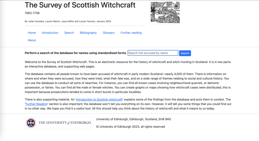
The Survey of Scottish Witchcraft started life as a Microsoft Access database in the late 1990s and contains details of the people who were accused of witchcraft in early modern Scotland. Researched by a project team at the school of History, Classics and Archaeology, the database was also given a web interface by the University’s then Computing Service.

Screenshot of the Survey of Scottish Witchcraft online database.
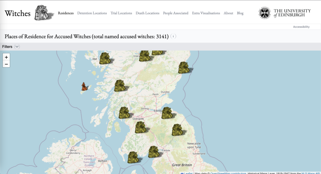
In 2017, Data Science students at the university began using this dataset to create visualisations that brought the data to life. This work eventually led to the creation of an interactive map website in 2019, designed and built by a ‘Witchfinder General’ student intern and colleagues within Learning, Teaching and Web.

Screenshot of interactive map, which shows residences of accused witches.
Since being launched, the website has received lots of attention from journalists, academics and the interested public, so this was an exciting project to be involved with!
Coaching in UX
The website is maintained by a project team that includes developers, a student worker ‘Witchfinder General’ and our Wikimedian-in-residence. Ahead of the next version launch, they reached out to the UX team for some help and advice around design.
We were asked to help make the user experience of the website as good as humanly possible, which we love to hear, even if it’s not as easy as it sounds!
Our first step is always to meet with the project team and ask lots of questions, such as:
- What’s the project/website goal?
- Who are the website’s users?
- What are the key tasks you expect a user of this website will carry out?
- How much time can your team commit to UX activities?
Given our current focus on supporting the EdWeb2 project, the UX team have limited resources to run UX activities on behalf of other teams. We identified an opportunity to empower the Witchfinder team to own their site’s user experience and we decided to coach members of the project team to conduct their own usability testing.
Given that this was the Witchfinder team’s first experience of UX, we hoped this approach would show the value of UX activities and give them confidence to continue user-centred design practices in the long term. We also recognised the benefit of the team watching users interact with the website they had built, rather than relying on the UX team to present a list of fixes and solutions.
Potential challenges
After our initial meeting with the Witchfinder team, we needed a plan, but we had a few challenges to solve:
- This was the first time applying UX methods to the website, so it was almost overwhelming to know where to start. How could we make this process more manageable?
- There were already new designs for improvements, but without seeing someone use the current website, we didn’t know if these were solving real usability problems.
- We were keen to reinforce that UX isn’t a one-time activity that can fix everything in one go. The process may produce more questions than answers, so it takes continued time and resource to keep testing and improving – before and after a website goes live.
What we did
We set up time with Ruby Imrie, the current student worker on the project, and identified some of the priority questions the project team wanted to answer about the new designs, such as:
- Do users understand what the website and homepage is about?
- Do users understand how to filter information?
- Are they able to complete key tasks on the website, e.g. finding details about someone accused of witchcraft?
With the help of Steve Krug’s book ‘Rocket surgery made easy’, we came up with a plan for Ruby to recruit participants and run research sessions to help answer these questions. We were also able to provide resources for creating usability testing scripts and were available to sit in on the sessions and take notes.
Outcomes
Ruby ran five research sessions and asked users to navigate through a test version of the new website and complete key tasks. From this, the project team were able to create a list of issues and planned to speak to developers about how to resolve these and prioritise, based on effort involved.
I caught up with team afterwards to debrief what they had discovered, and it was great to hear that they had learned things from users that they hadn’t noticed themselves! They have also become more involved with the users of the site by going to see plays, book talks and city tours that have been informed by the website, which you can read about in Ruby’s blog posts.
We discussed further opportunities for user research and the Witchfinder team will be running more tests after next iteration of the website is launched. I’ve also encouraged them to reach out to again for further advice and guidance.
Learnings from the project
Throughout this process, I learned that it was important to make UX processes as easy as possible so that they could be maintained by a small team with other responsibilities. There’s a lot of tools and methods available in the world of user research, but the most effective place to start was to simply put the website in front of users and watch them use it.
It’s possible to test a site and get plenty of valuable information, whether the project is at early design stage, or fully live. However, some of the team’s findings needed to be addressed before the new version of the website was launched, so the earlier we can try out ideas with real users, the more time we have to fix problems!
Finally, supporting the project team to carry out their own research gave them opportunity to identify issues for themselves and see their hard work in the hands of users. I hope this gives them more confidence to continue with research activities in the future!
Further reading
Witches interactive map website
Survey of Scottish Witchcraft database

