Developing digital strategy with Student Systems
I’m currently working with the Student Systems team to help them prepare for the development of a new website. Together we’re taking stock of what they’re trying to achieve as a business, where the website is best placed to support this, and how their systems and communications channels work together.
That age-old saying, “Fail to prepare, prepare to fail” applies to websites, and I’ve always insisted on understanding (and sometimes challenging!) a business unit’s approach to online communications in the process of helping them to develop a new site.
Fortunately, I’m working with some very customer-focused colleagues at the moment so there’s a great appetite for challenging how things have been done in the past and putting mechanisms in place for ongoing monitoring and enhancement in future.
Student Systems are the team that manage the online applications system, EUCLID, and undertake a wide range of monitoring and reporting services relating to the student record. They’ve got a wide customer base, a high volume of system usage in complex areas that are absolutely critical to University business.
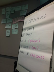
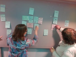
To kick things off in earnest, I ran a workshop in which the Student Systems team got together with stakeholders from across the University to collaboratively identify:
- What the unit is here to do, where priorities lie
- Who they’re serving
- What University staff are looking for in their engagement with the unit
Out of this came some fairly long lists – this always happens when you get a group together and ask them to see what they can come up with. But by collectively prioritising a small number of items (objectives, audiences and top tasks) rise to the surface.

Essential to good website management – common understanding of business objectives, target audiences and what they want to do.
So we’re now in a phase of reviewing and rationalising the outcomes of the workshop. The Student Systems team are grouping audiences and identifying a set of top tasks for each that we will prioritise and monitor in the new website.
We’re doing this through internal review in tandem with data analysis: Google Analytics data, enquiry analysis and top tasks surveys.
This might seem like a lot of lead-in work before actually building a website, but ultimately it helps editors make informed decisions about what content to cut, what content to keep, where gaps exist in information provision and how to structure the navigation and homepage. It keeps the website as lean as possible and minimises Student Systems’ content management overhead.
Because flabby websites help no one. They make the priority, in-demand content harder for the website visitor to find (increasing the likelihood of direct enquiries being made) and they mean the business has more content to keep up to date.
So ploughing into the development of a new website – not spending long enough on business objectives and content curation – leads to a lose-lose situation. Bad for the user, bad for the business.
I’ll write another post as we get towards the end of this process, but in the meantime if you want to learn more about the techniques we’re using have a read of these excellent articles:
Lou Rosenfeld – Retune don’t redesign your site (my blog post on Usability Ed)
Gerry McGovern – Top tasks surveys and what it means for your website (my blog post on Usability Ed)
If you’re keen to fine tune your website and cut some of the flab, drop me a line.


