
Concept testing: The UX research approach driving user-centred development of Drupal’s interfaces
Drupal is the University’s content management system and Drupal CMS – its new ready-to-use site-building product – is developing apace. As Drupal UX Research Lead, I’ve used concept testing to gather quick insights that keep interface decisions user-focused and keep development moving.
As part of the Drupal CMS leadership team, I take responsibility for improving Drupal’s UX based on findings from user research. In this blog post, I reflect on how I’ve adapted my research approach to ensure we have evidence to hand ready to guide rapid, iterative product decisions at the interface level, while remaining faithful to the overarching product goals.
Ensuring UX research informs agile product development is a well-known challenge
I first grappled with fitting UX into Agile as UX Lead on the University’s Web Publishing Platform (WPP) project. Defining a UX and Design process to keep the project focused on user needs prompted me to think about how UX research and development complemented each other and the need for data-based feedback.
Dual-track Agile emerged as a good way to align the disciplines – with a UX strand focused on continuous discovery around tasks feeding into a staggered development strand focused on defining features.
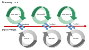
Diagram depicting the dual-track Agile process, adapted a diagram by Jeff Patton, from his book ‘User Story Mapping: Discover the Whole Story, Build the Right Product’
When I considered how to implement this in Drupal, I realised the importance of defining a prioritised list of user tasks to act as the target for research and therefore the basis for future feature development.
In September 2025 I blogged about three key task areas on my shortlist for Drupal CMS UX improvement. These included:
- How people make sense of Drupal interfaces through the Drupal labels on different features and functionalities
- How people maintain and extend their Drupal sites, to keep things up-to-date and add in extra functionality
- How people use Drupal AI functionality in a range of contexts within Drupal sites
Keeping these broad task areas front-and-centre helped me remain clear on our research priorities, to ensure I gather appropriate data to pass to the development strand to inform the ongoing build and configuration of the Drupal CMS product.
Read my earlier blog post about aligning UX and Agile:
For the long-term, the Drupal CMS product strategy keeps high-level priorities in focus
When working in tight development cycles, concentrating closely on shaping a product, it is easy to get lost in the small decisions and lose sight of the wider product purpose. When Drupal CMS began (initially as Drupal Starshot), it was launched with a product strategy. Using the framework from the book ‘Playing to Win: How Strategy Really Works’ by A.G. Lafley and Roger L. Martin’ the strategy set out:
- Our winning aspiration: Putting the power of Drupal into the hands of marketers, content creators and other non-technical users
- Where we will play: Focusing on marketers, targeting organisations in the mid-market segment
- How we will win: Prioritise ease of use, ability to grow and scale, directed use of innovative technologies (such as AI) towards marketer and content creator use cases
- The capabilities we must have: interfaces that are intuitive for non-technical audiences, out-of-the-box marketing and content creation capabilities, and simplified ways to extend site functionality
Keeping points of the product strategy front-and-centre has been essential for me to ensure I design the right research approach, to enable learning about what’s most important in the least amount of time to unblock technical development decisions. It has also helped me remain grounded when working in a constantly-changing development environment.
Read more about the initiation of Drupal CMS in my blog post from 2024:
UX leading the newest developments in Drupal – a mindset shift for Drupal CMS
Read more about Drupal CMS in the Drupal CMS product strategy (on Drupal.org)
Read my post from September 2025 setting out the research priorities for Drupal CMS:
UX leadership in open-source Drupal: Insights, lessons and future aspirations
In the short-term, Drupal interfaces can be constantly changing
As content management systems go, Drupal CMS is no ordinary product. The fact that it is an open-source product means the pace of development and innovation associated with it is particularly rapid and changeable as it can be shaped by an ecosystem of factors in a dynamic global community.
Most recently, innovative solution opportunities have arisen due to the development and launch of Drupal Canvas (Drupal’s newest visual page builder). The launch of Drupal Canvas in November 2025 signalled a new approach to creating and handling content in Drupal, and was a perfect fit for Drupal CMS given the target audience of marketers and content creators, therefore it was added into the v2.0 release of Drupal CMS.
Referring back to my three prioritised task areas, the inclusion of Drupal Canvas in Drupal CMS brought considerations of Drupal interfaces to the forefront. I identified the need to understand how target audiences would make sense of Drupal features and functionalities based on how they were presented in Drupal CMS.
Read more about Drupal Canvas within Drupal CMS in the announcement of Drupal CMS 2.0 on Drupal.org
Concept testing gathers user insights quickly, to support a fast pace of development
Given the rate of change in Drupal, I realised I needed a fast way to seek user feedback on interface designs, so I could feedback findings while development was in flight. Concept testing is a research technique deployed to test product ideas to assess whether they are worth progressing, to sense-check understanding of content and interaction patterns, and to gauge how people instinctively react to interface layouts and arrangements. This approach follows the Lean UX methodology – doing the least amount of work to learn the most important thing – and is particularly valuable in new product development, to avoid wasting effort and time developing solutions or heading in directions which may not align with user expectations.
Access the Lean UX Canvas (Jeff Gothelf)
By continually capturing ideas as visual mock-ups, I’ve built up a bank of concept testing material
Drupal’s flexibility lends itself to experimentation and many ideas and concepts arise from people setting up a Drupal instance and playing with the functionality it provides. Following the progression of Drupal innovations I have started the habit of collecting screenshots of the concepts being mooted on the fly. As things progress, I have been able to use prototyping and wireframing to turn the screenshots into visual representations for test participants to look at. Developing appropriate test scenarios around these visuals, I have been able to run quick online sessions with test participants to gather insights to feed into ongoing development.
Findings from my concept tests with users have provided direction in ambiguous circumstances
Over the past 6 months, I’ve completed multiple rounds of concept testing, drawing on my network of contacts for help shaping appropriate scenarios and recruiting participants that match the Drupal CMS target audience. In some cases, the sessions have focused on engaging participants around a single concept (sometimes referred to as monadic testing), in others I have asked participants to view multiple concepts in sequence to make comparisons and contrast. My test findings have helped guide Drupal CMS interface choices in changing circumstances – I’ve summarised a selection of the learnings and the decisions made.
Changing the label ‘CMS’ to ‘CMS Content’ will improve understanding while we work out the wider architecture
Drupal Canvas was included in the release of Drupal CMS v2.0, however, it was not technically feasible for Canvas to replace the form-based node-editing content interface traditionally found in Drupal. Therefore, in v2.0, both types of content creation mechanism needed to be present and it was unclear of the best way to present these options, recognising that the architecture could change. Distilling the different possibilities into a series of mock-ups, I ran several tests to find out which made most sense to users. One test sought to discover whether the label ‘Pages’ to access the Drupal Canvas editing interface and the label ‘CMS’ to access different content types was something users would understand.
In a test scenario, I asked participants to imagine they were responsible for a website and needed to look at content that had been published to review it. I presented them with the mock-ups and asked them to talk through what they would expect to find by selecting the different options in the left-hand menu. When they had described their expectations, I showed them what they would actually find, in order to check alignment.
Results of the test revealed that participants associated ‘Pages’ with an editor for individual pages, indicating that it was an acceptable label for entry into the Drupal Canvas editing interface. Participants were less clear of what to expect by choosing ‘CMS’, and they did not associate it with content. When they saw the content types they would find by selecting this label, they grasped the concept. These findings affirmed ‘CMS Content’ would be a better signifier for users, at least in the short term until bigger architectural decisions were made.
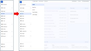
Screenshot of Drupal CMS showing the ‘CMS’ label and the screen that appears once ‘CMS’ is selected
Removing icons for menu labels will reduce ambiguity and cognitive load
As the test participants analysed and commented on the different menu labels, I took the opportunity to seek their interpretation and understanding of the icons associated the labels themselves. There was no clear consensus on the icon meanings from the participants, therefore the decision was made to remove the icons in the interim, to avoid unnecessary confusion or misinterpretation.
Screenshot showing the different icon options for the ‘Pages’ and the ‘CMS’ menu labels
Removing ‘Create’ will make the menu options simpler in the interim
In the same series of tests probing users’ understanding of the labels for the different content options, I asked test participants when they thought they might choose the ‘Create’ option compared to the ‘Pages’ and the ‘CMS’ options. From their responses, it emerged that they were unclear when they would choose ‘Create’, signalling that this label was a ‘nice to have’ rather than a necessity. In the interests of decluttering the interface and making it easier to access content options, this label was removed.
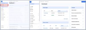
Screenshot showing side-by-side Drupal CMS dashboard designs, the one on the left has the ‘Create’ menu option (outlined in red), the one on the right has the ‘Create’ menu option removed.
Using a vertical arrangement of filter options provides more flexibility than an horizontal layout
Engaging participants further in the test scenario, I sought to gather their preferences for finding content using the Drupal CMS interfaces. By questioning them about their usual search and filtering approaches, it became clear that there were many different facets and factors they could draw on to find content. It became clear that arranging these in a horizontal way would lead to unsightly wrapping and a clunky interface design, which prompted a decision to opt for a vertical filter arrangement.
Reflection: Concept testing is delivering strong returns for minimal effort
Findings from my short series of experiments demonstrate the value and usefulness of concept testing as a research approach, and I am keen to apply it in more areas of my work. The ease with which it can be executed highlights it as an excellent entry-level UX research technique, and as such I am especially motivated to work with both technical and non-technical colleagues in the community to coach it so that others may realise the benefits for themselves.