
Understanding design better by looking from different levels of magnification
Different types of ‘design’
Over the past two years, the UX Service has worked on a variety of projects. They differed in nature because they involved working with people in different parts of the organisation who were facing different challenges relating to delivery of projects and enhancement of services.
A few examples include:
- Improving IT self-help materials on a website for IS Helpline
- Making it easier for students to locate information via the MyEd portal
- Exploring student attitudes to digital ID for Card Services
- Learning about Document Management practices in different parts of the University for the SharePoint Service.
Read these case studies and more on the UX Service website
However, another way that they differed is in the kind of design that we were engaged in.
I observed people engaged in many different design activities. But it was not necessarily apparent to everyone that they were ‘doing design work’.
It is very easy for us to think only of visuals or graphics when someone says ‘design’, but it is possible to engage in a design process for something which does not result in a visual or graphic output, for example the design of a voice interface like Amazon’s Alexa or the design of an in-person customer service desk experience.
This lack of understanding or clarity of what is involved in design (or even what design is) also meant that people were unclear on the purpose of user research, when you might do it and how.
Despite having enaged with the UX Service, we encountered colleagues who were still unclear on the purpose of user research, when you might do it and how
Jared Spool’s levels of magnification analogy
I’ve been preparing a report to summarise my findings, as well as using the insight to evolve the design of our Digital Experience Standards.
In the process of doing this, I’ve been particularly inspired by an incredibly helpful article on this same topic by Jared Spool, in which he used a magnification analogy and a famous short film from 1968
Read Jared Spool’s article: Zooming In and Out of UX Design Resolutions
To help us understand the different types of design Jared refers to 7 minute film called ‘Powers of Ten’ which Ray and Roy Eames created in 1968.
Watch Powers of Ten on YouTube
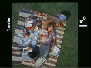
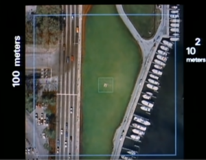
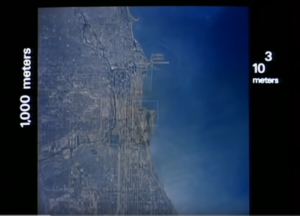
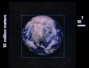
‘Powers of Ten’ illustrates design perspective
I’ll quickly summarise Jared’s point…
In the film, we see an overhead view of a couple picnicking in a park and zoom out from that same location progressively, by factors of 10.
We go from seeing the overhead shot of the picnic…


What this video tells us about design management
This is a really powerful analogy and helps us better understand why design management is challenging.
Essentially, colleagues at different levels of the organisation have different perspectives. All valid, but all require different skills and processes.
The key takeaways from Jared Spool’s article:
-
You can’t see what exists on any level other than the one you are viewing.
-
Different things are important at each level.
-
Because you can’t see what exists on other levels you can’t tell what’s important at those levels by looking only at the level you’re on.
-
What happens at one level can affect the other levels.
How this relates to design
A single web page or computer screen

A collection of linked screens which form a website or software application

A collection of different websites and web-based applications

The changing use of different digital systems over time and in tandem with offline touchpoints

-
What people experience differs depending on the level you’re viewing
-
What’s important changes depending on the level you’re viewing
-
What happens on one level can affect the other levels
-
The user interface components (text, links, buttons, accordions drop-down menus)
-
The code for the user interface components
-
The types of technology used to produce the code for the components
A different type of design happening at each level of magnification
When we operate at the very “zoomed in” levels where we’re concerned with code and components we’re in the area that a web or software developer would operate in.
- User interface design is where we consider which items belong on a single screen, their functionality and location.
- Graphic design is a discipline which deals with typography, styles, the appearance and presentation of elements, amongst other things.
- Interaction design is the discipline which deals with how items behave and act when you ‘interact’ with them, for example, when you click on a button does a pop-up box open or is an area of the screen revealed?
- When we talk about user experience design we are looking across different levels of design and taking a view which looks at all of the things a person uses from their perspective.
- Service design is best described in the article by Jared Spool which partly inspired these observations:
“In what we now call Service Design, we moved to a resolution that expands the users’ experiences across a greater time and distance.The digital components of the experience still need design at the application/site and screen levels, but the challenges we’re tackling at the organization-wide level are very different.At this level, we’re dealing with different organizational departments and their business needs. We’re coordinating the user experiences, not just for a single customer, but for all of our customers, users, employees and partners.”
Tools, methods and challenges change with the ‘level of magnification’
As with the physical world example, different tools are needed at different resolutions or levels of magnification. Astronomers need a telescope rather than a microscope.
Similarly when we engage in design activities we need to use the right tools for the task we are engaged in.
User Research helps us ‘see’ what is happening at different levels
If want to create something which someone else will routinely use, it is well understood in the UX field that we are not the end-user and so what works for us might not work for them. We also have many other assumptions.
Quite simply there are things that we don’t know.
It is often the case that a person who is requesting or sponsoring work is viewing things from a different ‘level of magnification’ to the people who will use the end result.
It is helpful to have insight into what is important for people at every ‘level of magnification’ involved.
This is the ‘context’ that is explored and revealed by user research activities.
And this is why it is important for those activities to happen ‘upstream’. Which brings us to my second analogy.
We can view the tasks in a human-centred design process as if they were a river. Some things would take place ‘upstream’ and those tasks which naturally follow on could be seen as happening further ‘downstream’.
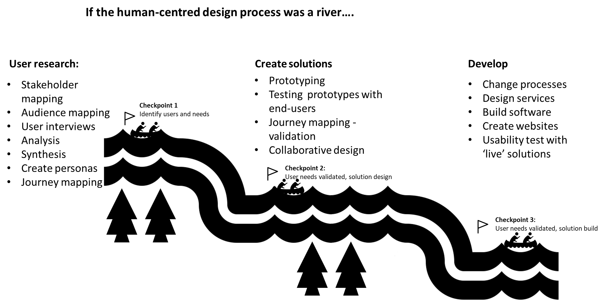
It may be helpful the next time you are considering creating a new product or service, or changing an existing one to think about:
- Whether your actions might have an effect on other levels to your own
- Where in the stream of activities you are currently working
Our ‘downstream’ activities can be made more effective by what we learn from user research conducted ‘upstream’.
Learning what is happening at the different levels and how our changes would impact people at those levels before ‘going downstream’ is what helps us:
- Avoid making solutions that would not be used, therefore saving money and time
- Create better solutions