
Building on launch: Enhancements to the Degree Finder visitor and editor experience
Following the launch of the Undergraduate Study website and Degree Finder in March, we’ve released 11 updates that have steadily improved editorial workflows, collaboration and performance. Alongside usability and design refinements, these enhancements have made the service more efficient for editors and more effective for prospective students.
This post isn’t an exhaustive list of what we have delivered. Every release includes bug fixes, security patches and module updates as standard but that’s quite uninteresting (for many, at least). Besides, we have a Sharepoint site for that.
Details of all Study site software releases (Edinburgh staff login needed)
A year of incremental improvements
As well as the standard software updates, we (mainly the Content Operations Team and myself) have introduced improvements in response to feedback and usability testing which have really made a difference for degree finder editors and visitors to the website:
- Improved comments functionality
- A new access level for subject matter experts
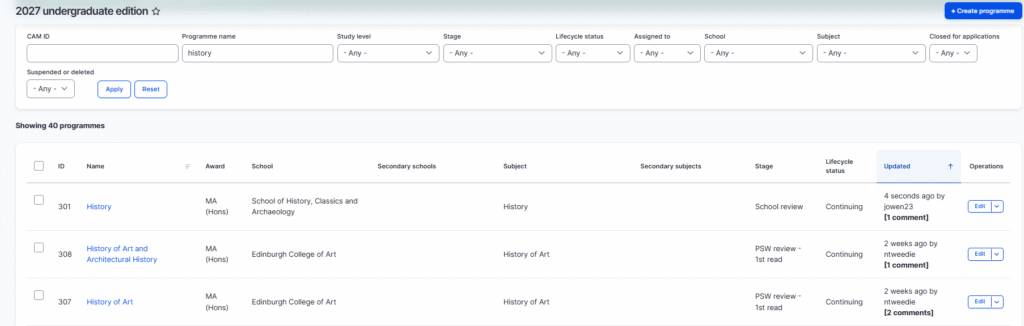
- Search filters for degree finder editors
- Editorial change review functionality
- Better editorial change notifications
- Updated degree search boxes for the website
- AI-friendly entry requirements presentation
- Web page layout and design refinements
- Significantly improved page load performance
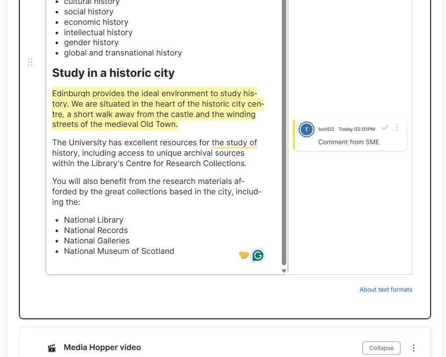
We improved the comments functionality
We introduced email notifications when editors are tagged in a comment and when a reply is posted on a comment thread. We also made it easier for people to see the number of unresolved comments at a glance.
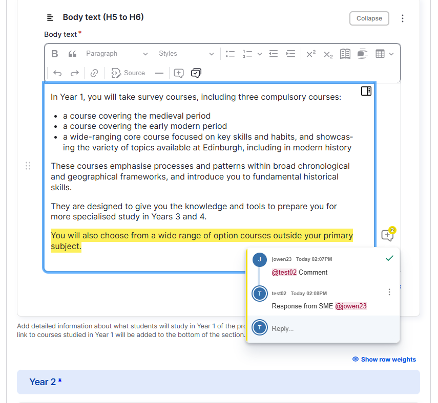
We introduced a new access level for subject matter experts
The Content Operations Team work directly with editors in all schools and colleges. These colleagues are typically student recruitment and marketing professionals, and they rely on contributions from colleagues leading degree programmes. These are academic and administrative support staff who we term subject matter experts.
Our subject matter experts are directly involved in reviewing programme content every cycle. To help them suggest changes to content, we’ve introduced a new experience where those users can comment on the content in the system, but not make edits to the content.
Our editors in schools and our Content Operations Team can see those comments, make edits and reply to the comments, all without leaving the CMS and keeping everything in one place.
We made it easier for editors to find their content
We’ve made improvements to the CMS experience for our editors navigating around and finding their content.
For example, we’ve added new filters and sort options to the list of programmes in the system, which helps editors with many programmes find the ones they’re looking for.
We’ve also improved reusable content features, by making it easier to see the school and study level that an item of reusable content relates to.
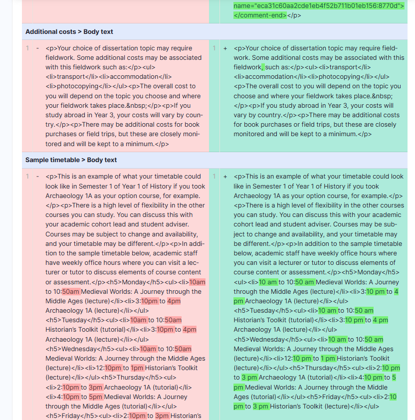
We made it easier to review changes across different revisions
We introduced the ability to compare revisions, enabling editors to select any two revisions with the interface showing only what has changed. This makes reviewing edits significantly easier, especially when those edits spread across different sections of the programme page
It is also possible to compare across multiple revisions. This helps our Content Ops team see a complete overview of edits where those edits have been made across different revisions.
We added new notifications for in-cycle edits
Sticking with the theme of reviewing changes, we introduced a new email notification to our Content Ops team when in-cycle changes are submitted for review.
This improves the operational efficiency of the service, by ensuring that our team is notified as soon as changes are submitted for review, and removes the need for our team to be manually checking for new changes.
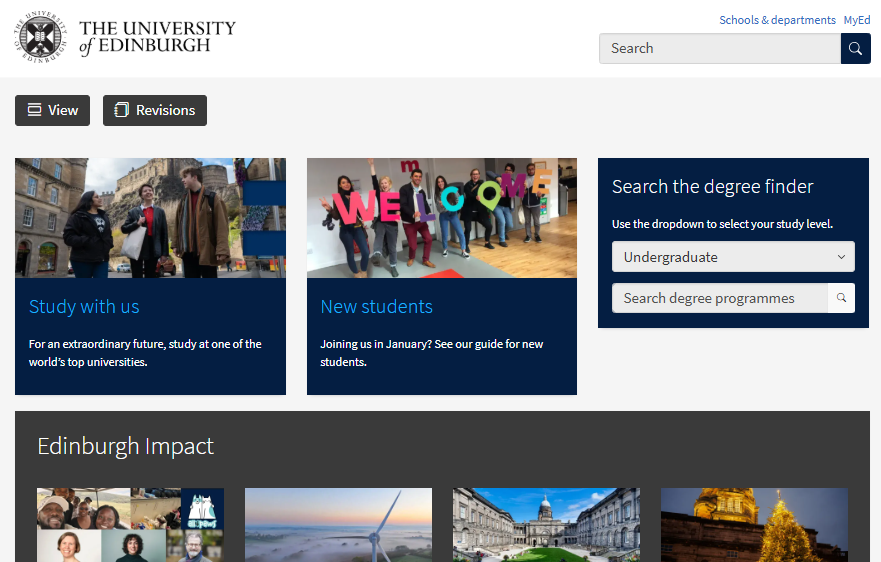
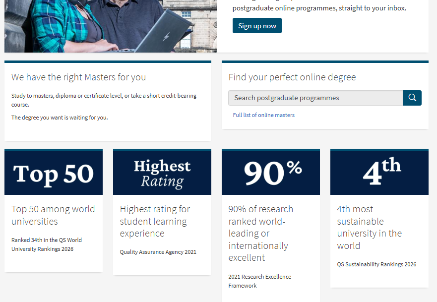
We introduced the new unified study search box across the central website
We introduced a new search box. This replaced the two separate study search boxes on the homepage and other parts of the website.
This new unified study search allows the website visitor to select the study level from the dropdown.
This new search box also provides more flexibility for campaign pages, allowing the search box to adapt to different needs. A good example of this is the online learning campaign page, which embeds a focused search box, where the search results are pre-filtered to taught postgraduate online programmes.
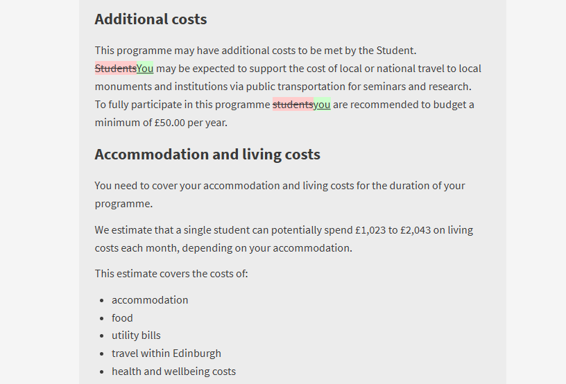
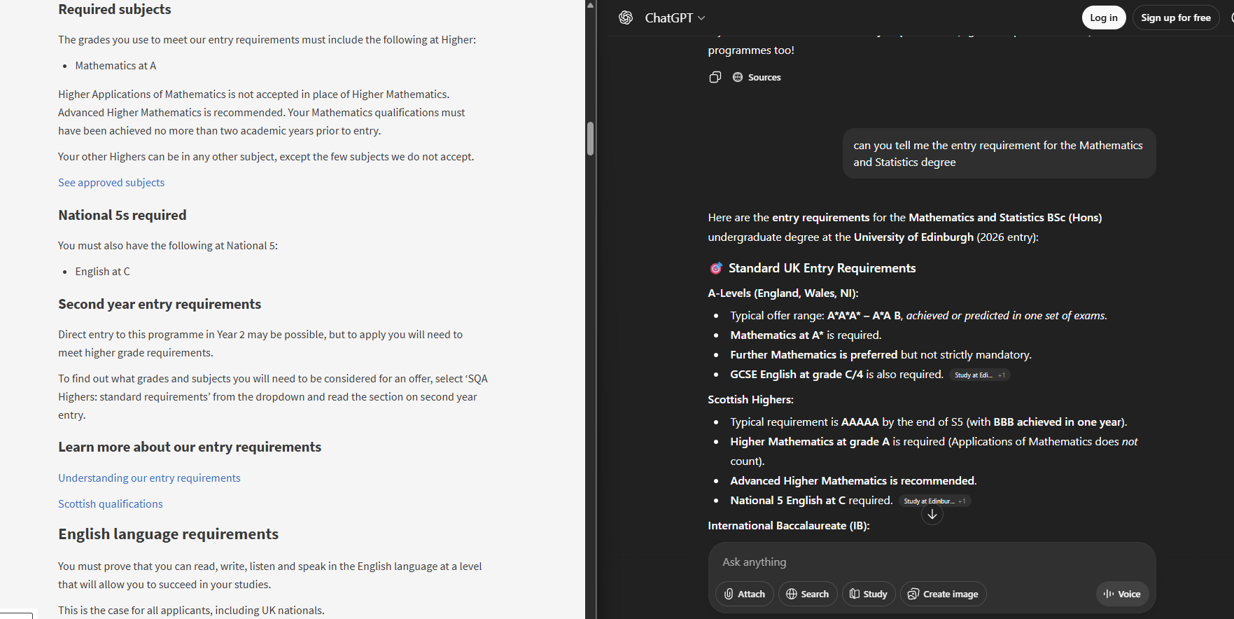
We introduced a new presentation of our entry requirements specifically for AI
Our approach to presenting entry requirements developed iteratively over quite a long period, improving each time we tested it out with students. By the time we launched in March we were very confident that it worked well for them.
However, something we didn’t consider at the time was that it was not possible for most common AI chatbots to read our entry requirements. This is because the interactive dropdowns that we use on programme pages impeded website crawlers from accessing the information.
The result of this was that AI chatbots would either respond with content from third-party sources, which may or may not be accurate, or simply did not provide an answer at all.
Inspired by our colleagues at the University of Dundee, we’ve introduced a new presentation specifically for AI assistants. This new presentation, linked from the very bottom of undergraduate programme pages, displays all entry requirements content on a single structed page.
This new presentation now allows AI chatbots to crawl this content and respond to users asking about our undergraduate entry requirements.
We continued to refine the layout and styling of our pages
We’ve continued to refine and tweak the styling, layout and presentation. These improvements have been in response to rounds of usability testing and feedback from our colleagues in schools.
Some of the more notable improvements include:
- Continuing to refine the font sizes and weights of the new heading and paragraph styles that we introduced during our early beta. We’re looking forward to working with the EdGEL team in the new year to explore how these could be rolled out across the web estate.
- We’ve moved the Events section to the top of the programme page.
- We’ve introduced the updated DiscoverUni widget, which fixes accessibility issues in the previous widget.
- Visual improvements to our subject pages and search pages to more closely align with EdGEL components.
Significant performance improvements
From day one the experience of browsing our new degree finder have been fast and responsive, but we knew there was more we could do.
Without diving into the technical details, we’ve made improvements to how these pages are loaded and served to users. We’ve introduced new systems which reduce the load on the CMS and allow pages to load even faster.
This has helped us retain excellent page load times despite the significant increase in traffic as we launched the postgraduate programme pages.
Looking forward to 2026
We will continue releasing new updates and changes throughout 2026, with our first release of 2026 happening at the start of February.