
A fresh take: Designing our new centralised 2026 Undergraduate Applicants site
In January, we launched our new undergraduate applicants site for 2026 entry, featuring key information for students who have applied to study an undergraduate degree programme. This site marks a significant change in approach from previous years. Following discussions with the Colleges, we (Prospective Student Web) agreed to take over management of the undergraduate applicants content for the first time, paring it back to a campaign page with several subpages embedded in the central Undergraduate Study site.
Historically, each College worked independently to publish and manage their own undergraduate applicants site. This was a resource-intensive activity, which often led to duplicated and dispersed content; subject information, along with other elements such as sample timetables and videos, was repeated across our web estate. We sought to address such issues by centralising the content and leaving the programme-specific information to the new degree finder. We also prioritised a streamlined and simple design to improve the user experience for prospective students.
How the old applicants site(s) behaved
The old applicants sites contained a lot of duplicated content, ‘hidden’ but public pages, and created high maintenance demands.
Large volumes of information were copied across from other sources, such as general key dates from the central Study site. Lengthy ‘explore your subject’ sections mirrored what was on the degree finder, with minimal unique content. Additionally, the sites included ‘hidden’ pages designed for and directed to a particular audience. These pages were shared with users via email but were still publicly accessible by search, resulting in event bookings by unintended users, like non-applicants registering for offer holder sessions.
As College resources changed in 2025, maintaining this system became increasingly unsustainable as colleagues had less capacity to collate and update information, especially on behalf of Schools. We recognised the need for a centralised approach that addressed applicants’ specific needs at this stage of the applicant journey, and supported conversion efforts for those who had not yet made a decision.
Our approach for 2026 entry
We adopted a campaign-page approach for our new applicants content, modelling the structure largely on the College of Arts, Humanities and Social Sciences (CAHSS) postgraduate applicants page, which we had co-designed earlier in 2025. Drawing from existing user research conducted by the Prospective Student Web team, we focused on removing repetition, reflecting the business needs of the Colleges, and directing users to the information most important to them at this stage of the student journey.
The key word here is ‘direct’. Our Study site already offers comprehensive information about prospective undergraduate students’ ‘top tasks’, so we chose to link to existing content rather than replicating it. We also leveraged our new degree finder, which now includes sections beyond just the programme details, such as School and facilities information, sample timetables, and can even support programme-level event call-to-actions (CTA). This enabled us to streamline the page by removing anything that was superfluous to maintain clarity and focus.
During the project, we also held interactive sessions with stakeholders to identify and address their business needs. We employed agile methods to continuously iterate on our designs and gather feedback to address issues promptly. This collaborative effort ensured that the final design satisfied the different requirements of each College and general applicant and conversion goals.
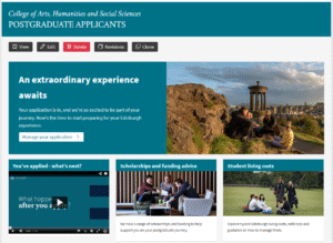
Screenshot showing the design of the CAHSS postgraduate applicants campaign page.
Some changes that we made
Our stakeholders indicated that easy access to subject and programme information was a priority for applicants. The 2025 site required users to have prior knowledge of complex University structures, with a large overview page that listed subjects (not programmes) under their corresponding College. Applicants, likely unfamiliar with these structures, had to scan each list to find their relevant area, and once they’d done so, would encounter repeated School information, a link to the degree finder, and only one or two unique pieces of content.
Our new degree finder eliminates the need for these extra pages as we’ve developed comprehensive programme templates that integrate all relevant details, including sample timetables. We’ve therefore linked directly to the degree finder with a CTA that leads users directly to our programme search function. Applicants no longer need prior knowledge about the University departmental structure – they can simply enter keywords from their programme name on the degree finder to find the necessary information.
We also created a ‘Key dates’ subpage, offering applicants an ‘at a glance’ view of important events. Initially, we had arranged these dates into categories – deadlines, applications and results, and semester dates – including sessions for applicants and offer holders. After consulting with our stakeholders, we chose to separate the applicant and offer holder events into distinct pages to provide more detailed information about them (more on this below). We also removed the categories and reordered the key dates chronologically, anticipating students’ desires to easily track upcoming events and grasp the overall timeline. To further support this, we added a prominent banner-style CTA near the top of the campaign page featuring the next key date and a link to view all upcoming ones. This is updated by the Content Operations team as deadlines pass, so users returning to the page see the next major milestone in their applicant journey.
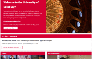
Screenshot showing the 2026 undergraduate applicants site, including the key dates CTA banner.
Managing events information
While most shared areas of content were easy to merge together, our biggest challenge was unifying College-specific events pages. Unlike content such as student accommodation, which is generic, we couldn’t take a single approach to advertising applicant and offer holder events. This is because such events are offered both centrally and by each College, online and on campus, and can be open to both applicants and offer holders or just offer holders.
We decided that the most practical and effective way to present this information would be to build two subpages – one for online applicant and offer holder events, and one for campus offer holder events. We included links to the other page on each, so that users could easily navigate between the two.
We identified that students encountered three contact points about events – in the initial email from their College or School, on the applicants site, and on the Gecko booking form they used to register for events. The user journey was therefore previously fragmented, as users were directed to the applicants site to find events information (such as the schedule, location and timings) but ultimately had to return to the email and access the Gecko booking form to register. Once they’d booked a place, they would have to revisit the applicants site to access event specifics. For online sessions, booking links were included directly on the applicants site; as a result, this historically resulted in non-offer holders booking and attending offer holder-only events.
To combat these issues and to support a linear user journey, we decided to minimise event details on our pages. We provided a brief overview and session dates to help attendees plan, but removed full event schedules, which would be available on Gecko at the point of booking. On the campus offer holder day page, we included links to central information about travel and accommodation in the city, removing the need to duplicate this content. All other details would either be handled by the Gecko booking form or were unnecessary at this stage of the student journey. To prevent non-offer holders from attending offer holder events, we excluded booking links from both pages.
Wrapping it all up
The new undergraduate applicants site represents our dedication to supporting prospective students through the different stages of the applicant journey. By centralising the content and enhancing the user experience, we’ve significantly eliminated duplicate information and streamlined navigation to key details. As we move forward, we are committed to ongoing collaboration with stakeholders and look forward to future projects.
On a personal note, this is my last week with the Prospective Student Web team and therefore my final blog post! It has been a real highlight to glean knowledge and expertise from my wonderful colleagues who have supported me immeasurably. I am taking many lessons away with me and am excited to continue similar work in the years to come.


Hi,
Great insight in this post about designing the new centralised 2026 undergraduate applicants site. Improving the structure and user experience will really help prospective students find the information they need more easily.