A year of continuous improvement with Helpline
The end of 2017 marks the first anniversary of our collaboration with IS Helpline to iteratively improve their IT help provision. A year in, we look back at some of our achievements in the process of improving the user experience around IT support at the University.
Background
Our goal has been to increase levels of self-service on common IT issues and thus reduce the number of support calls fielded by Helpline, the team in Information Services who field the vast majority of initial enquiries from staff and students.
To achieve this, we’ve been working on enhancing IT help provision through a process of continuous improvement:
- prioritising areas of support that generate the largest amounts of work for Helpline
- conducting usability testing with students and monitoring website analytics to understand how online content is being used
- making improvements to website structures and navigation, enquiry channelling processes and most importantly, the content on webpages
- assessing how effective our changes are, and either returning to make further improvements or moving on to new areas in need of enhancement
Read my blog post detailing the process of continuous improvement
Achievements
We have seen improvement in a number of areas relating to Helpline overheads and end user satisfaction.
In this post, I’ve picked three examples from among the many areas we’ve worked on this year, to highlight the main aspects of online provision we’ve been enhancing: enquiry channelling, website information architecture and most importantly quality and clarity of web page content.
Enhanced website enquiry channelling
The problem: The initial usability tests that kicked off this collaboration showed that students gave up on using self-service materials to solve an issue before submitting a call. Furthermore, they were confused by the existing form interface for submitting an enquiry.
This experience resulted in dissatisfaction among the students we observed and a preference to submit calls via email instead. For Helpline, these submitted emails can be incomplete, meaning they have to spend extra time acquiring more information.
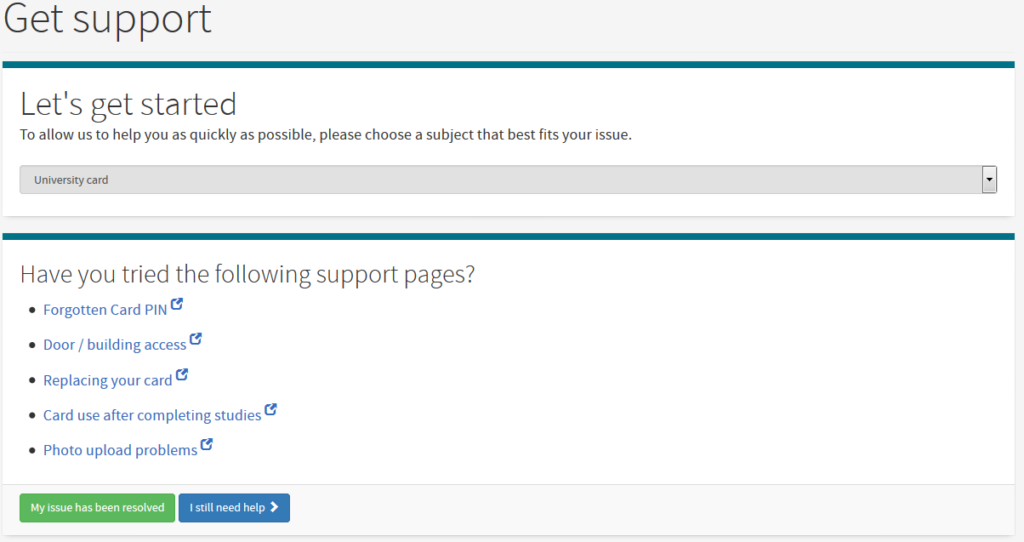
The solution: We introduced a new self-service contact form, which presents users with a series of popular support pages based on the topic they select. This encourages them to self-serve their issue before placing a support call.
The form also captures technical information about the user’s device, so if they do submit a call, Helpline will not need to gather this information at a later stage.
The impact: The introduction of this form saw the average time to call completion for Helpline calls drop from 3.25 down to 2.00 days.
On average, 45% of visitors to the form choose to progress to submit a support call, rather than investigate suggested support pages.
Redesigning the presentation of FAQ lists
The problem: In usability tests, we noticed a pattern in sub-optimal performance around students’ interaction with lists of frequently asked questions (FAQs). Students were observed to miss key information, and generally be disinclined to interact with long pages of content, instead deciding to submit a support call.
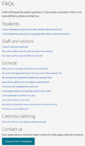
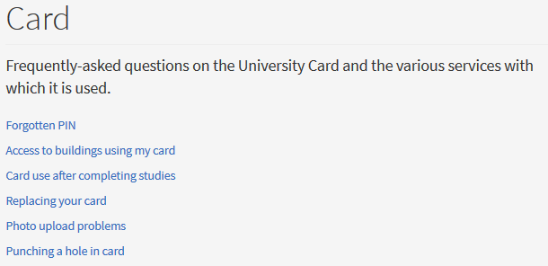
The solution: The number of question-and-answer pairs was cut back, each presented on its own page with best practice in writing for the web applied to the copy.
The impact: Separating the topics into separate pages has allowed for the Helpline contact form and IT help site to link directly to specific answers of frequently asked questions. This means Helpline operatives can provide direct links in support calls to improve customer satisfaction.
Helpline can also now measure the demand for content across the academic cycle and prioritise presentation accordingly at different points in the year. For example, 6/15 topics on the Printing FAQs page accounted for 78% of views, which led to us removing the extraneous questions from the page.
Additionally, shorter, focused pages perform much better in the search engine, meaning people find the relevant content more quickly.
Iterative improvements to high demand self-service guidance
The problem: Issues with content structure and use of plain English resulted in student participants failing to resolve their issues even if they had navigated to the correct page containing the answer to their problem.
For high demand support pages such as eduroam connection issues, students had trouble discerning that step-by-step guidance was being presented. By not recognising this, students were picking out particular steps to try and diagnose their issue instead of following the steps in order.
The solution: By removing excess content, restructuring with subheadings and giving prominence to keywords, we made content clearer and easier to follow.
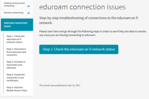
For eduroam connection issues, we turned a long single page of instruction into a series of clear step-by-step pages which students follow in order.
Eduroam connection issues step-by-step pages on the IS website
The impact: The new structure of the eduroam connection information enables us to monitor effectiveness stage by stage. By the third step, almost 60% have exited the process and only 3% of those who start the self-help process now reach the point of being referred to the IT Support Desk (the final step).
Regular user insight
It’s well acknowledged that the most successful service teams have regular access to their customers, and throughout this project – regardless of what we’ve been working on – we have involved users.
Watching staff and students trying to solve problems for themselves on the Helpline website helps us better understand their challenges and design better solutions. This insight into why problems are occurring, supplemented with the big data of support call statistics and website analytics (telling us what is happening), helps us focus on what is most important to our users and give us confidence in the improvements we make.
The Fast Path to a Great UX – Increased Exposure Hours: article on uie.com
Bringing together colleagues from the Website Programme, Helpline and across the Information Services service management community to regularly watch students interact with our support materials has been a really positive experience. It has helped us understand together where and why things need to improve, to see the impact of positive changes, and learn where our enhancements need further work.
Neil Allison, User Experience Manager
Find out more
We’ve been writing about our work with Helpline all year, and have collected these all together in a series:
Helpline-UX collaboration blog posts
The future
This collaboration has only been possible through the the contribution of expertise and insight from our Helpline colleagues, in particular Gavin Anderson and Neil Bruce.
Working together with the University website team has really helped us with the development of our self-help pages. By working with them and following the processes they’ve recommended, we’ve been able to identify the key areas for improvement and measure the how these changes are received with our user community. Lauren and her colleagues have brought experience and insight we didn’t have in our team and have shared these skills with us. We intend to continue collaborating together to ensure our support pages meet the needs of the user community.
Neil Bruce, Head of Operational Services
The best solutions come from a shared understanding of the problems and a collaborative, iterative approach to overcoming them. We look forward to continuing this working relationship and improving students experiences while reducing costs for Information Services.
The collaboration with the University Website team has been a very fruitful, informative and beneficial one, and has both helped identify and directly influence a number of ways in which the Helpline has been able to improve user education and reduced the number of hoops through which users need to go in order to get to the information they seek.
Gavin Anderson, Senior Computing Officer
Get in touch
If you want to improve your users’ experience of your digital services and reduce your enquiry management overheads, get in touch to discuss how we might help.



2 replies to “A year of continuous improvement with Helpline”