User research is driving improvements to MyEd for staff
Over the last 3 months I had the opportunity to work on a research project with the aim to improve MyEd for staff.
MyEd for students had already gone through a transformation earlier in the year, and this was a chance to bring about similar improvements for the staff view of the portal.
Top tasks research for MyEd
The first thing we decided to do was to carry out some top tasks research with the University staff community.
Read more about the top tasks technique and its use by the UX Service team
The idea behind this was to identify the top 5 tasks from each participant so that we could see if there were recurring themes and patterns in terms of what staff were using MyEd for.
Initial research to inform task list
We started by looking at the traffic to MyEd using Google Analytics. This gave us information about the pages that were most visited, and the popularity of individual clicks to various parts of the portal.
Simultaneously, we created a short questionnaire that we used to interview staff to find out the last 3 things they did on MyEd. This gave us some qualitative data where we could see common themes in what people said. For example, ‘EUCLID’ and ‘Learn’ emerged as common themes.
We also got ideas which we hadn’t seen so much, such as ‘using the sports facilities’. All of this helped to inform what would go into our list of Top Tasks.
Working with colleagues, we rationalised the list of tasks down from about 170 to a more realistic 78 for the research.
Survey results
We launched the top tasks survey and promoted to staff. We were really pleased that 590 colleagues engaged with the survey and took part.
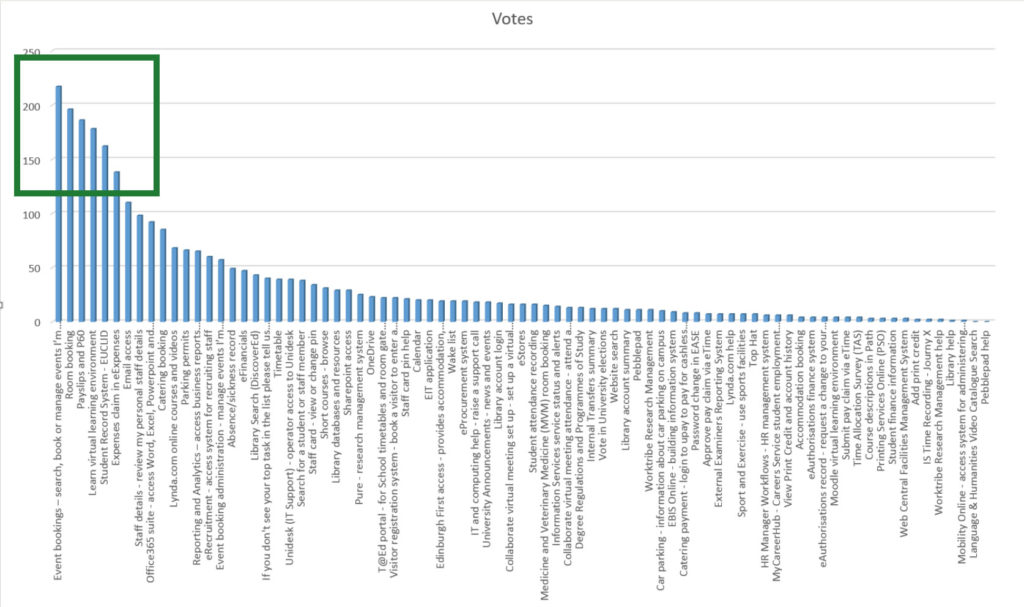
As the graph below shows, we saw a grouping of top tasks that people most do in MyEd. The top 6, highlighted with the green box, represent nearly 40% of the vote from staff and contain the following tasks:
- Event booking
- Room booking
- Viewing payslips and P60 information
- Visiting Learn – our virtual learning environment
- Visiting the Student Record System (EUCLID)
- Expenses claims

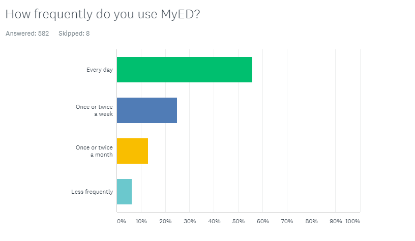
It was interesting to see that over 50% of our staff users said they use MyEd every day in their work. This demonstrates that by improving the service, we can bring significant benefits to the user experience. We can help staff find information and services more easily to help them do their jobs.

The survey also revealed more local variations in the results. For example, EUCLID and Learn featured closer to the top of the list as the top tasks in the Colleges as opposed to non-academic departments. This is perhaps reflective of the nature of the work in terms of working with and supporting students.
Next stages
The next stage was to look at how we could further inform an information architecture for MyEd.
Paired card sort
I ran card sorting sessions with pairs of colleagues. This involved asking them to sort cards representative of the sort of content they would use in MyEd on a day-to-day basis. I asked them to collaboratively create groupings of cards, and then give them a meaningful name.
This was interesting because it enabled me to hear how different groups of people think about content and groupings within the context of their work.
Online open card sort
We also ran an online open card sort using Optimal Workshop using the same set of cards, and asked groupings of staff to sort the cards and name the groupings online.
It was interesting that both of these card sorts surfaced themes and groupings such as ‘staff resources’ and ‘bookings’, providing useful information that we could feed in to the next stage.
Online hybrid card sort
Using these outputs and learnings, we then moved into a key phase of the research – the online hybrid card sort. We promoted this to staff around the University and were very pleased to have over 650 staff members engage with the card sort.
We provided staff with some categories that we had created based on the research to this point. We also gave them the ability to create their own categories. We then asked them to sort a set of cards representing content and services available on MyEd for staff.
The results
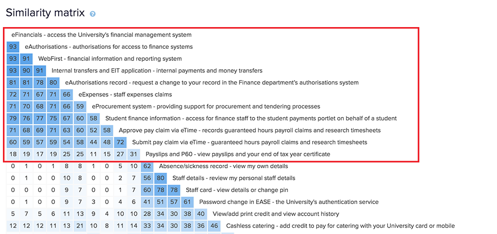
It was really interesting to see where there were strong groupings in terms of where people thought content belonged together. An example of this can be seen in the Similarity matrix below.
The darker the blue in the boxes, the stronger the level of agreement among participants. The red highlighted box shows a grouping where people thought items relating to ‘Finance’ should be grouped together. This level of consensus provides a strong indication that would inform the information architecture.

What’s next?
From the research to this point I have been able to suggest a draft information architecture. Research will continue into this with techniques, such as tree testing likely to be used to validate and improve the information architecture. This will, in turn, improve the user experience of staff using MyEd.

