Top priorities for web publishing at the University
Over 200 people from around the University participated in our latest top task survey looking at the diverse needs of our large and devolved Web Publishing Community.
What is a top task survey?
A top task survey basically includes a long list of tasks and asks respondents to pick out a limited number of tasks that are most important to them when they’re working in a certain context (for our survey, the context was web publishing). These surveys are difficult to do, so a heartfelt thanks to everyone who completed ours. We know they are tough to fill in and a bit frustrating as well. However the data we get from these surveys are so important and valuable we hope you forgive us yet again. It does share the burden of prioritisation and it helps to show what a difficult and complex area web publishing is.
Who filled in the survey?
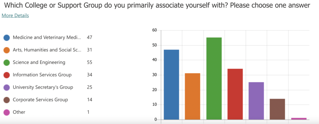
College and support groups
There was a good spread of submissions from across all the Colleges and support groups.

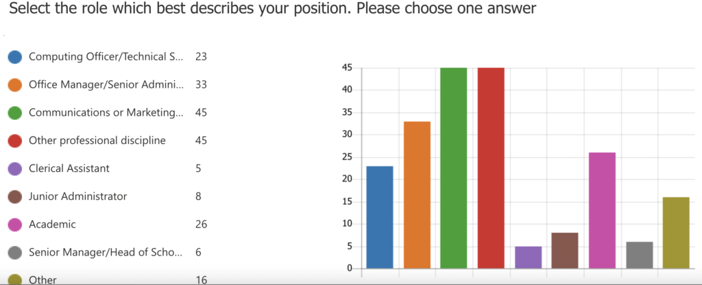
Roles

We also asked about the roles of staff – to enable us to break down the results further. We’ll be revisiting this in later blog posts but we’ve already started to see areas of cross over between the different groups. For example tasks to do with images (either image positioning or uploading documents and images) was in the top 10 across all 9 roles. ‘Make content stand out/look engaging’ appeared in the top 10 tasks for 7 out of 9 of the different job roles.
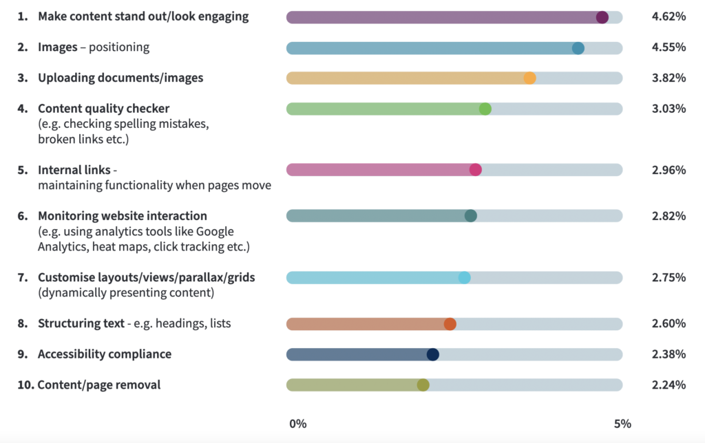
What are the top 10 tasks for the whole community?
Top 10 tasks overview (percentage of total votes)

Analysing the results
It certainly seems that our web publishers around the University are keen to make their content stand out and look engaging. It shows the importance people place on content, and therefore this will be a top priority for us to address. It’s a good time to draw attention to the work we have started on creating a new Design System for the University.
Design is clearly important and we recognise staff would like more flexibility not only in how images are placed in content but also how they are managed and uploaded into the system. This is a complex area and we need to be careful in the way we position and use images and that we don’t make content more difficult to read. All images and content also need to reflow on mobile devices and we are starting to realise that content needs to work well on monitors and very large screens as well.
We can’t rush into any solutions but need to look for clever and innovative ways of making this work for both our content creators and our target audiences – the top quality prospective students and staff we want to recruit. This of course makes our project really exciting and we shouldn’t shy away from taking some risks and trying things out on a small scale before making decisions that could affect the whole web estate.
What are the next steps?
We’ll use the results from the top tasks survey to help us prioritise our work as we develop the new web publishing platform. A lot of these tasks will have far-reaching implications and will direct our work in the editorial interface of the Content Management System as well as evolving the design and the functionality available to our editors.
We’ll publish some more posts in the coming weeks as we get to grips with the results and come to some more conclusions looking at the data in greater depth.
Find out more about the Web Publishing Platform or our Design System projects
Creating a world-class web publishing platform – How you can help
The University Design System: a journey that has just started
Come and join us at our community events
If you would like to know more about we do in Website and Communication we’d highly recommend you come to one of our virtual Web Publishing Community sessions. We cover varied topics from archiving, accessibility and analytics through to user centred research, our vision for design and web management in all its different guises.
Web Publishers Community Sessions


2 replies to “Top priorities for web publishing at the University”