Sketching workshops have provided insight into students’ needs and expectations for Learn Ultra
As part of the Learn Ultra Upgrade project, members of the Educational Design and Engagement team conducted a series of workshops and hybrid user experience testing and interview sessions with students on internships within Information Services, to help the project team understand how the integration of the new Ultra Base Navigation (UBN) layer could be tailored to meet students’ needs.
UBN user experience sessions were designed to build on what had been learned from the successful programme of user experience work carried out as part of the Learn Foundations project – an overview of the final phase of this UX research can be found at the following blog post:
Understanding what staff and students need from Learn for hybrid teaching and learning
The initial step in planning the UX activities for the UBN was to review the findings from the UX work of Learn Foundations and to identify what we still needed to find out to help guide decisions about the UBN. This ‘gap analysis’ revealed the need to understand more about the contextual needs of students when navigating Learn, to uncover how they made sense of the UBN when they saw it, and how they expected it to work. To capture this information, sketching activities and semi-structured interviews were arranged.
The interview process and findings are detailed in Alan Hamilton’s blog post:
Understanding how students interact with Learn Ultra and Ultra Base Navigation
Sketching workshops
Sketching is typically an activity carried out in the early stages of a design project to collaboratively generate ideas and discover solutions to problems. By asking people to sketch what they would expect to see when interacting with elements of the user interface, it is possible to get a clear visual sense of what they are thinking, which can be preferable to asking them to verbally convey this information as it helps to avoid misinterpretation. Individual sketches can then be shared, and through a process of iteratively refining design ideas and voting on the most important features, the group produces a concept that can be taken forward to the next stage of the design process.
A guide to collaborative sketching
The aim of our workshops was to find out what students expected from the new features of the UBN, namely the Institution Page and the Activity Stream. We aimed to discover what they expected them to look like, what they would expect to find there, and what tools and features would be most important and useful to them. Our findings could help us to make decisions about the best place for users to land when they entered Blackboard Learn, which pages within the navigation layer were going to be of most interest, and what information should be available there. The workshops would also help demonstrate how the UBN might solve some of the existing user issues and pain points highlighted by previous UX work.
Format of the workshops
The workshops were held remotely on Teams with sketches captured on the online whiteboard tool, Miro. Two workshops were held, one with 3 participants and the other with 6. The participants were all students, currently on internships within ISG. Of the 9 participants, 7 were familiar with the current version of Blackboard Learn , the other 2 being from a different institution were entirely new to the platform.
Workshop introduction
Students were shown a mock-up of the UBN layer showing the new features: Institution Page and Activity Stream.
Participants were asked to consider:
- What they would be able to do in the Institution Page
- What tools and features they would expect to find there
- What the page will look like and how it will be structured and laid out
Individual sketching
Participants were given 3 minutes to sketch out their initial ideas. Having completed this, they were given a further 6 minutes to sketch 2 further versions of the page, either adding new ideas or varying the initial sketch. Participants could build their sketch directly on the Miro board using drawing tools, shapes and text, or sketch with pen and paper and share a photo of the sketch to the Miro board.
Sharing initial ideas
Participants were invited to talk through their sketches while these were being viewed by the group in the Miro board.
Adopt at least one other idea to create refined sketches
Having heard ideas from the rest of the group, each participant created a refined sketch which incorporated at least one element from another participant’s sketches.
Paired sketching
Participants were put into pairs and given 5 minutes to share their refined sketches and to work together to create a single sketch combining the best of each other’s ideas.
Share collaborative sketches
Each pair was given 2 minutes to show the group the collaborative sketch they produced, highlighting the parts they chose to keep from each other’s previous sketches and why.
Final vote
Once each pair had fed back, the group were given 3 minutes and 10 votes each to review the collaborative sketches and vote on the parts they thought most useful and relevant to the brief.
The process was repeated for the Activity Stream.
Output from the sketching sessions
The sketches gave a good picture of students’ perceptions of the Institution Page and Activity Stream.
Institution Page
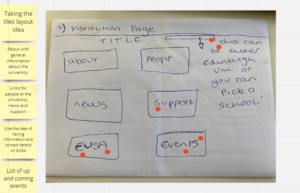
It was evident from the sketches and discussions that the purpose of the Institution Page was unclear to students – apart from being a place for useful information, they didn’t identify a clear purpose for the page, and for this reason did not indicate it was something they would find useful when they were accessing Learn. The students’ combined sketches and votes revealed that they felt this was a place they could find sources of help and support, links to important information and services across the University, and a welcome message. However, most of the suggested content for the page floated by the students – including University-wide news and events, key dates in the University calendar, School-specific information and announcements, Personal Tutor information, campus maps, and contact information – are all located elsewhere in the University infrastructure suggesting that the Institution Page did not have a defined purpose in the eyes of the students.

With such a broad range of links and information suggested, much of which will be duplicated on existing University or School web pages, it was difficult to identify a particular focus for the Institution Page, or how it would benefit students when they arrive in the UBN interface. Visually, sketches generally depicted a set of tiles or blocks representing different categories of information.
Activity Stream
Although initially unsure what the Activity Stream might represent, participants soon built a consensus on the purpose of this feature, some creating sketches that were not dissimilar to the real feature in UBN.
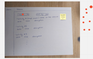
Students’ sketches progressed towards a vertical timeline of events, in reverse chronological order. The most important items participants wanted to see in the Activity Stream included assignment due dates, grades and feedback, and announcements. Many of the participants included a filter tool so that they could simplify the timeline and focus on particular items.

Other sketch features that were upvoted by the group included the ability to filter items in the Activity Stream by course, and a search facility.
Students felt it was important that the Activity Stream should be a clean, uncluttered interface. This was reflective of some of the issues reported with the notification features in Blackboard Learn which students have said they found difficult to find and confusing to use and customise. Participants who had used the current Blackboard Learn thought the Activity Stream was comparable to the current Learn notifications emails but envisaged it as more user friendly, and preferable to receiving multiple emails that they said tended to be overlooked.
Conclusions
The sketching workshops were an excellent opportunity to surface students’ thoughts about how they currently use Learn and how UBN would fit into their experience. In combination with usability testing/interview sessions on the UBN, the sketching sessions provided a clear picture of how the new interface will meet students’ expectations and needs. We found that the Activity Stream was a concept that appealed to students and our findings can help position and promote this to improve the user experience in Learn. Analysis of the output from the sketching sessions and usability testing and interviews indicated that the purpose of the Institution Page was unclear and its content would overlap with information provided in the MyEd portal and University main website. The decision was taken to remove the Institution Page from the UBN interface.


3 replies to “Sketching workshops have provided insight into students’ needs and expectations for Learn Ultra”