
How we helped the School of Health in Social Science to improve their web content
The UX Service has helped more colleagues to conduct usability tests on their website and prioritise web content improvements.
After only two weeks of usability testing, colleagues from the School of Health in Social Sciences had identified priority areas for improvement on their website. They discussed the findings with the School’s senior leaders and agreed on changes to their web content, to better meet the needs of their web audience.
Colleagues from the School of Health in Social Science contacted the UX Service for help with their website
The School’s Communications and Marketing team had recently reorganised and streamlined their content ahead of their website’s migration to EdWeb2. However, they were uncertain whether the current layout and functionality were providing the best possible user experience for their visitors.
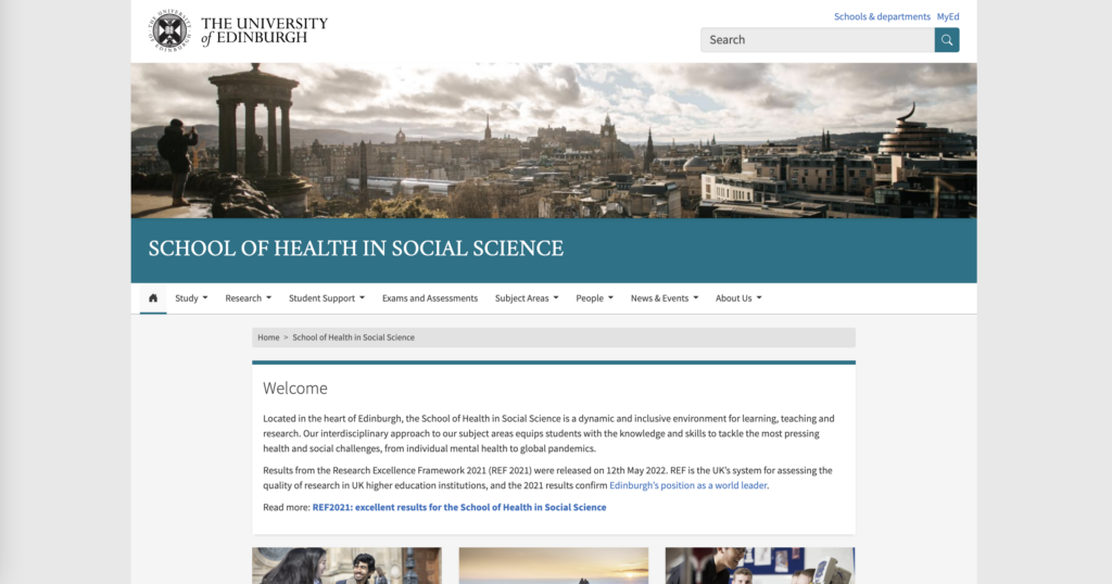
Homepage of the Health in Social Sciences website.
We discussed the website’s goals and target audiences
Members of the UX Service met with the team, who told us more about what they wanted to achieve with our support. They wanted to discover the tasks and questions their audiences had when visiting the website, so that they could check that their content was addressing these needs. These audiences included:
- prospective students
- prospective researchers
- research collaborators.
The website also needed to support certain goals for the School, for example, recruiting students and maximising the impact of research outputs. Therefore, the team wanted to make sure that their audiences could find content relating to both studying and research for their Health in Social Science topics.
The UX Service recommended that the School run usability tests with priority audience and tasks
We felt that usability tests would give the team an indication whether people could find important information using the website.
The team spoke to senior colleagues within the School to confirm the priority audience and tasks for the website. A top priority that emerged was prospective students finding information about the School’s programmes and research.
Based on this priority, the team wrote a list of tasks to test on the website, in order of importance. We provided a template for usability test script and guidance on the wording of the task questions.
Some of the tasks that participants were asked to complete were:
- “If you were looking for a postgraduate degree in Nursing that allows you to train and register as a Nurse, how would you find the relevant programme at University of Edinburgh?”
- “Find a programme that offers you a qualification that allows you to practice professionally as a clinical psychologist after graduating.”
- “Can you identify a research project related to young people who have experienced an Acquired Brain Injury?”
Team members of the UX Service facilitated the usability tests with seven participants
The School’s Communications and Marketing team recruited students from the School and organised the individual research sessions. They also observed the sessions while members of the UX Service facilitated using the test script.
The participants were a mixture of male and female students from Postgraduate Taught and Postgraduate Research programmes. Nearly all the testers were non-native English speakers.
Testing the website helped us spot problems and find quick-win solutions
Participants weren’t always sure where to find certain information to complete key tasks on the website. The UX Service and School team discussed the reasons behind this and worked together to find possible solutions.
Acronyms in navigation menus caused confusion
We saw that participants couldn’t find a research project about Acquired Brain Injury which was listed under ‘YARNS’ (‘Young Adults Rehabilitation experiences and Needs following Stroke’). They were looking for words related to brain injury, so wouldn’t know what the acronym meant unless they already knew about the project.
The School team and UX Service discussed potential solutions to this problem. The simplest solution would be to expand the acronyms in left hand navigation bar in the ‘Current Research’ page. This would clarify the terminology for visitors unfamiliar with specific research projects and allow them to scan for the keywords they’re expecting to find.
This proposed change would need another usability test to see whether it solved the problem.
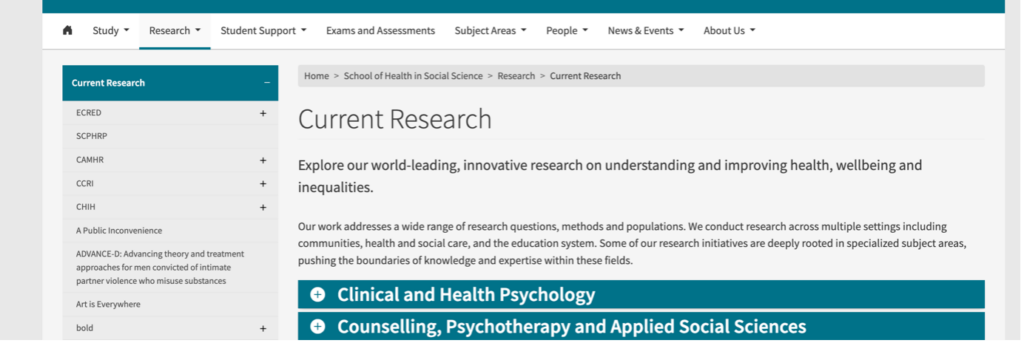
The ‘Current Research’ page in the School of Health in Social Science website contains acronyms in its left hand navigation menu, which participants didn’t understand.
Participants didn’t understand the difference between ‘Postgraduate Taught’ and ‘Postgraduate Research’ programmes
For example, when asked to find a degree programme that allowed them to train and register as a Nurse, many participants tried to find this under ‘Postgraduate Research Programmes’, rather than ‘Postgraduate Taught Programmes’. This meant that they often got lost when searching for specific programmes.
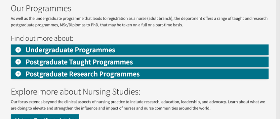
The ‘Nursing Studies’ page of the website, which contains accordions that conceal the list of programmes. Usability testing showed that participants didn’t know the difference between taught and research programmes and often clicked the wrong accordion.
The UX Service suggested that one solution could be to remove accordions that conceal lists of degree programmes under these headings. Presenting the postgraduate degree programmes together in one list would prevent users from making a choice between ‘Taught’ and ‘Research’, then continuing down the wrong path.
The UX Service continues to support the School of Health in Social Science with their website
Since this round of usability testing was completed, the UX Service has provided further advice on how to continue testing and researching further improvements on the School of Health in Social Science website. Our Senior Content Designer has also run an editing session with the School’s Communication and Marketing team to optimise content on a page that was identified as containing too much information.
It’s been a great experience to work with the team, who were keen to learn more about how user-centred design practices can improve their website. They were able to make quick improvements to their website in the space of a few weeks without committing to a full-time project.
I hope they’ve enjoyed the experience too and look forward to continuing our work with them in the future!
You can read more about how the UX Service helps University colleagues
How we’ve used an editing process to improve web content – blog post by Nick Daniels, Senior Content Designer
How green can we make the UX Service website? Using digital sustainability data to drive user-centred design decisions – blog post by Emma Horrell, UX Manager
DIY user research: Helping the New Students team to optimise their web content – blog post by Catherine Munn, User Experience Research Specialist
If you would like to learn how the UX Service can help with your project, please visit our website: