Proper Heading Structure Design for Web Accessibility
What is Heading Structure and why is it important for web accessibility?
Designing websites with sound heading structure in mind is critical to making your websites are truly accessible, as websites with good heading structure make it easier for screen readers to successfully and quickly navigate pages to find relevant information.
As much as we rely on visual presentation to convey information, cognitive processing is made much easier when information is presented both visually and structurally. Indeed, surveys of screen reader use find that heading structure is the most important way that those who rely on assistive technologies use to navigate webpages and find information.
Breaking up content by organizational relevance also aids users in more quickly deciding where and if there is pertinent information available, increasing engagement by shortening user journeys.
How can I implement and optimize accessible heading structures?
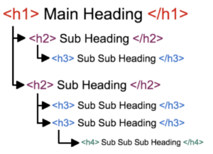
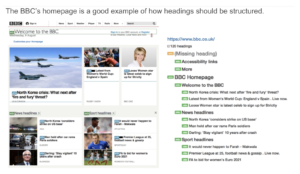
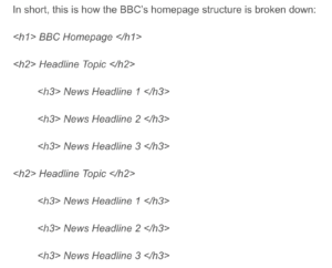
First, it’s always important to keep in mind that the structure of the code should align with the visual presentation of the website and ultimately serve as, effectively, a “table of contents”.

As demonstrated by the above image, <h1> describes the page as a whole, and a page should always- with a few exceptions- have only one <h1>. In continuation, headings <h2> through <h6> represent increasing degrees of “indentation” in the “outline” provided by the entirety of the heading structure. As such, you shouldn’t skep heading levels, e.g. skipping from <h2> to <h5>.
Text that is visually displayed as large, bold, or emphasized, is not translated or interpreted as a heading unless the <h1> – <h6> mark-up is used. To highlight or emphasize text that is not a heading do so using a style sheet language like CSS or an adjacent tool- not heading tags.
If there is a segment of content that is visually grouped together but doesn’t require a <heading>, use an an <h> tag and position it off screen so that a screen reader will pick it up, but a visual reader will ignore it.
Remember: while it is critical that headings represent the structure of a page with full integrity, don’t over-describe- using too many headings can be overwhelming for people who rely on screen readers to navigate. Instead, implement them with the same discretion you would use for alt texts.


Additionally, HTML lists (like <ul>, <ol>, and <dl>) convey a hierarchical content structure.
- Unordered lists (<ul>) are for content with no sequential order or importance (bullet points)
- Ordered lists (<ol>) suggest sequence, order, or ranking, typified by use of numbers or letters
- Description lists {<dl>) are used for key:valye pairs, like terms and definitions in a glossary or questions and answers in an FAQ. Terms (</dt>) are usually bold, while descriptions (<dd>) are typically normal weight and indented
What about Tags?
The following tags are used to mark header and data cells:
- Header cells are marked with the TH tag with the ID attribute giving a header name
- Header rows are enclosed within the THEAD tag
- Data cells are contained in TD cells with a header attribute which locates the row and column of the cell
- Data rows are enclosed within the TBODY tag
- Cells in the second row have both an ID attribute and a HEADER attribute
Quick Tips: Heading Structure Do’s
Do
- Use lists to:
- Present key terms and concepts
- Organize information meaningfully
- Convey sequence
- Create links for additional information
- Use the styles menu for headings
- Indicate that the links are anchors (e.g. “table of contents”, “jump to”, etc)
- Use standard bullets provided by your software’s list – screen readers misidentify custom bullets
Further Guidance and Resources for Implementing Proper Heading Structure
As we move quickly towards the September’s Accessibility legislation deadline, we want to provide tools and in-depth guidance to help you improve the heading structure of your site. To that end, we are providing in-depth workshops and informational posts centred around high-impact, efficient, and approachable site fixes.
For sites within the EdWeb web estate, we provide a web governance tool called Little Forest (please email Astoria DeTuncq at ddetuncq@exseed.ed.ac.uk for access) to provide accessibility auditing information. With Little Forest, we can audit how accessible your site is in terms of heading structure, identifying problem areas to enable more focused improvements.
Additionally, we hosted a Heading Structure workshop on July 21st, in which we delved further into the importance of heading structure to accessibility, best practice methods to achieve optimal heading structure, and information on how to use Little Forest site audits to gauge your sites for heading structure accessibility. We have uploaded a recording of this workshop to Media Hopper Replay.


1 replies to “Proper Heading Structure Design for Web Accessibility”