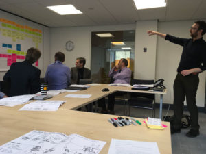
Presenting findings from user research into BI/MI
Last week, I presented back some user research findings to the Service Management team in Information Services. The research has been looking at how people get hold of the facts and figures they need to understand what’s happening within the University.
Those facts and figures include things like:
- student numbers
- staff numbers
- financial information
- estates information
The University collects data on all of these, and much more besides. Various staff then need to access this data, collate it, adapt it to their needs, and then use it. Sometimes staff use the information to answer a question or help make a decision, and other times, they need to gather information because an external organisation has requested it.
This type of activity is also known as creating and using Business Intelligence / Management Information (BI/MI). There are large numbers of staff across the University who regularly use BI/MI as part of their job, with the main tool for this being BI Suite.

Nick presenting the findings from BI/MI user research. The storyboard is on the desk, the user journey map in on the wall.
“The research presented in the session gave us a clearer idea of what users want from our service, and how they’re currently using the tools we support. Hearing reports from users both taught us new things and confirmed things we suspected already.”
— Alex Carter, Head of Service Management
UX techniques
In the presentation, I explained what I’d found out by speaking to University staff about how they work with BI/MI. To summarise the findings, I used two increasingly popular methods from the UX toolkit: storyboards and user journey mapping.
The storyboard for this project uses a cartoon format to show the actions of a typical user as they engage with BI/MI.
The user journey map goes into more detail, showing extra information about the user’s experience: what they’re trying to achieve at each stage, alongside their thoughts, feelings, and pain points.
People got up and interacted with the user journey map on the wall, and by presenting information in cartoon form, the findings came to life in a way that they might not have otherwise. Using sketched out work is a good way to communicate that the thing you’re presenting is unfinished, and that it will likely develop as we hear more from users.
The purpose of all of this is to understand where people are having problems with a service, which in turn allows the service providers to work out where to focus their efforts and what to prioritise in future projects.
Reporting back early
We wanted to present back our findings several weeks before the end of the research project. By looking at it as a work in progress, Service Management staff could then provide input into where we should focus our efforts in the remaining time.
“The research review session really got my team focused on our users. Better understanding their needs and frustrations will help us design better services and support their adoption across the University.”
— Susan Cooke, Enterprise Data Services Team Manager
Find out more
If you’re interested in bringing in more UX techniques into your work, come along to the monthly UX lunchtime meetups.
Monthly UX meetups at the University of Edinburgh
Or to find out more about how we can help you understand more about your users, contact us.

