MyEd: improving the staff experience
We recently made some changes to the staff view of MyEd, to make it easier for staff to use MyEd, and find the content that they need. The changes include:
- Adding Learn to the staff home page.
- Making changes to the menu structure to improve how we organise content.
- Making it possible to favourite all portlets, so that staff can access the content they use most often with a single click from the home page.
This blog post explains the research process behind the changes, and how we gathered the evidence that informs them.
Changing the homepage
In contrast to students, who use MyEd in quite similar ways, regardless of level, year or school, staff use MyEd in many different ways. This makes it more difficult to identify what content should be on the homepage. We wanted to find out more about how staff use MyEd, and whether we could change the content on the homepage to make it more useful for staff. We used two different methods.
Top tasks
The first was a top tasks survey, to identify the top 5 tasks from each participant so that we could see if there were recurring themes and patterns in terms of what staff were using MyEd for.
Read more about the top tasks technique and how it can be used
This gave us some really interesting information. The 6 most popular tasks, which accounted for nearly 40% of all votes cast were:
- Event booking
- Room booking
- Viewing payslips and P60 information
- Visiting Learn – our virtual learning environment
- Visiting the Student Record System (EUCLID)
- Expenses claims
However, more detailed analysis shows us that there’s quite a lot of variation between different groups of staff, for example academic staff and non-academic staff, or colleges and service groups.
Analytics data
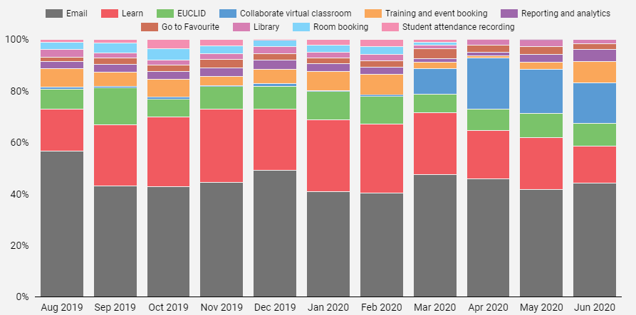
We also looked at usage data, to understand which areas of MyEd staff use the most. This shows us that the most used portlets by a considerable margin are Email and Learn, with over 50% of all staff usage. This is interesting, as although we can see below that email is one of the most used portlets, it was actually number 7 in the top tasks survey. The next most used portlets were EUCLID, Training and Event Booking and Room Booking. However, this has changed over the last few months with most staff working from home. Learn and Email are still the most used portlets, but unsurprisingly, Room Booking is seeing very little use now, whereas the use of Collaborate has grown significantly.

Making changes
We can see from the usage data that some portlets are used much more than others. However, we also know from our Top Tasks survey that staff don’t all use the same content. This makes it very difficult to design a homepage which suits all staff, and it’s one of the reasons we kept the homepage simple for staff, with just Email and Calendar. We do see that Learn gets a lot of traffic compared to other portlets, so Learn has now been added to the homepage for all staff. We decided not to add any other portlets to the homepage, partly because improvements to Favourites mean that staff are now able to add any portlet to their Favourites. This means that they can customise their homepage, and make the content they use most often accessible with a single click.
Changing the menu
Designing a new information architecture
We wanted to improve how content is organised for staff. We did a lot of work with students before the launch of the new MyEd to understand how they categorised and grouped content, and over the last 12 months we’ve been carrying out similar exercises for staff content. These have included interviews, card sorting and tree testing.
We started with some face-to-face card sorts with colleagues. Colleagues were given cards which each described one task or piece of information they might use MyEd for, and asked to group them together, and give names to their groupings. We followed this up with some online studies, inviting groups of staff to do the same activity online. This allowed us to identify initial top-level categories, and we used these in a large scale online hybrid card sort. Users were given the categories from the earlier research, but could also create their own. Over 650 colleagues participated, which gave us a huge amount of data to analyse.
For some types of information, for example finance related, there was a great deal of consistency in how cards were grouped. For other types of information it was much less clear. We also found that information which was harder to categorise was often grouped together into a type of ‘catch-all’ category.
Testing the changes
We used the data to develop a new information architecture and menu structure. We tested this new structure using another online study, this time a tree test. A tree test asks participants to click through a menu to identify where in the menu structure they would click to carry out a particular task. This let us see how effective the new structure was, and whether staff would be able to find the content that they need. Overall it was quite successful, although we identified some areas which were problematic, and made some small changes. The new menu is now in place, and we’ll continue to review and monitor it, to see how well it is working.


What is really annoying is the lack of useful communication: when clicking on My Information/Staff Details (which is still available), one gets: “Out of Service This portlet is no longer available.”, with no information about where to go now instead.