Making usability testing agile
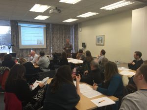
At the end of last year, I ran an open invite session for web publishers, developers and project managers in which I outlined how we’re conducting rapid, iterative usability testing as part of the development of the new University CMS, EdWeb. The presentation was followed by a demo of the process in which everyone participated.
In this post, I’m basically writing up what I said so that colleagues that couldn’t make it can get a good idea of how I fit regular usability testing into a very tight development schedule. We had 24 staff from around the University join us and the event was oversubscribed so hopefully this plugs a gap.
I’ve included links to the slides and am happy to help anyone who wants to try it for themselves. It’s pretty easy and the resources I use are freely available.

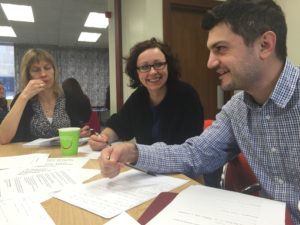
24 staff from around the University joined the CMS development team to watch 3 usability tests and contribute prioritised issues to address.
What we’re trying to achieve
The first thing to be clear about is that this isn’t about agile development. It’s about achieving regular, rapid, inclusive usability testing that results in measurable improvements, and with minimal overheads. So it will work for you regardless of any development methodology you’re following.
I’ve run a usability testing training course for years and had over 600 colleagues around the University attend. As Steve Krug says, “It’s not rocket science” and I think most leave my training seeing just how easy it is to get insight into the effectiveness of their website or application. Many go on to put the training into practice.
Usability testing training session overview and participant feedback
But there are challenges, and I overhauled this training a couple of years ago to cover what happens after you’ve done a few tests and identified what you feel you need to do to improve.
The challenges staff have raised with me (and I’ve encountered myself at times):
- Getting the go ahead to use your time on usability testing
- Getting colleagues to take on board what you uncover
- Getting fixes to problems implemented
And challenges such as these aren’t just faced by people like you and me. Usability and user experience professionals the world over encounter blockers such as these every day.
Caroline Jarrett and Steve Krug presented research on the topic: Why usability problems go unfixed
I have additional challenges playing the role of UX Lead for the development of the new University CMS, the main one being that this is not a formally recognised role within Information Services and there are no formal usability-related processes in their approach to software development. But on the plus side, this has given me scope to experiment and innovate and it’s helped drive me to where we are now and the approach that we take.
Our process
I’m going to say right now that there’s nothing particularly innovative going on here, and that I didn’t invent any of it – I’m just standing on the shoulders of giants. Mainly Steve Krug, with a bit of help from David Travis.
The majority of what is covered below (minus a few tweaks) is from Steve’s fantastic book: Rocket Surgery Made Easy. After running sessions for a few months, I also discovered the Gov.UK user research blog which highlighted that they’re just a bit further down the same road I’ve taken us.
Have you had your recommended dose of research? – Gov.UK user research blog post
What we do:
- Get the right people in a room
- Watch a small number of short sessions with users doing something
- Prioritise the issues we see
- Collaboratively consolidate their priority lists
- Agree actions for usability issues
- Repeat every few weeks
Who are the right people? Basically everyone with a stake in the development. No exceptions. Our time is so tight that I’ve negotiated within the team to ensure that at least one representative from each area of activity is present. Ideally the whole team would be present to observe but it’s not an ideal world. So this means I always have at least: a project manager, a developer, a service manager, and a training and support representative. Sometimes I manage to get a more senior stakeholder in the room for at least some of the time too. So a minimum of 4 colleagues see what I see, and sometimes we’ve had 9 or 10.
What do we watch? We watch real CMS users undertaking tasks in usability testing sessions that I facilitate. The focus for the session is agreed a week or two in advance so that I can plan scenarios and make sure we have a representative environment to work in, and also so that the team can focus my attention to whatever they feel is most appropriate. Typically this is an area which is causing concern or an area where we’re about to begin adding new features.
How many participants? In the presentation I use the graph from Jakob Nielsen’s famous article, “Why you only need to test with 5 users” but what I actually said was “As many as you can fit into the time you have (so probably not very many)”. In practice for us, with 3 hours allotted for this activity, we watch 3 participants for about 20-30 minutes each which leaves us with enough time to discuss at the end.
Jakob Nielsen: “Why you only need to test with 5 users”
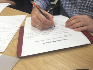
How do we prioritise? We all make our own notes, and at the end of each participant’s session, we each fill in a form independently that logs the top 3 issues we observed. So at the end of the session we have each filled in a form with 9 blank spaces. We may have written down the same 3 issues for all 3 participants, but not usually.
How do we consolidate? In the early months we just did this through an open discussion, but I found it quite hard to keep the discussion on track and therefore on time. Time ran on and people needed to leave so getting real consensus was difficult. And then I remembered David Travis’ usability issue prioritisation flowchart and more recently we’ve been using this. This has helped keep the post-test conversation to about 30 minutes and provided greater transparency about how we prioritise.
And so out of this, we have a list of prioritised issues that we assign to members of the team to action. The action might be:
- Get this prioritised for upcoming development (because the solution is “obvious”).
- Make changes to our training and support processes.
- Add to challenges for future prototyping of new interfaces and processes for additional testing (because we don’t have consensus on how to improve the situation, or the best solution would be costly to implement so we want to be assured it’s right before we commit the development time).
Benefits of this approach
For the development team:
- We get closer to our CMS users – and immediately see the impact of our efforts
- We gain shared insight & experience
- We confirm ownership of the priority issues
- What to fix immediately
- What to do better next time we’re developing in that part of the system
- What we thought was a problem that turns out to be something we can live with
For me:
- The process keeps set up and organisation of session to a minimum
- No report writing – just a single wiki page logging what we did and a table of priority issues and actions
- Doing this regularly moves the culture of the team on, emphasising CMS usability on the development agenda
What we need to do better
I have two challenges that I continue to work on:
- How do we minimise usability issues making it in to the system in the first place?
- How do I get more of the right people in the room, more often and for longer?
How do we minimise usability issues making it in to the system in the first place?
This is tricky because we’re working in Drupal, an open source CMS. This means our developers rarely create stuff from scratch. They’re drawing on a community of developers’ existing work which means the cheapest solution is to just take it as it is. We have inconsistencies in presentation, labelling and functionality which need to be prioritised to be addressed. This of course gets us back to why I’m doing this testing in the first place.
Developer time is so tight, it’s difficult sometimes to find the space to discuss just how we’d like something to work to the level of detail we’d all like. Ideally I would work with developers to understand what was cost effective to work on and what we should probably leave as is before I went off to prototype and conduct early usability testing. But this can’t always happen and I have to work with what I receive from developers as a first pass. However, going back to why we’re doing this testing, the more our developers see real users interacting with the product, the more likely they are to make better decisions independently (not that our developers don’t make a lot of good decisions of course!) and we get more (more) right first time.
How do I get more of the right people in the room, more often and for longer?
As I mentioned earlier, we have agreed a minimal attendance from the team but the benefit of this process comes from everyone seeing the same thing with their own eyes, and discussing it together. Everyone on the team agrees it’s a very worthwhile initiative but unfortunately we all have other pressures and commitments. We continue to discuss and evolve our wider working practices and I hope that this activity can further enhance the perception of value in usability research on the project.
What are you waiting for? Try it yourself!
So there you have it. Not that hard at all, particularly if you just take on the same materials and processes I have. The benefits are cumulative I think. With every month that you get stakeholders back together to watch users the greater the momentum behind the user focus grows.
Have a look at my slides and drop me a line if you have any questions. All the resources and further reading are in the slides, but essentially all you need is:
- Steve Krug’s free resources from Rocket Surgery Made Easy
- David Travis’ usability prioritisation flowchart
You can download my slides from the Web Community wiki, or if you’re not a member of University staff, I’ve uploaded them to Slideshare. The Community page also includes feedback from a few of the people who attended.
Web Community wiki page – download slides and read feedback
Sessions slides on Slideshare.com
After the event – the feedback
Colleagues from across the University that came along to our open session were incredibly positive both on the day and after it in comments on the session wiki page.
I think the session worked in 3 different ways:
- Users of our current CMS got a preview of how they’ll undertake key tasks in the future. We were open about where we’re up to, including the flaws we still need to deal with.
- Members of our web management community got to highlight issues they saw in the new system, and contribute to an open and democratic means of prioritising the severity of issues.
- Developers, project managers and website owners gained some experience of a way to approach usability testing that is efficient, inclusive and more likely to result in improvements being made.
For readers who don’t have access to our wiki, a few quotes:
“…[the session] gave me a few good ideas to use when user testing my own websites, particularly the flowchart for prioritising issues and the instructions for usability test observers… [I] will be trying these out in February when testing a website we’re developing… I also enjoyed collaborating with other university staff.”
“…[the session] highlighted the importance and difficulties of user testing someone ‘live’. I noticed that myself and other participants began focusing on aspects of the design which we thought should be improved regardless of whether those aspects actually caused the participant any issues. So I took away from it the realisation that a bit of focus and discipline in observation is needed…”
“It was good to see users in action and how the new university website is shaping up. It was an interesting insight into user testing and definitely gave me ideas for our own user testing. I think the prioritisation flowchart was really useful and I think I will use this myself in the future. Another thing to mention, is that it was good to see other staff from the university and collaborate.”
“Overall, excellent… The slides …and notes I took will help myself and colleagues greatly as we undertake user experience sessions in the coming weeks… The session was extremely useful and provided valuable insight and guidance on how to run UX sessions that provide measurable results.”
Read more comments from attendees at the session
Did you try it yourself? How did it go?
Please leave a comment if you’ve tried a technique such as this for yourself. How did it go?
If you’re a member of the University and are thinking about usability testing, get in touch if you’d like some help and advice. Remember we have the UX community mailing list too, so call on your peers for support.
My contact details on the University Website Programme website
Join the UX community mailing list


I think we should try and emulate most of this at our College.
How does your usability testing relate to other aspects and forms of testing, like house style and accessibility testing (we found abbreviations caused users problems as well as non-underlined hyperlinks), device independence (testing on mobiles, say, and responsive designs where the UI changes) and information architecture (search, labels, navigation)? It’s not always the case that the problem will be one for developers to solve, I guess.
I also wonder if usability testing might cover cases where a user has to download and install a plug-in to view content, something which has caused differences of opinion on whether this was justified. Plug-in use should be fading these days anyway, I guess.
Do you have any “favourite fix” case studies? I suppose that could be awkward, since fixes could be obvious in hindsight. I had one case where a menu became unusable due to the user’s settings (large fonts), but that came from feedback from the wild, not from user testing, and the fix required correspondence and the user’s own suggestion, and the problem wasn’t evident in ‘normal’ use.
I think you should keep research relating to interaction separate from your compliance checks. House style or accessibility guidelines should be rooted in best practice in usability of course. But these are checks on your content or design, not on how visitors interact with it.
There is a lot of value however, in combining usability studies with things like website analytics or enquiry analysis. It’s often said that doing these kinds of things together bring benefits greater than the sum of their parts. I’ve certainly found combining research in these areas to be invaluable when working on website studies.
But the main point of this kind of session – getting everyone in a room seeing the same thing at the same time – is the efficiency it brings, and the impact it has on members of the team who aren’t as close to the end user of (in this case) the Content Management System. If you haven’t already, I recommend reading the article I link to on the GDS blog, which in turn references an article by Jared Spool on UIE.com.
In terms of “favourite fixes” I think they would usually be the ones that are simple, but result in a massive ROI. They’re not usually very glamorous though: for example where we have saved a user 30 seconds here or there, multiplied by hundreds of users doing it over and over, results in savings in the tens of thousands of pounds annually.