
Improving the usability of long pages – what we covered in our April Content Improvement Club session
Content Improvement Club is our regular meetup for web publishers. This month was the first time we ran the session at Edinburgh Futures Institute, which had a great classroom space and was centrally located for people to get to. We looked at how to improve the usability of long pages to help users complete their tasks.
In the session we worked together and colleagues shared their thinking to surface:
- reasons for and against long pages
- ways to handle long pages (for example using headings, chunking text, linking out to other sources)
- considerations of website visitors using the content and their associated tasks.
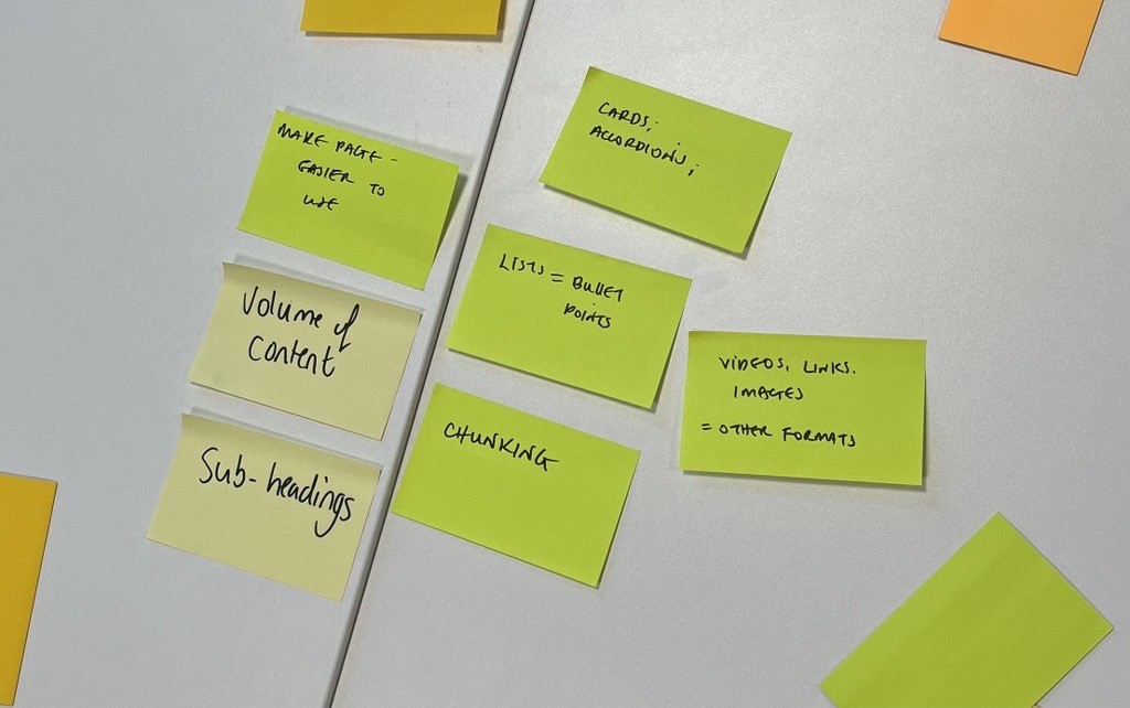
Sticky notes from group exercise with descriptions of issues relating to long pages.
Are long pages a problem?
Given the information-heavy nature of the University web estate, colleagues often have questions about the length of their web pages and how long is too long?
The answer to these questions is nearly always contextual. It very much depends on the information you are trying to convey and the reasons why users are consuming the content. Therefore, long pages aren’t always a bag thing – often it comes down to laying them out effectively to prevent information overwhelm.
Consider your users
During the session we discussed that long pages might be necessary if:
- you have a lot of detailed information to communicate on a topic, or
- the user needs to compare options or see a complete data set.
We did acknowledge, however, that for many task-orientated pages (for example instructions on applying for a student card or checking library opening times) shorter pages are more suitable, as often page length can affect users’ ability to complete their task timeously.
Techniques to improve the usability of a long page
In the session we considered different ways to make a long page more effective, such as:
- chunking text
- inserting headings
- using bullet points
- putting the ‘best bit first’
- linking out to other sources (for further detail)
- having a more focused topic
- removing unnecessary content and waffle
- breaking content into separate pages.
We also discussed some of the usability implications of page components such as accordions and the importance of questioning your assumptions by testing out new layouts with users.
What is an accordion?
An accordion is a content type which displays a stacked list of headings. When you click on a heading, it expands to show content associated with the heading. It can also be known as a concertina. Here’s an example:
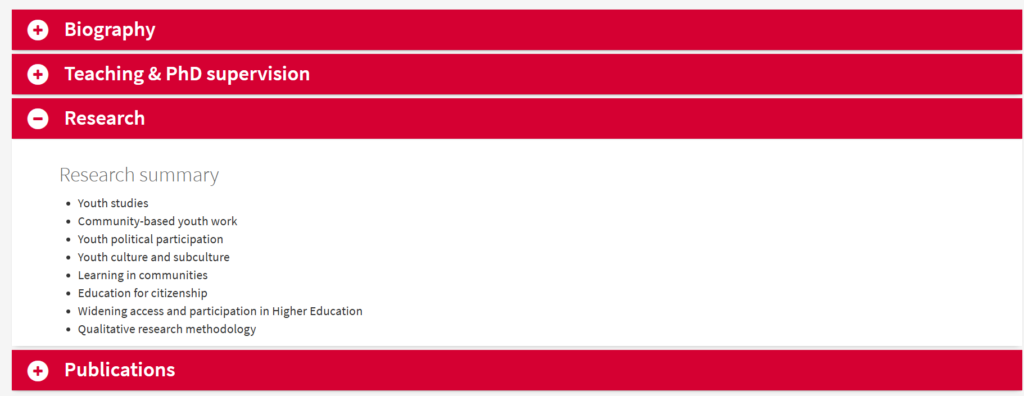
A screenshot of an accordion content type, taken from a staff profile page.
Accordions come with a cost for the user
Accordions make a page shorter, but they come with some trade-offs:
- There’s an interaction cost for the user. Revealing hidden content is usually more effort than scrolling.
- Users don’t always know the name of the thing they’re looking for. This means they have to open all of the accordions as they search for it on the page.
- A browser’s “Find” tool (accessed via CTRL+F) often doesn’t return content in closed accordions
- It’s often difficult to write a clear, succinct label for an accordion that effectively summarises what it contains.
When designing a page, we’d recommend starting with writing your content as simple headings and body text. Then only turn it into accordions if you think the trade-offs are going to be worth it.
Session activities
Together, we looked at seven pages that attendees brought along. Some were staff facing, and others were student facing.
Here are two examples that we looked at.
Human Resources
Human Resources: Planning your recruitment
For this page, we considered and discussed the following points to generate ideas for improving the page:
- What were the needs of the target user of the page: the University staff member about to initiate a hiring process. What would they be looking for?
- How much information was enough for the target user at this stage? For example, did they need detail of the different pieces of legislation, or would this be better covered in the training materials?
- How could the different sections of information be arranged in a sequence that aligned with the order the target user would seek to do things? For example, first they would need to make sure they had done the necessary training, then look at what they needed to do in the People and Money system, so it made sense to put the training section higher up the page.
- How could each section of information be labelled to support the target user scan-reading the page? An ‘Introduction’ label was ambiguous and could be replaced with instructive step-by-step labels like: ‘Before recruiting, check if you can cover the work with existing staff’ and ‘Familiarise yourself with our recruitment policies’.
Careers Service
Student-Led, Individually-Created Courses: Get your summer recognised
For this page, we discussed:
- The format of the table content – how easy was it for users to read? How did it look on a mobile? Are there more accessible ways to display the information?
- Position of buttons on the page – would having these at the bottom of the page mean users were less likely to follow the calls to action?
In the discussion, we talked about the purpose of the table and if there were other potential ways the information could be laid out. In this instance it was to show comparative information, so there were benefits to showing information adjacently in columns.
We suggested:
- looking at the page on a mobile to see how the table displayed and whether it was still easy to navigate in this format.
- considering whether key call to action buttons should be placed further up the page.
Takeaways
At the end of the hour, colleagues left with annotated pages that they could use to implement changes.
We asked attendees what they liked about the session and how we could improve it for next time. Comments included:
- [It was good to get] ideas from a variety of viewpoints re my web page (usually work on it solo – so nice to discuss).
- Helpful to review pages with other colleagues to get different perspectives.
- Interesting session, good to work with people from other parts of the university.
- Team, please keep offering these sessions, I personally find them very useful.
- Would be great to have more time (90 minute or two-hour sessions).
Useful blog posts about long pages
- Don’t be afraid of the big long page (blog post by Amy Hupe and Caroline Jarrett)
- Undergraduate beta programme pages showcase (blog post by Prospective Student Web Content Team) – reports on usability tests featuring long pages
How to hear about our next session
We’ll promote our next session via our mailing list. If you’re interested, please sign up:
Join the UX and Content Design mailing list (University login required)
Other training that we offer
More training is listed on the User Experience website: