Improving alt text at the University
When it comes to making digital products and services accessible, alt text – short for alternative text , or images as words – is a fundamental requirement. It can be tricky to get alt text right and this was a priority for the new Web Publishing Platform.
Why is alt text necessary?
Images and non-textual content are used extensively on websites and apps, but not everyone will view the images. For some, images may not load due to the internet connection they are using, others may be unable to see visual content due to blindness or low vision, and some people may consume digital content as audio, read to them by speech software. Alt text puts images into words so those that don’t see the images can still get their meaning. Alt text on images is a requirement of the Public Sector Bodies Website and Mobile Applications Accessibility Regulations 2018 – commonly known as WCAG 2.1 – therefore missing alt text can be picked up in an accessibility audit.
Guideline 1.1.1 of WCAG says ‘All non-text content that is presented to the user has a text alternative that serves the equivalent purpose’.
WCAG guideline 1.1.1 – Non-text content

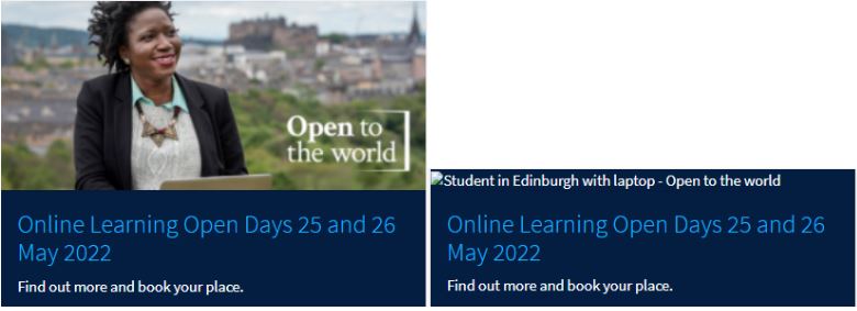
How a card from the University homepage appears with image versus alt text displayed. On the left the image is displayed. On the right the card is displayed with alt text instead of the image.
Why we made alt text a priority in the Web Publishing Platform project
Alt text impacts user experience and is important for accessibility compliance. We know writing alt text can be tricky. It can also be difficult to know how assistive software will handle it and present it to users. Standards like WCAG, and guidelines from organisations like Ability Net, WebAIM and Deque have helped improve our understanding of how to get alt text right.
Building a new Web Publishing Platform and a new Design System for the University presented the chance to review alt text across the University web estate. Applying our UXD process to ensure we worked in a user-centred way, it was important to understand the current state and choose areas of focus.
We wanted to make sure we retained existing alt text good practice and functionality and maximised any opportunity to improve things. More specifically, we wanted to ensure:
- People can add alt text to images in the first release of the new platform
- Sites in the new platform display and handle alt text in a way that supports people using assistive software and complies with WCAG guidance
- Guidance for University web publishers and editors writing alt text for images is as clear and as easy to apply as it possibly can be.
Adding alt text in the new platform
When you use EdWeb, you’re currently prompted to add default alt text to images as you add them to the asset store. When you add an image from the asset store to a page, you have the option to adopt the default text, or change it to reflect the context of use on the page.
Alt text is most accurate when it is written for context (more on this in the section below), so we’re planning for our new Drupal Gin Interface to handles alt text on images in a similar way. In the first iteration, default alt text is a required field, to minimise the risk of images being used with no alt text, which could fail accessibility requirements.

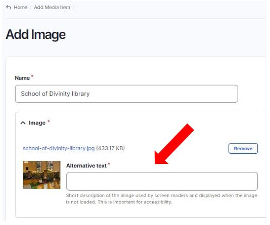
Field to add alt text in the ‘Add Image’ section of the new platform.
In the new platform, you’re prompted to add default alt text when you upload images to the media library – we have yet to add the functionality to change this when you add images into pages.
Alt text on linked images within cards or panels
One of the key considerations for the new platform was the way it handled alt text on images which were linked. These images typically exist along with linked text within components like cards or panels (sometime referred to as widgets). When an image is part of a card component, the linked text spells out the link destination and it’s important that the image isn’t separately linked to the destination, as this would mean there are adjacent identical links – which contradicts WCAG guidance.
To prevent this happening, a ‘stretched-link’ class can be applied, meaning that the card is treated as a single entity, linking to a single destination. Including normal descriptive alt text on the image means as well as the link destination, users not viewing the card can get an indication of what the image shows.
WCAG guidance technique – combining adjacent image and text links for the same resource
Updating alt text guidance
Accessibility auditing software such as Little Forest and Silktide will help identify where alt text is missing from images used on the University web estate, however, it does not check the quality or relevance of the alt text in the context it is used. It can be difficult to write concise alt text which accurately describes images in the context they are used. There is also a balance to be struck between conveying the meaning of images effectively while not confusing or overwhelming users.
Conversations with members of the web publishing community, and analysis of existing alt text usage indicated a need for guidance about alt text which was more specifically geared to typical scenarios of digital image use at the University, with examples of good and bad practice, and pointers and tips backed up by reasoning.
Help make our alt text guidance better
Taking on board feedback and needs of web publishers, and in a bid to help people write better alt text, I have drafted some new guidance on alt text, and am encouraging web publishers to read this and comment on it to make it better.
The updated guidance currently exists in the wiki (Confluence) with a view to possibly moving it into the new Design System. Please read the guidance and add comments and suggestions, either within the Confluence page or by emailing me directly.
Adding alt text to images – guidance v1 (University log in required)
Sources on alt text
Here are some of the sources I consulted to help draft the guidance:
W3C Web Accessibility Initiative – An alt Decision Tree
How to Design Great Alt Text: An Introduction (Deque)

