
Helping students find support online: How usability tests of the student health and wellbeing site led to content improvements
When the team behind the health and wellbeing website contacted the UX Service for help improving their student-facing content ahead of the new academic year, we were happy to oblige. Adopting a coaching approach, we guided them through usability testing to identify and prioritise content changes, to make it easier for students to find out about support.
The University student health and wellbeing site contains critical support content to help students while they learn with us. From this website, students can access important detail about how to engage with the services available to support their physical and mental health. Ahead of the start of semester one of the Academic Year 2025-2026, Essi Kauranen asked for UX support to make some improvements to the site, with a view to making it easier for students to find key pieces of content.
Getting a site map and checking analytics provided insights on site set-up and usage
Before thinking about how we could help the health and wellbeing team with specific improvements, it was important for the UX team to obtain some background knowledge of the health and wellbeing site, its content and its commonly viewed pages and sections. To learn about how the site was composed, we generated an XML site map and converted this to an Excel spreadsheet to provide a list of all the site URLs and page titles. This served as a useful way to visualise all the pages in the site, and to see the different topics covered by the pages. To gauge which pages received most interactions, we used a Looker studio dashboard to cover the period of a year which showed that:
- The homepage received the most webpage views
- The wellbeing services page and the student counselling pages received high numbers of website clicks and webpage views compare to other pages
- Pages about period products, mental health and crisis support were also well-visited
As well as helping the UX team to familiarise with the site, both of these datasets were useful to share with the health and wellbeing team, to give them a fresh perspective on their site and its content.
We established students’ main reasons for visiting the site, and used this to shape usability tasks
In a short call with Essi, who looks after the pages on the health and wellbeing site, we discussed how the site is currently used by students to access the support services available. The analytics figures on the most-visited pages were an indicator of the most sought-after content, however, insights from staff involved with promoting and delivering the support services gave a clearer steer on the associated demand and use of the services available. Logs of enquiries were another useful source of data to highlight which services students wanted and needed to access, and those they had difficulty accessing through the website (which in some cases had prompted them to send direct emails).
These discussions helped tease out typical circumstances which prompt students to access the health and wellbeing site, and the associated tasks they are looking to perform. Furthermore, it helped establish the site’s priority content – in other words the information within the site that was most important for students to be able to access easily.
The scenario-led tasks were as follows:
- You’re a current student at the University. It’s a Friday and you want to find out if the Health & Wellbeing Centre is open tomorrow. Where would you go to do this?
- You need to find a counsellor to speak to and you want to refer yourself. Can you find where/how you would do this?
- Imagine that you are just starting at the University and have just moved to Edinburgh. You want to find out how to register with a GP practice in case you fall ill. Where would you go?
- Can you identify where in the King’s Buildings you can find period products?
- You are struggling with your finances and you want to see how you can access support. Can you use this website to help you find this sort of information?
- You’re concerned about your flatmate, who has appeared sad and withdrawn lately. You want to find out how you can support them. Can you show me where’d you’d go on the site?
- You think someone in your course is being bullied and you want to let someone at the University to know about it. Ideally you would like to do this anonymously if possible. Can you identify where on the website you would go to do this?
- You feel your mental health is declining and you need to speak to someone urgently about your wellbeing. It’s late Tuesday evening. Can you identify where you could find someone to talk to?
Using a template, we worked together to prepare a usability script to use in tests
With tasks and associated scenarios confirmed, this information could be used to draft a usability script. A usability script is an important tool for conducting usability tests to help ensure that test facilitators follow a protocol that both keeps participants informed and gathers useful data. When watching people interact with technology (as the role of a usability test facilitator requires) it can be easy to forget to explain the test set-up, react to participants’ actions, become distracted or veer in various directions, therefore having a script helps to keep on track, and also helps to provide the facilitator with a level of control to counter feelings of nervousness about conducting the tests.
The UX Service supplied a template script which was adapted to fit the scenario and the tasks. Considering the sensitive nature of some of the tasks, we also added in scripted sentences to advise participants about these tasks in advance, to give them the option to skip them if they wished.
We coached the health and wellbeing team in usability testing
In preparation for running the tests, Essi the communications manager behind the health and wellbeing website, set about recruiting participants to represent the student audience of the site. Essi was also keen to run the tests herself with support from the UX team, so we arranged a practice run of the test, using the prepared script and with a willing participant. This enabled final tweaks to be made to the script and the tasks before the usability tests with real participants took place.
The test results prompted content improvements to the site
Responding to what was observed in the tests, several changes were made to the health and wellbeing site, focused on making it easier for students to find support content.
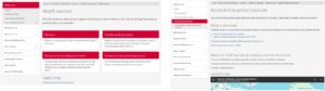
The opening hours of the Health & Wellbeing Centre were made clearer
In response to the results from task 1, some small tweaks were made to the layout of the content on the page about the Health & Wellbeing Centre. In particular it was changed to include three lines outlining the opening times of the wellbeing area of the centre and the Bristo Square Pharmacy.
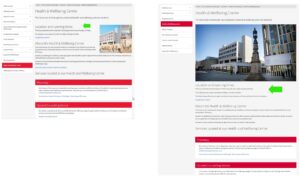
Screenshot on the left shows content about the opening times of the Health & Wellbeing Centre before usability testing, screenshot on the right shows the improved content
The number of steps to reach the student counselling service was reduced
The results of task 2 highlighted that there was a need to click through an interim page about the Student Counselling Service before reaching the self-referral form (on a card on the Student Counselling site homepage). Following the tests, this page was removed, making the journey from the health and wellbeing homepage to the Student Counselling site shorter.
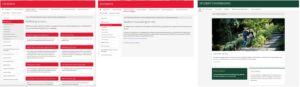
Screenshots showing the pathway of pages to navigate to the Student Counselling site before the usability tests
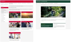
Screenshots showing the pathway of pages to navigate to the Student Counselling site after the usability testing
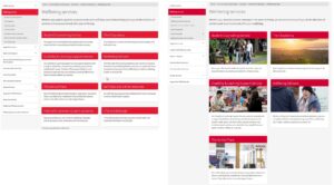
Surplus content was removed from the period products pages
Finding out about the locations of period products in task 4 was impacted by the content on the Health services and Access to free period products pages. As a result of the testing, changes were made to make the key information about where to find the products more prominent by removing content which distracted from the main purposes of these pages.
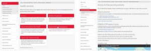
Screenshots showing the content relating to period products before the usability tests
Screenshots showing the content relating to period products tweaked after the usability tests
Content about wellbeing services was streamlined
Following the results of task 5, the content on the wellbeing services page was reviewed and content that did not support students finding information about these services was removed, and several design changes were made to the page.
Screenshot on the left shows the design of the wellbeing services page before the usability tests, and on the left, the streamlined wellbeing services page
A small amount of usability testing goes a long way to improve website content
Often when teams across the University contact the UX Service for help, they have reservations about the time commitment and the effort required to guide user-centred content changes. In this piece of work with Essi from the health and wellbeing team we demonstrated a high return-on-investment for the UX work. In other words, for a relatively low outlay of effort and time spent planning, running and analysing the results of usability tests, content was markedly improved to suit the expectations and mental models of students using the site to access important support content.
If you would like help improving your website content for your audiences, feel free to contact the University UX Service.