Frontend United 2019
We were in Utrecht to attend the conference Frontend United 2019. This is a non-profit, developer-first, community-focused conference. Its aim is to connect frontend developers and designers from all kinds of backgrounds closer together to share knowledge, experiences and ideas.
Conference details
Location: Utrecht, The Netherlands
Attended by: Joanne Gordon and Aileen Robertson
Highlights from the Frontend United conference
Day 1
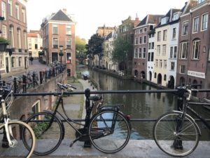
Utrecht is an amazing city. We were struck by the beautiful architecture, canals, cleanliness, and the bicycle traffic jams!
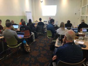
We started with a full day workshop titled ‘Next Steps with CSS Layout’. It was run by CSS working group member, Rachel Andrew.
It was held in a venue called ‘De Witte Vosch,’ or The White Fox. We were glad we arrived early as by the time everyone else had arrived, there was standing room only!
The workshop was focused around creating layouts using grid, flexbox and multi column displays. We discussed compatibility across browsers, and mapping layout from the top, right, bottom and left of the physical screen – to using logical properties and values.
It was a fascinating day and we could see real potential to use these new CSS techniques to achieve some of the layouts that we require for our clients’ websites.
Day 2
Going offline – Keynote speech
Jeremy Keith
Web Developer, Clearleft
Day 2 marked the start of the conference itself, and Jeremy Keith kicked things off.
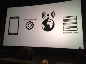
The main take away from Jeremy Keith’s keynote speech was the possibility of creating websites that are available offline. This is achieved by installing a service worker which sits between your device and the network and instructs your cache to store the page that you have previously viewed. It is particularly useful for static websites, such as online books. Jeremy also demonstrated how content, including audio files, could be saved to your cache to be recalled later.
I don’t care what Airbnb is doing (and neither should you)
Stephen Hay
Creative Director, Rabobank
This talk was intriguingly entitled, ‘I don’t care what Airbnb is doing (and neither should you)’ by designer Stephen Hay. The main premise of this session was that we can often be tempted to rely on conventions because they will often give us an acceptable solution with minimum effort. However, the solution to this problem might not fit the solution to your particular problem.
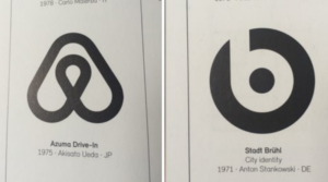
Do these look familiar?
“Trying to be different by imitating ‘different’ won’t make you different. Nothing exciting happens in the comfort zone.”
By this, Stephen was illustrating that if we all copy the company/person who is different, it becomes a trend and we all end up with the same product.
“Stop focusing on the solution, and start focusing on the problem.”
How to design and award-winning website
Peter Van Grieken, Inclusive design consultant, Frozen Rockets
Luc Princen, Freelance developer & designer
Take aways:
- We should not work in silos.
- Accessibility should inform the design.
Peter Van Grieken and Luc Princen showcased their award-winning website for KIT.
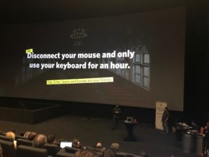
They spoke about the design process from gathering data to wireframes, simple prototypes, design and development. But, they also designed their website with accessibility in mind at every stage of this process, and stated that accessibility should inform the design. They suggested we should all spend ½ hour testing out our websites without a mouse and using keyboard navigation.
An interesting concept in the initial stages of a project was to conduct a ‘pre-mortem’. This involves gathering your team and going through any reasons why this project might go wrong in the future.
They spoke about working in silos. Not all decisions are made in a siloed design phase, and in fact there will always be things that are missed and design decisions will need to be made in code.
How to design an award-winning website
Day 3
Grids all the way down
Rachel Andrew
Web Developer, Perch, W3C
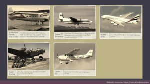
Following on from our workshop on day 1, Rachel talked about Flexbox and Grid. She suggests that you can use either method to suit your needs by looking at the patterns you might require.
Flexbox is good for laying out items in a sensible way and will expand to fill the available space. Grid is good for structure control where you might have fixed widths.

Layout with Flexbox
Layout with grid
Not all browsers have compatibility right now, but If you’re building something now, it is fine to use whatever is available and look at fall backs. It’s perfectly possible to create good fall backs so that your patterns look good on old browsers, but new browsers can take advantage of this new technology.
You can nest grids inside a grid that inherit the parent properties using Subgrid. This is only available on Firefox Nightly behind a flag right now, but we can play about with it and perhaps identify case uses for the near future.
Creating a design system that people actually use
Rebecca Hill
Software engineer, WeTransfer
Rebecca suggested that you need one or more designers, developers and a business person, in order to create a useful style guide. You need buy in from the people that will use it and time and passion to make the design system work. Start the education process early to get people to commit to it completely.
Clear documentation is very important and it is a really good idea to prefix all classes and consider naming conventions that are part of the system. The process of building a design system is ongoing and iterative, and the process of maintenance and updating might be passed to the customer or different developers, so this ensures that you can always identify the original components.
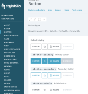
Make available examples of CSS code to copy and paste.
Style Guide WeTransfer file download
Designing for deaf people, for everyone actually
Marie van Driessche
Interaction Designer, VPRO
Marie is deaf and uses sign language as her first language. Marie gave an in-depth introduction about what it is to be deaf and to be part of the Deaf community. This was so interesting and inspiring.
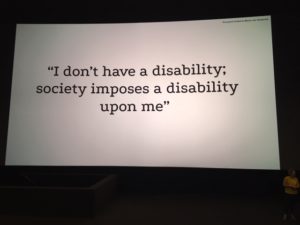
It was enlightening to hear that sign language is regarded as their first language and it doesn’t exist in written form. We often consider the needs of users’ visual impairments, but actually there is a significant portion of users who struggle with reading for many reasons.
85% of the videos on Facebook are viewed without sound and with subtitles. So, actually a large proportion of people are using this feature with or without hearing impairments.
For example, something to consider is mandatory fields on web forms that are of no use such as ‘telephone number’. It would be useful instead to provide an option to choose your preferred method of contact including a comment field to explain why a user does not want to be called.
Top tips:
Reading = effort
- Improve readability for everyone.
- Use headings and subheadings
- Make one point per paragraph
- Use short sentences: seven to ten words per line
- Use bulleted lists
- Use easily accessible language
- Avoid unnecessary jargon or slang
- Use images, diagrams or icons or translate
- Chunk your content
- Use white space
- Glossary for specialised vocabulary.
Goodbye Utrecht
We found this conference both informative and inspiring from a technical and holistic point of view. We learned some new CSS techniques that we’re sure will prove invaluable, web design and development processes, and gained fascinating insights into design for accessibility.


