
Five quick wins to improve your content: What we covered at February’s Content Improvement Club
In our February session of Content Improvement Club, publishers from across the University met up and worked together on pages from their sites. In this session, we focused on five simple things that we can all do when checking over our content.
About the session
Content Improvement Club is our monthly meet-up for web publishers. In February, publishers brought along a page from one of their sites and worked on it in collaboration with colleagues from other parts of the University. In the session, we used a checklist to cover five things that are useful to look at when working on a piece of content.
Five things on the checklist
This is what was on the checklist:
- Check how it displays on a mobile
- Make it easy to scan
- Check the links
- Use images effectively
- Keep it up to date
1. Check how it displays on a mobile
Most publishing work happens on desktops or laptops, so it’s natural that we focus on how our sites display on larger screens. However, it’s always worth checking how your site displays on a mobile.
One way to check this is using the developer tools in your browser:
Google Chrome: Simulate mobile devices with device mode
Microsoft Edge: Emulate mobile devices
In the session, we loaded our pages in mobile view and checked how they were displaying. In most cases, the content management system took care of everything.
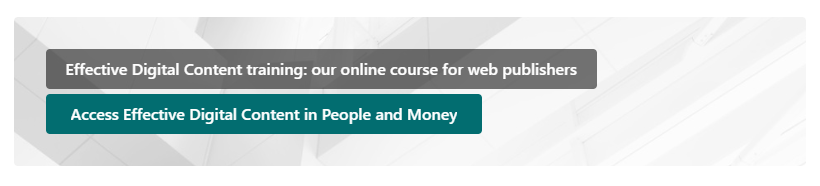
One thing that took us by surprise was SharePoint cutting link text short in a call to action web part. Here’s how that looks in desktop – the green bit is a clickable button:
But here’s how that same button looks on mobile:
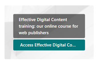
So this is something worth considering if you use a call to action in SharePoint.
2. Make it easy to scan
Most web users aren’t reading every word. Instead, they skim through content to get the gist of it, and scan through it to find a particular bit of information. We can make our sites easier to use by designing the content for this behaviour.
In this session, we looked at three ways to do this.
First, chunk it up. Look for large blocks of paragraph text and see if you can break them into smaller paragraphs.
Second, use headings to signal to users what each section of the page is about.
Third, use bullet points to make lists of items easier to read.
Guidance on headings and lists in the editorial style guide
Because the session was about quick wins, we just did these three checks and moved on. But if you have more time, there are other things you can do to make content easier to scan:
- Cut excess content – anything irrelevant, waffly or out of date.
- Write in plain language.
- Put the best bit first.
See our write-up from a previous Content Improvement Club for more on this:
Editing that works – what we covered in our September Content Improvement Club session
3. Check the links
In our content, we’re aiming for meaningful link text that helps users predict what will happen when they follow the link. To work with assistive technology, the link text needs to make sense on its own.
Common errors include:
- using a web address as link text, like ‘https://www.ed.ac.uk’
- using vague link text, like ‘click here’
At the University, we usually add links just below the relevant paragraph, putting the link on its own line.
Guidance on links in the editorial style guide
In the session, we checked through the links on the pages we’d brought along.
There was some discussion about situations where putting links on a new line doesn’t work so well. For example, one attendee shared a page that consisted of a long list of academic references. In this instance, it seemed like keeping the links in-line made more sense than repeating each one below the references.
We also talked about why we follow the practice of putting links on a new line at the University. It’s been in our guidance for a long time – the earliest reference I’ve seen is in a PDF from 2010 called the ‘Polopoly Elements Guidance’. Polopoly was the central content management system at the University before EdWeb.
The main reasons we put links on their own line are:
- It makes links easier to find – inline links can become buried within a paragraph of text.
- It makes it easier to write link text that makes sense on its own – this helps us to write accessible, usable link text.
4. Use images effectively
Images play an important role in communicating with our audiences. But sometimes we add images to a page when they don’t serve much of a purpose.
In the session, we considered what role our images were playing and whether they were necessary for the page to do its job.
We also discussed the sustainability benefits of reducing the number of images on our web estate. Images add to the weight of a page, increasing the amount of data being transferred when users load the page.
Finally, we checked whether any images on our pages had been uploaded with appropriate alt text.
5. Keep it up to date
We gave our pages a quick check for any information that was out of date. We also looked for information that was likely to go out of date.
In groups, we discussed the various strategies we use across the University to maintain the accuracy of our content.
Some strategies that attendees mentioned were:
- setting calendar reminders to check in on certain pages
- keeping in touch with colleagues in Human Resources to ensure that staff listing pages are up to date
Our next Content Improvement Club
In our next session, the topic we’re covering is:
Using headings and links to make your content more accessible
The session will cover some of the topics discussed here, but with more of a focus on accessibility considerations.
Date: Tuesday 24 March 2026
Time: 2pm to 3pm
Place: Online only (Microsoft Teams)
Content Improvement Club: 24 March session
How to hear about future sessions
We promote these sessions via our mailing list. If you’re interested, please sign up:
Join the UX and Content Design mailing list (University login required)
Suggest a topic for a future session
We’re keen to continue covering topics that colleagues across the University would find useful. It would be really helpful if you could let us know any ideas you have using this form:
Suggest a topic for Content Improvement Club (University login required)
Other training that we offer
More training is listed on the User Experience Service website:
Training | User Experience Service