Evolving the mobile website experience – what we learned in recent user research
During March we undertook some user research with University staff and students to look at how they interact with the new website design on small screen mobile devices. I presented our findings and what we’re going to do with them at last week’s Web Publishing Community session.
I’m not going to go into the detail of what we found out in this post as that’s available in the slides I presented. Rather, I want to focus on the benefit of undertaking this testing because I feel the experience saved us development time and helped us focus our attentions for future design and experience work.
Download my presentation from the web publishers community wiki (EASE login required)
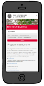
To briefly summarise though, we were looking at the navigational and orientation experience on a small screen, and whether design elements could be refined or removed to bring page content more to the fore. We used a real website and participants undertook representative tasks. We implemented some refinements to the design (reducing banner space, reorganising the University crest and logo area, hiding the search box behind an icon and relocating the subsite navigation panel) and then parallel tested 3 versions where we relocated and/or removed the breadcrumb trail and the big ‘call to action’ contact us button.
The key thing that we uncovered was that while we’re not 100% happy with the presentation on mobile devices right now, actually what we have performs better than the design alternatives we proposed.
So while we have been able to introduce some nice refinements to the design (and they’ll be live before the end of May) the more fundamental “Can we safely demote or remove some elements?” question is for the moment, “No.”
We recognise that the collapsed navigation menu for mobile devices needs to work harder and will continue to focus design attention in this area, but for now all that we can say is that the route we’d taken was not the right one.
On the plus side though, undertaking a day of research and engagement with end users has:
- Highlighted a lot of positive elements to the way navigation works – it’s not bad, we’re just not as ‘content-first’ in our presentation as we’d like to be
- Gathered some really great responses in general about the perception of the new design on small screens
- Saved us development expense and enabled us to focus that developer time in other areas.
And I think that last point is so important. Three web professionals worked together on design enhancements and all felt that what we’d done was good and an improvement. We could have quite easily progressed on that basis, and let’s face it – that’s how most development decisions are typically taken. Spend limited time and resource and not actually be assured that we’re making things better.
Instead we’ve essentially improved the experience by not changing some things, and along the way learned more about how staff and students interact on mobiles which can inform future work both on the website development project and elsewhere.


