EdWeb deployment update February 2016
The next in our regular schedule of updates and improvements to EdWeb will take place on Monday 15 February. This deployment mainly focuses on improvements to homepages, though does also include some updates to the look and feel of the editing interface.
During this development cycle, we’ve been working together with Communications and Marketing to deliver some of the key features they require to make the University Homepage work when it is delivered in EdWeb.
New features
- Dynamic homepage panels – a new panel type designed so that you can set up a feed of links to pages in a section of your site. A typical use case would be so that news or event pages have links that dynamically appear on the homepage.
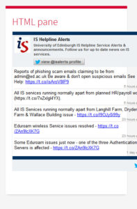
- HTML homepage panels – a new panel type that allows you to add HTML assets onto the homepage. This will allow for a wide flexibility of introducing third-party (that is, non-EdWeb) content onto the homepage. This flexibility does require care to be taken; for example, the responsive design can lead to display issues if your code is not implemented correctly.
- Homepage panel styling – it will now be possible to style homepage panels to reflect their priority on the page.
Style updates
Along with these designed improvements, we will also be updating the styling of the editing interface within EdWeb. This will bring it in line with current standards, and also align us with future developments in Drupal and Bootstrap (the design of the site).
EdGEL (Edinburgh Global Experience Language) design foundations
In addition, we are altering the colour contrast on links in EdWeb so that we adhere to accessibility standards.
The primary noticeable changes are positive, though we are aware of the impact that any change to the editing styling causes for website editors – and particularly editors just starting out in EdWeb.
- The admin bar area formerly labelled “Menu” will become “Manage”. This does not change the use of the button in any way.
- “Flat buttons”: the buttons in the interface (for instance, in the grey bar) are no longer shaded/rounded, but are now ‘flat’ – which I hope people will agree look a little sharper.
- Styling on ‘field groups’ – for example, the expandable fields that contain the branding elements on the homepage. These will now contain a small symbol to make it clearer that these can be clicked and expanded.
Along with these changes, we will also be deploying small (‘standard’) changes to the ‘modules’ that comprise EdWeb. These are detailed in full on the EdWeb Change Advisory Board (CAB) pages, and are mainly of use to technical users, or those who run EdWeb distributions.
Guidance for these new features will be added to our support wiki in the coming days.


