Campus maps update
In March 2016, the University Website Programme was approached by Communications and Marketing for help bringing the interactive campus maps application into EdWeb.
I was given the responsibility to enhance the existing application, and suggest additional functionality that I felt would benefit the end user. At a high level, the update set out to achieve the following:
- Full support for EdWeb, using EdGel elements
- Enhance the mobile experience
- Make finding buildings easier
Full support for EdWeb
After a day of testing, I was able to figure out a way to make the new application work within the restrictive EdWeb web application content type. This removed the need for less desirable implementation methods like iframes or URL masks.
The new interface was constructed using EdGel elements (which is based on the popular CSS and JavaScript framework BootStrap), and proposing new styles for currently non-EdGel elements. Two such areas were the area tabs and the point of interest toggles.

Custom designed EdGel elements showing the tabs and toggles.
A note on tabs…
In my update to the search results interface, I discussed the new mobile tabs in some detail. The team received some feedback about the usage of the site search function in the new interface. The team carries out extensive Google Analytics events tracking on the search interface, and we could see that the usage had dropped by a dramatic 80% since the new interface was put live. I suspect that there is a design issue with the tabs currently implemented in search, and I plan to revisit them in the near future.
Enhancing the mobile experience
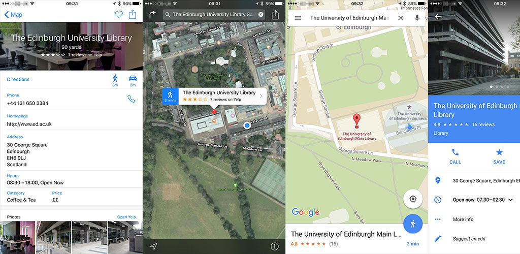
Maps on mobile devices is quite different to how it is delivered on a desktop or tablet. I have a lot less screen area to play with, and I still need space to allow the user to interact with the application easily. I looked at native applications to see how they dealt with the problem.
 Inspiration for the new campus maps mobile view from native iOS applications.
The two applications (Apple Maps and Google Maps) expose minimal point of interest information when a marker is selected, instead hiding it in a different interface. This is in contrast to the desktop applications, which can show point of interest information inside a floating window. As the information from the campus maps application is not as detailed (just a building title, address and sharable link), I was able to figure out a middle ground.
The new mobile interface
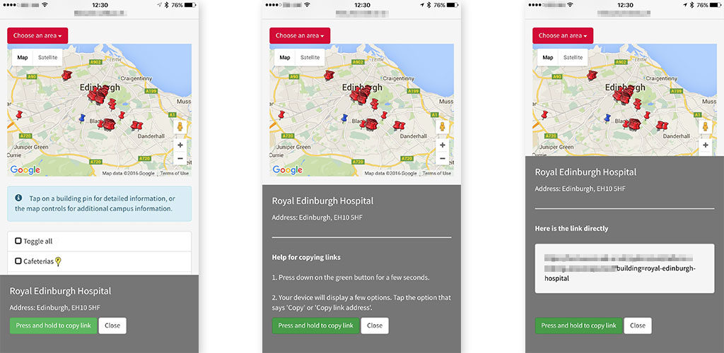
When a user taps a marker, a small interface slides in from the bottom of the screen.
 The new campus maps mobile UI.
The left-most image shows the interface a user sees when they tap on a marker. The maps interface is completely unobstructed, allowing them to continue interacting without having to close anything on-screen. This interface scales well from small devices like the iPhone 4s, up to the larger “phablet” devices like the iPhone 6 Plus.
Making interactions better
I took steps to minimise the pain of copying links to buildings on the application. Instead of just presenting a text field, I instead use a HTML button with a link, and prompt the user to press and hold to copy the link. A brief round of user testing showed that users understood how it worked, but for users that didn’t understand it, I took some steps to help them out:
- Two taps (not holding) brings up additional instructions that will try to help further.
- A further two taps displays the raw link text, in the hope the user can copy it in a way that’s normal to them.
- The counter is reset each time the close button is tapped, or when the user selects another marker.
Why not use JavaScript or Flash to copy the text to the clipboard?
Unfortunately, a lot of browsers (particularly on mobile devices) do not allow direct clipboard access via JavaScript. Adobe Flash can often do this for us, but it’s not possible to run Flash on a lot of modern mobile devices, including Android, iOS and Windows Phone.
Finding buildings
In the previous system, the buildings were listed in a large table in alphabetical order. I wanted to minimise users scrolling around the page (it’s time consuming, and frustrating on smaller displays), so I took the same system I used in the search results page for filtering phone and email results.
The system allows for a user to search for a building if they know the name (or part of a name), and the results appear in a filtered list below the input box. In the case where a user doesn’t want to search, they can jump to the building by using the A-Z controls.
Future work and wrap up
I hope to work again with Communications and Marketing in the future to maybe make additional updates to the application. If you would like to leave feedback on the campus maps application, please comment below, or use the feedback form to send a message to Communications and Marketing directly.
Working on campus maps was a great experience for me on a personal level, and I had more exposure to how the projects are implemented within the University.

