Better content, fewer support calls: improving the card process for new students
As part of our collaboration with IS Helpline, we worked to improve the web content on getting your first student card – and saw the support calls on this topic nearly halved.
Our collaboration with IS Helpline has looked to continuously improve IT help provision at the University in an effort to facilitate self-service by users. Our latest endeavour has focused on the student card process.
Read previous blog posts on the IS Helpline-UX collaboration
The card process at Edinburgh
Getting a University card is one of the most important tasks for new students – it’s what allows them to borrow books at the Library, access buildings and take advantage of student discounts.
It’s also a process that can cause a lot of overhead for the Card Services team who coordinate this – specifically, in cases where students don’t submit photos that comply with guidelines. In these instances, Card Services staff have to get in touch with each of these students to ask for a new photo.
The most common submission problem is when students send photos that don’t have a head-and-shoulders crop, a white background or are the wrong size. The Card Services team create thousands of cards each summer, so dealing with photo submissions that don’t comply with these guidelines can add a lot of extra work.
Earlier this year, we had worked with Card Services looking at student experiences with and attitudes towards personal versus ID photos, and how these perceptions influence the photos they submit for their card.
Card Services student research into photos
This summer we focused on enhancing the card pages to make sure students could easily understand the card process.
Initial testing
We first conducted an initial round of usability testing with students to assess the state of the content. We based task success on whether a student understood:
- where to upload their photo (the UoE portal, MyEd)
- what the photo should look like (passport-style)
- where to pick up their card (at the Library)
Testing these 3 tasks with 3 student interns (for a total of 9 tasks), there were 4 task successes and 5 task failures. Watching the students interact with the content confirmed what we already could tell about it, namely that is was:
- overly long and wordy
- lacking a clear structure
- not emphasising key calls to action

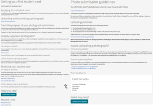
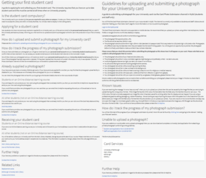
The card pages in 2017 (and the pages we tested on). We had done some initial edits on these pages last summer.
For example, the first link on the original Getting your first student card page was called ‘Photo submission guidelines’, which took you a page that listed the guidelines and where to upload your photo to. However, you had go back to the original page to find out how to collect your card, but this action was not mentioned on the submission guidelines page.
Reworking the content
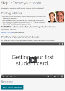
To address these issues, my colleague Gavin from the IS Helpline and I worked to turn the content into a series of step-by-step pages.
The card process pages are now divided into three steps:
- Create your photo
- Submit your photo
- Receiving your card
At the end of each page is a call to action button leading you to the next step. Our colleague at Card Services also created a video of the process
The results
Usability testing task success: Re-doing the same testing with 3 different students resulted in 8 task successes and 1 task failure – a massive improvement from the previous testing.
Support requests halved: The number of support calls related to card also reflect this improvement – from July to September 2017, the IS Helpline received 433 card calls. In 2018, they received 224, so the figure is nearly halved. Halved. (I just wanted to reiterate that. It’s pretty impressive.)
20% increase in early card production: The Card Services team were also able to pre-make more cards before start of term this year, which can be done when students send in photos that comply with guidelines in time. This year, the team pre-made 12,842 cards, up from 10,687 in 2017.
The power of effective content
All the changes we made in this project were to the content – we didn’t make any technical enhancements to the CMS to get these results.
No fancy gimmickry or technical work can fix any problem if the content isn’t already in good shape. Put simply, you get results when you create user-focused content that’s clear and concise.
Lauren gets great results by helping you understand your users’ needs and then crafting quality content they can easily engage with.
Neil Allison, User Experience Manager
Talk to us
If your department could benefit from a similar process of reworking your content and getting a grip of your website, get in touch.
Learn about your free website support service options
Read more
Read previous blog posts on the IS Helpline-UX collaboration
How to get a grip of your website (and then keep hold) – read Neil’s blog post


1 replies to “Better content, fewer support calls: improving the card process for new students”