Accessible polling cards: Keeping it low-tech
Card voting based on colours, text and shapes are an accessible way to do quick polling in small groups.
There can be a myth that if you work in digital, everything must be digital. Get the latest app or high-tech solution for your problems.
And don’t get me wrong, there are loads of people at the University working hard on these solutions.
However, I admit defeat at using interactive polling (I’ve tried both TopHat and Poll Everywhere) for the Effective Digital Content training, and I’ve gone back to the luddite approach.
It was at a workshop run by Rolf Molich (who developed the CPUX qualification) that I first saw the simple polling technique of holding up a coloured card to openly vote in a quiz or survey.
CPUX: User Experience certification
It’s a great, straightforward technique. Looking round the room, it’s easy to see what the consensus is or where opinion divides. I decided it was much easier than fiddling with logins, limits on responses, and errors that took time to fix.
Colour blindness
It’s a great technique… unless you don’t see colour well. Someone with dichromacy might not be able to tell the difference between a red and green card; or a green and yellow.
So when I decided to use the cards approach, I firstly made sure I got the most contrasting four out of the card colours available in the Playful Engagement trolley.
What is Playful engagement? – Blog site
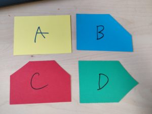
Secondly, I also wrote a letter on each card corresponding to answers A, B, C, and D (A and C, the two most contrasting colours, also have T and F one the back for basic true/false polling).
Other visual impairments
But what if someone’s vision impairment means they struggle to see both the letters and the colours?
The last thing I did to the card set was to snip corners away to make them into different shapes:
- ‘A/T’ (yellow) has no corners missing
- ‘B’ (blue) has the top right corner missing
- ‘C/F’ (red) has the top two corners missing
- ‘D’ (green) has the leftmost two corners missing

In my first experiments, I’d cut away the bottom left corner for one of them, but it occurred to me that that’s the corner most people would hold it up by, making it harder to see. So I kept the changes top and right.
I’ll be trying out the cards at Effective Digital Content this afternoon, and they’ll be available for our team to use at workshops.


Great approach. So simple, yet so much in there.
Thanks Karen! It seemed to work pretty well at the first session – although of course you never really know when it’s going to come in most useful because you can’t know what people’s accessbility needs are. I’ll come back with any updates!