
How usability testing guided user-centred improvements of the Digital Collections Platform
The University holds a vast collection of digitised artefacts including images, manuscripts and artworks, accessed through a central digital collections platform. The Digital Collections team asked for UX support with a project to redesign the platform front-end, to help ensure it served needs and expectations of platform users.
Following a piece of work to develop an instance of Archipelago (an open-source digital objects repository based on Drupal) to host the University’s digital collections assets, and a separate initiative to migrate the assets from a former platform, (LUNA), a project (LUC080) was launched to design the front-end of the resulting digital collections platform.
Access details of the LUC080 project on the projects website
Before project LUC080 began, the team had gathered ideas for the look-and-feel of the platform and had established the main requirements and tasks it was needed to support, however, they were interested in adopting a UX lens to critique it.
In particular, it was important to ensure the platform front-end was designed to support key use cases and anticipated user groups. The Digital Collections team had identified students, academics and library staff as user groups of the platform, and therefore, the team were keen to usability test an iteration of the platform with representative participants from each of these groups to see how well the platform supported them finding and accessing items in the collections.
We started by setting usability testing goals
After an introductory meeting between the UX Service and the Digital Collections team, we established the purposes of the testing:
- To learn how students, academics and library staff naturally interact with the digital collections platform
- To discover any problems with tasks the platform needs to support (to be fixed in development prior to launch)
- To identify any missing functionality or features the platform needs to support
Establishing these goals from the start helped guide the test design and, in the process confirmed the technical requirements for testing in an early version of the platform.
Together, we came up with tasks to shape a test script
Crucial to any usability test is the tasks that the participant will be asked to complete. Deciding which tasks to include in a usability test sounds deceptively simple, but it can often be tricky to get right. Teams closely involved in a platform technical development with full knowledge of all the available functionality may struggle to take an objective stance on the most important tasks from the audience perspective. The UX Service were well-placed to help the Digital Collections team tease out the priority tasks to be tested, and these 10 tasks formed the basis of the usability script.
The first task was a familiarisation task
In the book ‘Don’t make me think’ by Steve Krug (found on all good UX bookshelves), the author provides a template for a usability script which begins with a task where the participant is shown a screen (for example a homepage) and asked to talk about it, to say what they think they can do there, and speak about what it is for. Starting usability tests with this type of task is very helpful to familiarise the participant with the artefact they will be interacting with and also to settle them into the practice of speaking aloud. In addition, it produces very valuable insights into the first impressions provided by the digital product. For these reasons, the first task of the Digital Collections platform test required participants to look at the different parts of the homescreen, to talk about what these were for and how they could be used.
The next tasks formed part of a scenario for participants to follow
Engaging participants in usability testing is made smoother if the tasks follow a narrative they can get on board with. In the case of the Digital Collections platform, participants were asked to imagine being in a scenario where they were interested in finding items from the digital collections for use in their work. In support of this, tasks after the familiarisation task were focused around finding items in the collections, discovering more about them, viewing them and making use of them. To ensure the tasks flowed well, it was important to use open phrasing, to make the scenario more authentic and therefore encourage participants to play along with it.
Specific tasks were as follows (worded as they were in the script) and with the task purpose following in square brackets:
- You’re looking for an item in the collections containing French lute music. Please show me how you would go about doing this? [testing ease of use of basic search]
- You have some details about another item you are looking for – it mentions Professor Buckland and the city of Exeter but that’s all the information you have. How would you go about looking into this? [testing ease of use of advanced search]
- You want to see more items connected to Professor Buckland but not restricted to Exeter. How would you do this? [testing intuitiveness of advanced search features]
- From the items you have found, you want to download metadata from the Notebook 260 and also page 7 and page 129 – how would you do this? [testing ease of use of downloading functionality]
- You want to share page 129 with a colleague – how would you achieve this? [testing expectations for sharing]
- You want to compare a map on page 124 of Notebook 260 with one on page 83 side-by-side – how would you do this? [testing ease of use of one of the functions of the IIIF viewer]
- From the other Notebooks that are available, you want to see one that is within the University Archives and Manuscripts Collection from 1854 about volcanoes. Following that you want to find one on the subject of insects from 1829 [testing operation of the facets]
- One of the items you can see is called the Royal Letter Book. You want to check the description of this item in the catalogue description in Archives Online and compare it to what you can see in the platform record – how would you do this? [testing ease of linking to the catalogue and expectations about information in each catalogue entry]
- Within the Royal Letter Book, you want to get a closer look at some of the images. How would you see the images more closely, move from one to the next, and display them alongside each other – how would you achieve this? [testing ease of use of IIIF viewer to handle images]
- From the Royal Letter Book, if you wanted to ask a question or seek assistance from someone at the University, what would you do [testing whether the ‘contact us’ button was selected to meet this need].
Ahead of running the tests, we established the actions and the destinations that would signal the completion of each task by the participants. It was also helpful to have in mind the anticipated route to complete each task so that this could be compared with the steps participants actually took during the tests.
We coached the Digital Collections platform team to do their own usability testing
The ideal set up to run a usability test includes one person to facilitate and run the test, and another to observe what happens and take notes. The UX Service has helped several University teams with usability testing of their systems and platforms and we always encourage teams to have a go at carrying out the tests themselves.
Being able to run usability tests is a valuable skill
The UX Service coach teams to do their own usability tests for several reasons. Firstly, we recognise that there is nothing quite like watching someone use your own product, system and service – it is a very rich learning experience where it is possible to see first-hand what works and what needs to be fixed. Secondly, the UX team like to share our craft, it gives us a buzz to empower others to adopt our approaches and techniques. Finally, we recognise that the more people that know how to do usability tests, the more testing can occur, with all its associated benefits.
A dry run test gave the Digital Collections team chance to practice
We were pleased when the Digital Collections team were enthusiastic about learning how to run their own usability tests. To help them build confidence with the technique, we arranged a practice run, to check that the platform to test with worked as expected, and to try out how well the usability test script flowed. One of the Digital Collections team adopted the role of facilitator, running the test, another adopted the role of observer, and the UX Service provided the participant (a colleague who was unfamiliar with the platform being tested). The dry run highlighted some tasks and some aspects of the testing script to be tweaked, but on the whole showed that the test design worked well.
Testing with 14 participants provided ample data to analyse
The Digital Collections team sought representative participants for their usability tests and a total of 14 agreed to take part, comprising 5 students, 5 staff and 4 academics. The team completed 14 usability tests, which meant they were able to observe each of the 10 tasks being completed 14 times. This generated a lot of valuable data. Analysis began by examining the test results, firstly to tease out common issues shared by all participants and secondly to identify which tasks had proved easy to complete and which had been more difficult.
A spreadsheet logging the frequency of common issues across the 10 tasks helped the analysis
The Digital Collections team prepared a spreadsheet with the task in the first column, details of common issues in the second, and the frequency in the third. Adopting this approach enabled easy sorting to see which issues were most widespread among participants and therefore in need of being addressed as a priority.
An additional spreadsheet was used to sort tasks that were easily completed and those which were not
Having completed and reviewed the results of many usability tests with different teams over the past year, Mel Batcharj from the UX Service had created a handy template to log test outcomes. This included a separate tab for each participant and the tasks itemised on individual rows so they could be marked ‘complete’ ‘complete with issues’ and ‘not complete’. Categorising the results using this spreadsheet template made it easy to identify the problematic tasks and the ones that were problem-free across the spread of all of the participants. The spreadsheet also contained a separate column for notes on each task to record issues observed, so that these could also be considered in the context of individual tasks.
Analysis of test results revealed areas to be addressed, snags to be fixed, and areas for further investigation
Taking the data from both spreadsheets together, the team were able to identify which areas of the platform needed work to improve the user experience.
Simple search was used as expected, but a grey button meant participants missed advanced search functionality
Participants were able to use the search functionality to find the required item using keywords. When it came to using the fields in the advanced search to add in specific words to control the search, however, since the ‘Add’ button was coloured grey, some participants’ initial impressions was that this functionality was unavailable to them (and deemed it to be ‘greyed out’).
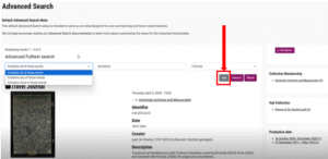
Screenshot showing Advanced Search with the ‘Add’ button in grey
Action identified in response
This finding highlighted the need to change the colour of the ‘Add’ button from grey.
Participants worked around the absence of a specific share button and went to ‘contact us’ to get help
Task 5 (to share an item from the collections with others) and task 10 (to request help from University staff) were both designed to discover whether there was a need for the platform to provide specific ‘share’ and ‘help’ functionality. For both tasks, participants recognised that there was no specific functionality in place, however, they were able to work around it – firstly by obtaining a link that could be shared, and secondly by visiting ‘contact us’ in the footer.
Action identified in response
This finding highlighted that providing ‘share’ and ‘help’ was a nice-to-have but not a necessity.
Participants didn’t recognise all of the available facet functionality
Successfully completing task 7 required participants to use facets, which they were able to do with a reasonable amount of success.
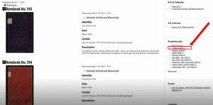
Screenshot showing the facets available to filter the items – highlighting the minus sign to remove the facet.
Action identified in response
The testing highlighted several possible areas of improvements to the facets:
- A clearer way to select and de-select facets (since the button with a minus sign to do this was not noticed by participants)
- An easier way to ‘reset’ facets to clear previous attempts
- Changing the background colour of several facets to denote which ones did what
- Making the facets searchable to reveal which ones can be applied
Participants had a limited understanding of what they could download in association with an item
Task 4 sought to test how easily participants could download from the platform. For each item there were multiple download options – the item itself could be downloaded as an image, as well as various pieces of metadata. The success of this task was in part dependent on participants being able to recognise and understand what they were downloading, (and in the case of metadata, being familiar with each of the different types of metadata available).
Action identified in response
The findings suggested that it could be beneficial to investigate different ways of enabling the user to navigate to individual pages, to work out numbers of items available and to understand the different download options on offer.
Participants were unfamiliar with what the IIIF viewer could do
Tasks 6 and 9 sought to understand how effectively participants could use the functionality on the IIIF viewer of the platform. Task 6 probed whether they could find and use the side-by-side viewer functionality. The majority of participants were unable to find the IIIF functionality to do this, however, they managed to achieve the task by viewing the items in separate adjacent browser tabs. Other features of the IIIF viewer were recognised and used by the participants – nearly all of them were able to use it to zoom in on images as required by task 9.
Action identified in response
These findings suggested that using the full functionality of the IIIF viewer required participants to be familiar with it – which would be likely to come with practice. Guidance could potentially support new users to become more confident with the IIIF viewer. Furthermore, investigation into configuration of the viewer could potentially reveal ways to make it more intuitive.
Usability tests highlighted various interface snags to be fixed
As well as noting usability issues, the Digital Collections team members facilitating and observing the tests also had the opportunity to spot snags and changes to be made in the platform to improve its overall usability. These included:
- Changing a technical URI label for the link to the catalogue to something more intuitive (such as ‘Full catalogue record’)
- Removing developer help-text on the advanced search part of the platform
- Aligning design of the platform interface (for example, the header and footer) with the rest of the library website.
We’re planning to support the Digital Collections team with UX-led continuous improvement
Having taken an active role in the running of the usability tests and analysis of the results, the Digital Collections team are keen to continue pursuing user-centred development of the platform. They are looking to align their future development work with identified areas for improvement, following the UX product design cycle stages: Build, Measure, Learn. The UX Service are keen to support them in this work, bringing our perspectives on ways to achieve cycles of UX-driven product development, drawing on our learnings from previous projects, such as in the planning stages of the web publishing platform development.
Read more about how we defined and reviewed the user experience design process for the web publishing platform project in my previous blog posts:
Defining the UXD process to support a user-centred web publishing platform