Usability testing and iterating on Campaign Landing Pages in EdWeb2
As part of the ongoing EdWeb migration, the User Experience (UX) team have been working alongside developers to identify any usability issues with migrated functionality before release. These issues can then be prioritised and addressed in future updates.
What are Campaign Landing Pages and why do they need development?
A Campaign Landing Page (CLP) is a page type in EdWeb that is intended for marketing purposes and is optimised to encourage users to take a single action. Unlike regular website pages, CLPs are not listed in the University website menus, so a user can only access them if they have a link to the URL of the page.
They also differ from regular webpages in that they have:
- The option to hide the site-wide search bar.
- More flexibility in layouts and visual components.
- Additional permissions that only let a subset of publishers create and edit these pages.

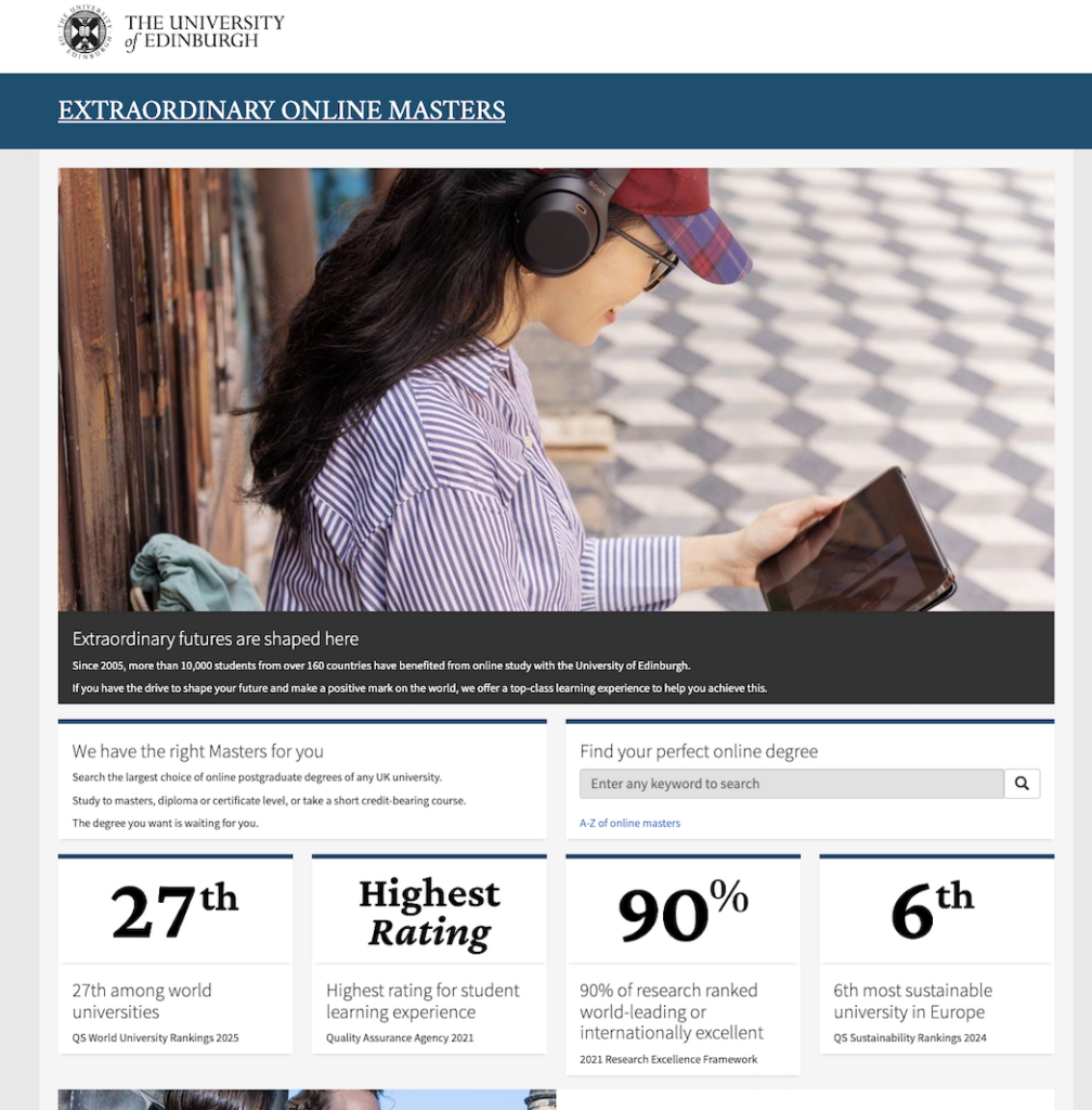
An example of the Online Masters Campaign Landing Page.
From January 2025, CLPs will no longer be supported by Drupal 7 which is the system behind EdWeb. The development team in Website and Communications therefore need to recreate this page type within EdWeb 2, supported by Drupal 10, so that the existing pages can be maintained and new ones created.
Campaign Landing Pages are used for a range of purposes at the University
In preparation for this work, the UX team spoke to seven web publishers about how they use CLPs in EdWeb currently. This was to help us understand publishers’ experiences when using these pages and to identify any potential opportunities to make improvements after the migration to EdWeb2.
The team uncovered several reasons why this landing page type is used:
- To publish time-specific or seasonal content, for example, providing new students with information about the start of term.
- To present a more focused view of school site information, for example, advertising a single programme offered at the school.
- To direct users to explore other resources, such as academic profiles or ticket bookings for events.
- To target a specific audience, for example, promoting specific programmes to school-leavers or final-year undergraduate students.
Responses from these publishers were mostly positive around the capabilities of CLPs, with some preferring this page type to regular EdWeb webpages, due to the flexibility mentioned above.
This research provided us with a clearer understanding of why certain features are needed, which then informed the decision to replicate as much of the original functionality as possible in EdWeb 2 – albeit with an updated Editor interface.
We were also able to compile a list of key tasks involved with creating these pages, which could be used for usability testing during development.
Usability testing sessions revealed what was and wasn’t working on the first iteration
Once development had begun, we asked four web publishers to try out the first iteration of campaign landing pages in a test environment following initial bug testing by developers.
Usability testing on an early iteration gave the developers time to spot any urgent problems for end users and fix these before further testing.
We asked our participants to try and complete 13 key publisher tasks that had been identified in the previous research. For example:
- “Please show me how you would create a new Campaign Landing Page.”
- “Show me how you would add an image and text to the page.”
- “Show me how you would publish the page.”
For each task, we noted down:
- Whether the participant was able to complete the task.
- If they were, were there any barriers? e.g. error messages, initially clicking in the wrong place, misunderstanding of labels.
- If they couldn’t complete the task, why not.
If participants all completed a task with no issues, then this functionality would be seen as successful. Any incomplete tasks and barriers would be flagged as usability issues to be prioritised by the development team.
A member of the development team also sat in on the sessions, and this sped up the process of communicating usability issues back to developers and getting them prioritised and resolved.
Running sessions with just four participants allowed us to test quickly, while providing enough evidence to see which tasks were easy to complete, and which caused problems. UX experts Neilsen Norman explain here why regularly testing with three to five users is enough to provide the insights needed:
Why You Only Need to Test with 5 Users
Development and UX team members collaborated to resolve problems
By the third usability session, we had identified some recurring problems which were raised with developers. Some issues were fixed quickly, while others will need more time to be reviewed. Some of the quick fixes are listed below.
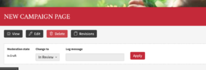
- Usability problem 1: Participants were confused when the heading banner of the CLP wasn’t displaying in Preview mode after the page was saved for the first time.
- Solution: This was corrected so that the heading is always shown in Preview mode and ‘Summary’ text is hidden:

Example of a Campaign Landing Page heading displayed in ‘Preview’ mode before publishing.
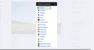
- Usability problem 2: Participants were confused by the overwhelming number of content types that could be added to a page. This slowed them down when trying to find basic items, like images and text:

Screenshot showing the long list of content types that could be added to a page.
- Solution: This was resolved by reducing the number of content types to just four options, which are most used features across published CLPs.
- Providing a smaller number of available options reduces cognitive load on publishers and gives the development team flexibility to add more options if they are needed in the future.
- This solution also removed content types that had previously caused usability issues for some participants.
- Usability problem 3: The ‘Jumbotron’ pane – a component that places a coloured overlay and text over an image – was not behaving as participants expected. There was no coloured overlay, which meant that text was difficult to read and caused accessibility issues.
- Solution: This was quickly fixed so that that a light, dark or brand-coloured translucent overlay can be placed on top of an image. Text colour is then automatically selected to provide enough contrast.

Example of the ‘Jumbotron’ pane displayed correctly.
These fixes were completed before we ran our final usability session, which meant we could check that the improvements were working with a fourth test.
There were also other issues that didn’t prevent tasks from being completed but could be addressed to improve the Editor experience for web publishers in the future. For now, development work is still ongoing to make the page type ready for release in EdWeb2.
Testing and improving to make web services work better for University staff
Developing web functionality is a complex process, which is why it’s essential for us to keep testing and tweaking throughout the lifetime of a system like EdWeb2.
By speaking to the people who use these systems and providing them with opportunities to try out early versions, we are catching problems earlier and also spotting ways we could enhance these services in the future.
You can read more about what UX team are doing to improve web services for staff and students at the University in our previous blog posts:
DIY user research: Helping the New Students team to optimise their web content
Web Content Design Assistants – helping us iterate our migration approach

