Web Publishers’ Community – March update
At this month’s session we got our first glimpse of how forms will look in EdWeb as well as hearing about the developments for viewing EdWeb on small screen devices and website search enhancements.
New features in EdWeb
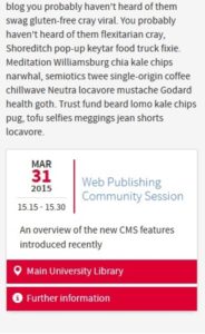
First up was Bruce who introduced the event content type and demonstrated it’s responsiveness.
The new asset type allows you to add a map as well as linking to additional information about the event.
 Bruce made good use of the Hipster Ipsum content filler to demonstrate the new feature and to educate the WPC about the meaning of ‘meggings’.
Next out of Bruce’s bag of goodies was the introduction of forms, which have been much in demand from the Web Publishers’ Community.
The forms afford the user a much wider choice than they had in Polopoly with the ability to create multi-page forms, send data by email and save collected data to an internal EdWeb database.
Getting sites migration ready
Duncan then took to the stage to remind the community of the steps they need to take to get their sites ready for a smooth migration.
He also outlined the steps the UWP editorial team take once a site emerges blinking into the brave new EdWeb world and finished off by looking at the tasks lead publishers should complete when their site is returned to them.
Small screen evolution
User Experience Manager Neil, then lifted the lid on the process and testing that has gone into the development of EdWeb for smaller screens.
After briefly running over the testing methodology and different layouts used, Neil presented the results of his research.
While there was positive feedback about much of EdWeb, one thing that required more work was the navigation menu of the site as users were unsure about the hierarchy and section navigation.
Neil’s previous post about what we’ve learned from usability testing during EdWeb development
Search improvements project
Stratos closed the session by showing how the UWP team have decided to prioritise developments for the University website search based on last year’s survey.
By dividing the results into different section the team decided to focus on ‘desirable and easy’ fixes before moving towards the more complex issues that need to be tackled.
Currently the team are working around sorting results by date and how best to present them as well as on the Advanced search function.
Presentations from the Web Publishers’ Community meeting on 31 March

