Understanding how students interact with Learn Ultra and Ultra Base Navigation
Learn Ultra is the newest version of Learn, the University’s Virtual Learning Environment (VLE). The University is planning a phased upgrade to Learn Ultra as part of the VLE Excellence programme and the wider University 2030 Strategy and Digital Strategy.
As part of a programme of user experience (UX) activities to support the upgrade of Learn Ultra we set out to understand the core requirements of students when accessing Learn and to ensure that the upgrade still aligns with the University’s approach to accessibility and consistency. The UX programme of activities was built on the previous UX work completed in phases 1-3 of the Learn Foundations project. Please see related blog posts:
A service design approach to Learn Foundations
Using Learn for hybrid teaching and learning – perspectives from staff and students
Understanding what staff and students need from Learn for hybrid teaching and learning
The initial UX focus was the Learn Ultra Base Navigation (UBN) – this is a fixed navigation menu that allows users to quickly access course content, grades and feedback and review course updates and notifications.
Activities that took place which addressed the UX of the UBN were – sketching sessions, semi-structured interviews and usability testing. This post describes the semi-structured interviews and usability testing – in which 11 students were asked to describe how they usually accessed Learn, prompted for their input on some of the features specific to the UBN, and presented with a sample scenario and usability tasks to complete using the UBN.
Within the semi-structured interviews we set out to discover:
- How students accessed their courses within Learn.
- What page within Learn Ultra Base Navigation students preferred to be the landing page when accessing their courses.
- How students used UBN to perform core tasks.
Interviews about accessing Learn
We started by asking the students how they accessed Learn. We were interested to find out if they went directly through the Learn web portal or through a link on MyEd. We were also interested to see if the students that accessed Learn via MyEd used the current academic year course list to access courses.
We found that students accessed Learn in both ways equally. However, the students that accessed Learn via MyEd did not use the course list to get into a course, they just used MyEd to launch Learn.
Landing page options
Students were presented with Learn Ultra Base Navigation and asked to look through three main parts of it – the Institution Page, Activity Stream and Courses. We asked the students what they thought they could do on the pages, what they might expect to see and how they thought it would support them as they used Learn. Afterwards, we asked which page they felt they would use the most and why, and which page they would expect to land on when first logging in.
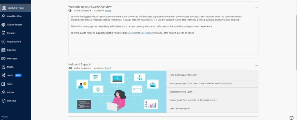
Institution Page
Students were unsure of the purpose of this page and said they expected the Institution Page to be more about the University as a whole. They were a bit confused what was meant by ‘Institution’.
By ‘Institution’, does it mean Edinburgh University? Or does it mean ‘Learn’? – Student
However, they thought the content on the page could be useful – they liked the welcome message and particularly liked the link to the helpline. They said would also have liked to have seen more help and support links relating to student services, key course dates and contact information for their School and courses.
The one uni page I used religiously in my last year was key dates. And that’s because I was obsessively wanting to know where my results came out. – Student

Learn Ultra Base Navigation – Institution page
Activity Stream
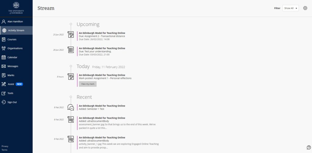
Students really liked the look of the Activity Stream. They liked how they could see their upcoming assignments and deadlines at the top of the stream followed by the announcements and course material that had been added to their courses. They liked how they could filter for assignments and tests or marks and feedback. However, they said they would like more filters added such as announcements. They also liked how you could easily change the notification settings in the stream to determine which notifications were they received by email. None of the students said they used notifications or posts in Blackboard Learn and did not know how to change the settings for the daily email digest in the existing system. Students said they felt the Activity Stream was a useful alternative to having email notifications, which they said they tended to ignore as they felt they were a bit much. A few students said they would have liked to have seen a course-specific Activity Stream.
I didn’t tend to use it [notifications in Blackboard Learn] because it was quite difficult for me to access everything, but this seems to have everything on one page and all types of announcements – Student

Learn Ultra Base Navigation – Activity Stream
Courses
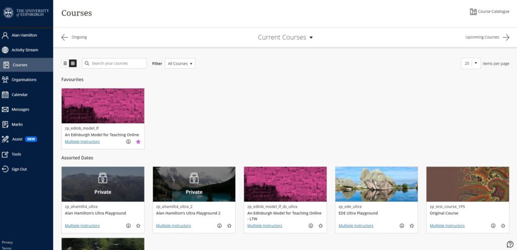
The students said they liked how Courses opened as an overlay across the UBN and thought it was easy to switch between them. They said they liked the filter options, tile view and the ability to add courses to their favourites. Some liked the image on tile view but others thought it might be a bit confusing to have the same image for a few courses, it would be better to have a unique image for each course. Most students organised their courses by term in Blackboard Learn but a few did not know they could do this. They found that the layout was easier to navigate and customise compared to Blackboard Learn.

Learn Ultra Base Navigation – Courses
Preferred landing page
Almost all students said they would like Courses to be the landing page when logging into Learn as they felt this was the page they would use the most. A few did say they preferred the Activity Stream to see any due dates or updates. Some thought the Institution Page would be good for new students to see, but they said they would not really use the Institution Page unless they were looking for help.
I would go onto Learn because I need to go to one of my courses so would rather it just landed there. – Student
I think it would have to be Courses just because that’s what I would normally be using Learn for. And then the other tabs would be if I wanted to go and find something else. – Student
Usability tasks
We asked the students to perform usability tasks based on common activities they regularly carry out in Learn. We wanted to see how they interacted with Learn Ultra and how they could use Ultra Base Navigation to help them complete the tasks. We asked the students to perform 5 tasks to find specific pieces of information. The tasks and the actions took to complete them were as follows:
1. Find recordings of a lecture
All students found the recordings easily by looking in the course area. It was mentioned that if a lecture was recorded in the virtual classroom Collaborate they would find the recordings within the Collaborate tool recording menu. One student mentioned that they would expect an announcement to be posted when a recording became available so they would also check the Activity Stream.
2. Find out what’s upcoming in their courses
The students checked the Activity Stream for upcoming items and looked for announcements. A few students had linked their Learn calendar to Outlook for timetabling so they said they would look there as well.
3. How to check for changes in a course
Students either checked or said they would check the Activity Stream and said they expected to see an announcement from their lecturer about the change. They also said they would check each course for announcements if they could not see anything in the Activity Stream.
4. How to change notification settings
Students checked their notification settings within the Activity Stream, they said they liked how this was organised. All students said they did not know how to do this within Blackboard Learn.
5. How to check for grades and feedback
Students checked the Activity Stream and accessed their grades from the assessment link.

Assessment link within the Activity Stream
They also used the Grades page within the navigation menu. They liked how the page was set out by course and could easily see their grade. Students would usually check the assignment inbox on the course for their grades and feedback in Blackboard Learn. Some of the students mentioned that an announcement would be posted to say when grades and feedback were available so said they would also look out for this within the Activity Stream.
Conclusions
In the research we carried out, all students said they liked the new look and layout of Learn Ultra Base Navigation, they found it easy to use and navigate. The students thought it was more intuitive than Blackboard Learn. Most notably the students liked the Activity Stream.
After the analysis of the response and comments made by the students in the semi-structured interviews, decisions have been made to:
- Remove the current academic year course list within MyEd. This decision was supplemented by analysis of Learn login statistics taken from academic year 2020/21. It was also noted that the MyEd course list gave a poor user experience for courses that did not follow the traditional academic year because courses would not show on the list.
- Remove the Institution page. It was agreed that the information that was on the page and the extra information the students wanted to see was available on other University pages and that the name ‘Institution Page’ was too ambiguous, creating a poor student experience.
- Set Courses as the landing page. Students found that this was the most useful page and felt they would find it more beneficial to land on as it provides direct access to their courses.
The programme of UX activities will continue to understand staff and student needs of Learn Ultra more fully as we enter the Early Adopter phase of the upgrade.
To read about the sketching analysis please see Edward Lithgow’s post:
To find out more about Learn Ultra and Base Navigation please visit our SharePoint (login required)


Thank you for your post.
I realise it is a phased upgrade but are you in a position to confirm if 22/23 cohort will use Learn Ultra. If yes, will there be guidance videos? Some of 21/22 students said it their feedback that it would be useful.