The new University search results page
The new University search engine launched on 9 July after a nine month research and development period.
Primordial soup
The University search engine was originally built by Joe Farthing, who has since moved to the Department for Social Responsibility and Sustainability. Joe did a great job setting up the service and Stratos Filalithis has maintained the search up until I became involved in August 2014.
Researching demand
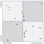
Twenty new features were identified through a staff survey carried out in October 2014. Staff members were asked to choose three of their most desired features. When the results were returned, Neil proposed a scatter diagram to help identify the features that should be implemented first. They were ranked based on demand identified from the survey and technical feasibility.
- The scatter diagram used to prioritise new features.
A firm foundation
December 2014 through to February 2015 was spent refactoring and optimising the existing code. From there, I took time to tidy up some minor user interface issues and started research for the new functions.
Design and UX research
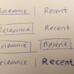
I stumbled on an issue with how to present the new sorting function. There are only two options – relevance and newest – but it proved to be an interesting design challenge. Because there are only two controls, communicating the active filter became quite tough; with three controls it’s easier. The issue was resolved by using a tabbed appearance, and it was pushed through to the release.
- Sketched ideas for the filter controls. Which one is active?
- The final appearance of the filter controls.
The initial release
I made my first deploy on 14 May 2015. This deploy brought in the UI fixes, along with a new sorting function that allows results to be ordered by newest first, instead of relevance.
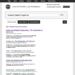
- The updated appearance.
- The old appearance.
Tricking the user
An advanced search feature was developed alongside the filter enhancements. From the survey, we knew that a lot of people wanted advanced search, but it was too generic. I realised that I didn’t know what people actually wanted from an advanced search, so it was decided an in-page survey should be implemented to try and find out what users wanted.
“EdStrapping”
The next step for search was to update the graphic design to match the new EdWeb theme. The search was the first major non-website and non-technical page to be updated. Through testing, I learned some interesting things:
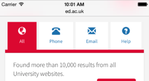
- On mobile, I found that users were not interacting with the fold away menu. Users were just scrolling past it. Stacked tabs had a higher success rate, but still much less than desktop. I increased interaction through the use of Glyphicons. Users said that they were drawn to the icons when they appeared on mobile devices.
- The contact link beside breadcrumbs caused confusion. Users believed that the button was relevant to their search, so it was removed.
- Moving the tabs to the left-hand navigation reduced interaction in phone, email, site and student results. It was resolved by keeping the tabs above the search results.

Summary
The latest release of search is a rock-solid platform to start building new features on. I’m planning to add new functions to search over the coming months. I’d love to hear from anyone who has feedback or criticism, please sound off in the comments!


1 replies to “The new University search results page”