Rapid collaborative prototyping enhances mobile search results
In the process of redesigning the website’s search results page, I tried out rapid collaborative prototyping and found it dramatically speeded up my design development and helped to build consensus with stakeholders in the team.
My first half of 2015 was spent on developing enhancements to the University search page, and then building a new interface to fit in with EdWeb.
Stress and dead-ends
Search is one of the busiest live services that the University Website Programme manage, so getting the interface right was of paramount importance. I went through three different layouts, all of them leading to dead ends when coming down to testing with representative users. Very high fail rates signalled major issues, and by this stage I was struggling to find ideas, and had spent a long time on it.
Enter: rapid collaborative prototyping
The idea was suggested by Bruce after he tried it out at Jeff Gothelf’s Lean UX workshop, and subsequently used the technique a couple of times in the process of developing some interfaces for the EdWeb CMS.
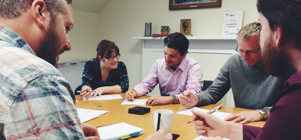
We gathered six members of the team together for an hour for this process. The group had a range of backgrounds including editors, developers, trainers, managers and people with experience in usability research. Neil led the session.

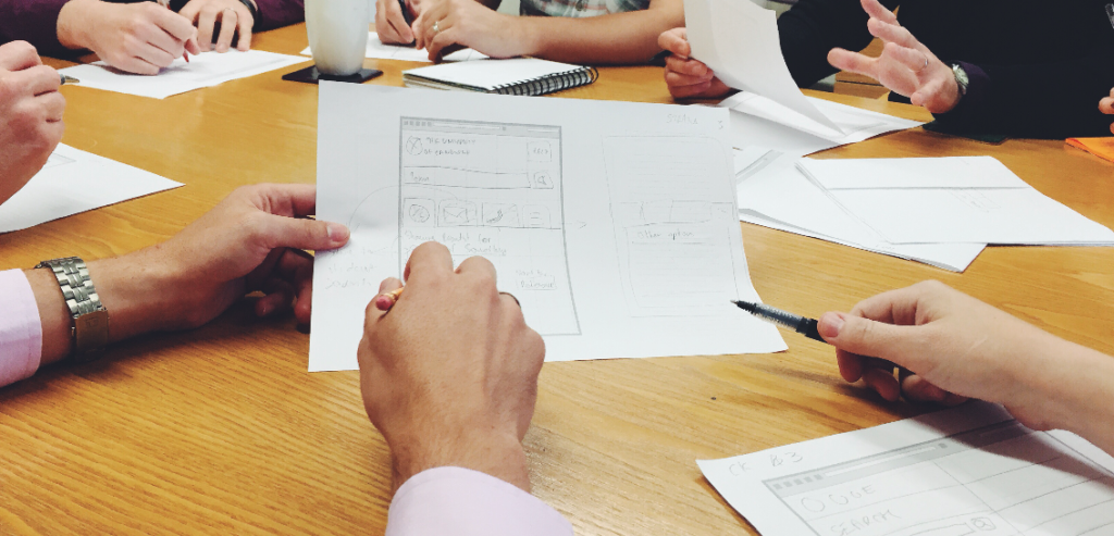
Quick sketch prototypes are talked through by participants.
Round one
In the first round, the team were shown basic requirements for the application, along with previous attempts at the interface. They then had five minutes to sketch out as many different interfaces as they can taking care to ensure that they keep to the requirements.
At the end of the round, each participant showcased their ideas to the rest of the group.
Round two
The second round is similar to the first round, but this time you need to take an idea from someone else’s design, and then integrate and refine it into your design. This time, instead of producing as many prototypes as possible, each person produced only one.

The team spent 5 minutes at a time generating and then evolving ideas for search results interfaces.
When the time was up, again everyone talked through their concept, and trends were identified and discussed among the participants.
Round three
We then did a third round, again with everyone refining their ideas, borrowing from each other and at the end talking through what they’d produced. By this point our designs were converging and I felt I had enough direction to pull these trends together into a single design I could again test with real users of our website search.
Debrief
This stage left me to take a deeper look at the completed designs and then come up with one refined interface. The breakthrough was identifying horizontal tabs using “glyphicons” as the optimum way of separating results.
I was able to implement the new interface in a few hours, and later user testing had showed a 100% success rate. The process took about six hours in total time spent among six people, and delivered a rock-solid result, in comparison to my around 28 hours (four full working days) leading to dead ends.
Team feedback
Feedback from the participants was very positive. They were happy to see their ideas being taken seriously, and having the ability to contribute to something different and deliver great results.
I thoroughly enjoyed the session, and the participants have also expressed interest in helping again. I have every intention of using it again for other design tasks in the future.
Try it for yourself
The University Website Programme runs training in prototyping and also provides informal advice and support.
Prototyping training offered by the University Website Programme


2 replies to “Rapid collaborative prototyping enhances mobile search results”