Tips to improve your website’s accessibility
Always keen to get my hands on (a) free coffee and (b) useful advice on improving website quality, I recently attended a briefing on “Tips to improve the accessibility of your website”, hosted by User Vision.
User Vision, a UX consultancy, run a series of (free!) breakfast briefings in their central Edinburgh offices on topics such as analytics, accessibility and usability.
User Vision event listing – “Top 10 tips for improving accessibility”
There is obviously overlap between advice in the fields of accessibility and usability – so I should stress that adhering to these principles will benefit all website visitors.
Tips to improve accessibility
The briefing also covered effective design and code structures (that are obviously important to consider when designing websites) but are taken care of by EdWeb. The points that I considered useful to our editors are below.
Page titles
Page titles should be descriptive and identify the main content of a page – to check your titles, take them out of the context of the site and see whether they still make sense. Page titles should also be unique to the site – this will also help search results.
Page headings
You should use regular subheadings to summarise and break the page into meaningful sections. Headings should be sequential – heading 3 (h3) should always come after heading 2 (h2), and so on. You should never use bold to define sections: screenreaders will not view this as a heading, so will not flag it up as a section. You should also never use headings (h2, h3…) to format text (‘make it larger’ or stand out).
Alternative text for images
Content images added to the site should have alternative text that convey the meaning of the image. If the image is ‘functional’ (“book”) this should be the alternative text. If there is text in an image, this text must be included in the alternative text. The alternative text does not need to mention that fact that it is an image – so alternative text should not begin “Image of…”, “Graphic of…”.
Colour
Websites should have clear contrasts between colours used (particularly where text is used on coloured backgrounds) – EdWeb’s design is compliant. But editors should also ensure that instructions on websites should not rely on colour (“click the red button”). Viewing your page in grayscale can flag where this could be an issue.
Link text
All link text should be meaningful and describe the destination of the link (so you should never use “click here”!). Using separate lines for your links makes them more prominent and easier to write link text.
Forms
A form label should clearly describe the input required from the site visitor. Confusing labels will not collect correct or useful information. Instructions and help text should be positioned before they are needed.
‘Design’
Sites should be designed so that people who zoom in and view it at a larger text size can easily understand the content and function of the site. A zoom of 200% should be tested as a guideline for this. It is also worth testing clarity of images added to the system.
Helpful tools to test accessibility
Viewing website without colour – Grayscale plug in for Chrome
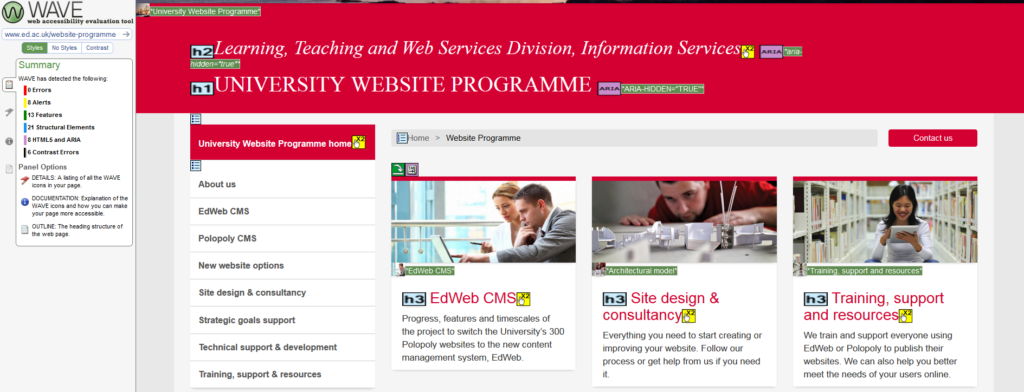
Web Accessibility Evaluation Tool (WAVE) from the WebAIM organisation
Fangs screen reader emulator plug in for Firefox
If you’d like to come and speak to us about the usability, accessibility or design of your site, then we’d be delighted to see you in one of our weekly support clinics.


