How usability testing helped us to design our Effective Digital Content online course
Carrying out usability testing early on in the design process provided useful insights about how learners would interact with our content. The feedback we received led to us making various changes to improve the user experience of the course.
This is part two of a series looking at our work to develop our Effective Digital Content online course. You can read about our motivations for developing the online course in Nick Daniels blog post:
Developing our Effective Digital Content online course
We took at content-first approach
We took a content-first approach to design the new course modules. This meant we prioritised writing good quality content that would allow users to understand the key concepts we were trying to teach, before considering design elements. We felt this provided a good foundation on which to build and ensured that the content was front and centre of any future decisions around format, layout and design of the course. With this in mind, the course modules started out life as simple Word documents which we used for the first stages of usability testing.
Usability testing provided useful insights early on
We tested our first iteration Word document modules in August 2024 with three web migration interns. The key point at this stage was to test the content itself and it was a really valuable experience. It helped us to establish whether the:
- content was clear and understandable
- users grasped the key concepts we were trying to teach
- users understood and could complete the activities.
Overall, we had a positive response from the testing, but there were some useful insights gained which we took on board and fed into the next iteration of the course.
We made content changes following usability testing
There were teething issues with our popular ‘do’s and don’ts’ list
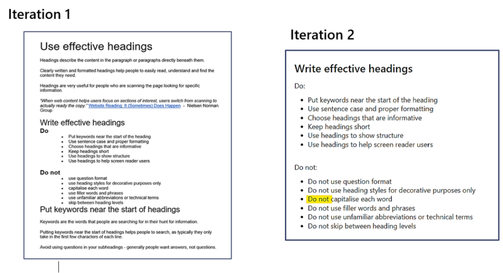
Each participant liked the ‘do’s and don’ts’ list we had included (pictured below). We received comments that this layout was very clear and would be easy for them to refer back to. We did discover, however, that this type of list format led to one participant misreading and becoming confused about ‘Using capitals in headings’. When scanning the text, they skipped over the ‘Do not’ heading and just read the bullet point in isolation – ‘capitalise each word’. This lead to incorrect answers in the activities.
We took this learning on board and after some research we changed the second iteration to repeat ‘Do not’ for each bullet point in the list, as well as in the heading. This is an approach which is mentioned in the NHS Digital Service Manual to avoid misinterpretation. The aim being that even if people skimmed over the heading , they still took away the correct information when reading the bullet point in isolation.

Screenshots to show the changes we’ve made to our ‘Do’s and Don’ts list’ within the course following learnings from usability testing.
Visual examples of key concepts were important
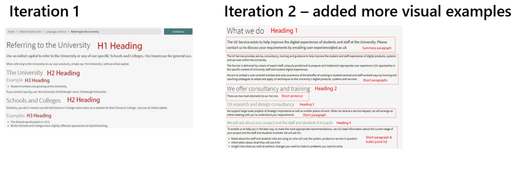
We found through initial testing that participants liked screenshots showing examples of heading levels. This showed us that visualisation of key concepts in practice was important. As a result we decided to add in more examples to show not only headings, but also different types of paragraphs to demonstrate effective chunking of text.

Screenshots to show how we’ve added more visual examples in the second iteration of the new course following usability testing.
We did acknowledge that extra thought would need to be given to the accessibility of these screenshots. We have worked on comprehensive alt text to try to ensure that those using assistive technologies such as screen readers still understand and benefit from the information we are trying to convey in the images.
We took the newly iterated modules for a second round of testing
We were keen to test the newly iterated modules after making the changes outlined above and were pleased to see that the issue with the ‘do’s and don’ts’ list had been resolved. The new screenshots proved to be effective and got a good response. We also gained further key insights on the ordering of key concepts within the content.
We needed to strike the right balance with our course activities
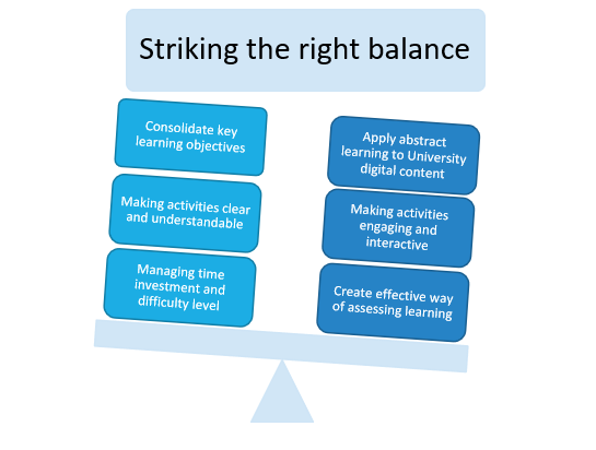
A key objective of developing the new course was to provide opportunities for learners to apply key concepts from the abstract to practical activities and University-related examples. When trying to achieve this, we had to strike the right balance to ensure the activity was also meaningful to consolidate key learning objectives as well as making it engaging.

Some of the key considerations we had to take into account when striking the right balance with the activities we wanted to create for the new course.
After testing the first prototype activities and considering the functionality available in Articulate (the software we are using to build the course), we decided to split our activities between auto-marked questions within the online course and a newly created workbook. The workbook provided greater flexibility to create activities where learners could provide free text answers and apply principles to individual University sites and web pages that they work on or are involved with. We continue to develop the workbook as well as the submission and feedback process.
We are now usability testing the Articulate course
Now that we have the course content built out in Articulate and we’ve created an accompanying workbook we are carrying out further usability testing, iterating where necessary to respond to user feedback.
Help us to test the new version of Effective Digital Content
We’re looking for staff who can meet us for a 30-minute Teams call to look though the new course and try out the activities.
If you’d be interested in helping with this, please use this form to get in touch, or you can contact Katie Spearman or Nick Daniels.
Help us to test the new version of Effective Digital Content

