Revisiting student experiences with Helpline reveals improvements to IT self service
I recently re-ran a usability study for the IS (Information Services) Helpline which I had first conducted back in June. The results, though far from perfect, are encouraging enough to reaffirm our conviction in the value of repeat usability testing.
Collaboration with Helpline
Last year, the UX team of the Website Programme planned out a collaborative journey with the IS Helpline team targeting the issues that form the majority of their support calls. With a view to enhancing the online student experience, our process involved watching students attempting to solve their own IT problems. After the first round of usability testing, the Helpline team launched into fixing the issues observed.
Read more about the collaboration plan with IS Helpline
Repeating usability test scenarios
Having an improved version of the website available based on our last round of testing, we were ready to test again. I used the same tasks we had settled on in June with some revision on the wording of the questions to better reflect the everyday experience of the participants within the University.
An example of the tasks we used is as follows:
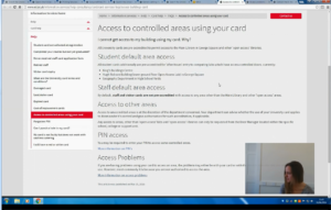
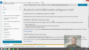
To attend a tutorial in the early evening you need to get access via a secured door at the Old College. It’s not a building you’ve used before. A friend tells you that the details you need on how to arrange this are on the University website. What do you do?
Collaborative usability review session
It was great to see so many managers representing different service areas of IS at this review session and to hear them ask to be invited back once the next round of testing is complete. Their presence was of great importance to us, as exposure to real users is essential if we are to increase engagement in improving student experiences and change attitudes to website management. We value the input from a wide range of colleagues and our sessions are open for them to share their observations and experiences.
During the session, following our well established procedure, we collaboratively logged and prioritised 12 usability issues on the revised version of the Helpline website:
- 2 critical
- 8 serious
- 2 medium
Collaborative usability observation sessions slides
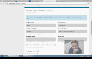
All in all, during the session we logged fewer issues than the previous time. The students seemed happier with their overall self-help experience and we saw them succeed in more tasks than last time. In particular, they were impressed with the new support enquiry form and managed to use it quickly and efficiently.
Trends in behaviours we observed
Assessing the results of both rounds of usability testing, we can pinpoint a number of trends in student behaviour which are important to take into account when planning improvements.
- On many occasions students either face difficulties or fail to locate the right piece of information even when they are on the right page.
- The students often don’t realise when they are directed away from the Helpline pages to another part of the University website.
- They feel surprised or think they’ve done something wrong when they encounter non-ed.ac.uk content.
It’s important to stress that these insights are not user opinions or expert speculations. They are derived by directly watching users interacting with the website as naturally as possible. Our process brings out user behaviours that wouldn’t otherwise be taken into account.
A fundamental issue we see repeatedly is the extent to which content management and information architecture decisions made across the University by business units within and beyond Information Services affect the Helpline team. Establishing better connections between enquiry management and website management seems fundamental to the long term goal of enhancing student experiences.
Enhancements since the first tests
A great deal of the improvements have been in essence editorial tweaks. Small changes can have a huge impact, when informed by observed user interactions. Relatively minor edits in the wording and ordering of the material helped make the tasks easier for the users to accomplish. For example, the task regarding getting access to a building they haven’t visited before had a higher success rate thanks to some reordering and bolding of certain phrases.
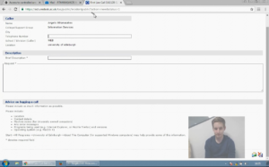
A striking example of the improvements made on the website has been the design of a new support call form. In the first round the UniDesk form was met with surprise as the users were taken away from main website (“What is this?”). They were impressed with the new built-in EdWeb form functionality, which they found modern, clear and easy to use. All in all, we noted leaps of improvements in terms of convenience (fields automatically filled) and efficiency (easy to understand what they needed to do next).
An iterative process
The collaboration with the Helpline has been a good example of how we can establish a process for a pattern of repeat testing and ongoing improvement. The real value of usability testing insights emerges when the process is repeated regularly. This study resembles one I ran last year involving iterative improvements to a new student app. This time, however, the scope of my work is broader and long-term for two reasons: First, the product is a lot bigger, namely a complex website rather than an app with one defined task to perform, and second, there’s no finite goal other than constant improvement of the service provision.
Iterative improvement of a student app
We’re here to help
We will be glad to hear from you, if you’re interested in getting your stakeholders together and delivering more efficient and user-friendly products. We can facilitate workshops tailored to your needs, where you have the opportunity to watch real students attempting real tasks and find out how a usability process works.


