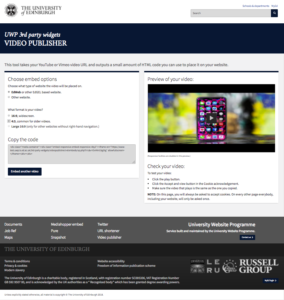
Gelling widgets – EdGEL4 is coming!
This is an overview of my work transforming existing the non-GEL UWP Widgets page into beautiful EdGEL4. I would like to share my experience of the technical challenges I have encountered. This post explains in simple examples what EdGEL actually is and may serve as a technical guide for those of you who plan to enhance your website with EdGEL.
What is EdGel?
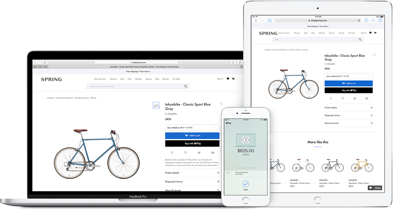
In 2007 Apple released their first iPhone. At the same time they introduced the Apple Human Interface Guidelines that specify how to build a user interface and to give a consistent user experience on every device that uses Apple operating systems. An app or website running on smartphone, tablet or desktop consists of the same visual elements and shares the same behaviour. Apple’s approach influenced other manufacturers and software developers to create better products.
In 2015 The University of Edinburgh inspired by the BBC Global Experience Language started working on their own user interface guidelines. The idea was to create a shared design framework that could be used by all University departments. That’s how EdGEL – the interface with a consistent user experience across University’s online content – was created.
EdGEL Principles
Atomic design concept
There are three levels of atomic design:
- elements – basic building blocks, e.g. buttons, labels, input fields but also colours or animations
- components – elements combined together in groups, e.g. forms containing fields, labels and buttons
- templates – components combined together. The perfect example could be a whole webpage using components.
 |
 |
 |
|---|---|---|
| Element | Component | Template |
Design patterns
To get the consistent behaviour of EdGEL content we use standardised components like search, pagination, carousels and tabs. University search is one example of using design patterns – it’s the same across all the pages and it’s always in the same position, in the top right corner. It changes only when the page is shown on mobile devices where it’s presented only as a magnifying glass symbol with the search field appearing when clicked.
Iconography and typography
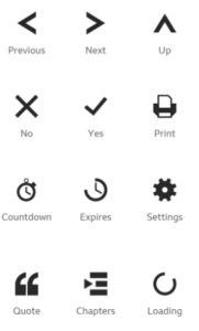
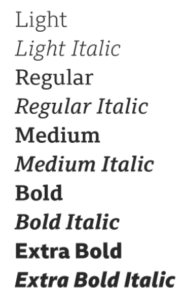
To increase the readability EdWeb pages we use glyphicons – an intuitive set of icons. We also very consciously limited the number of fonts used in EdGEL to two (with their variations) to make the reading experience consistent.
Responsive grid
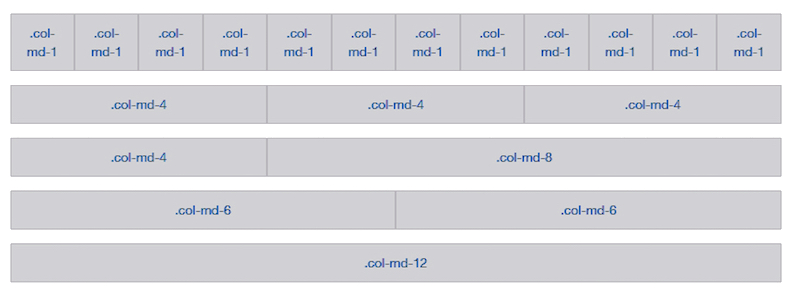
EdWeb uses mobile friendly Bootstrap’s responsive grid that can appropriately scale content, up to 12 columns as the device or browser window changes.
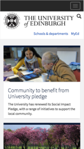
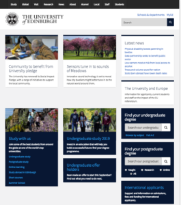
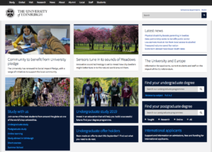
Using a responsive grid we have very precise control over how to differ website presentation on different devices. A page that consists of three wide columns on the desktop will be presented as one column on mobile devices because of the lack of screen estate.
 |
 |
 |
|---|---|---|
| Mobile view | Tablet view | Desktop view |
What’s new in with EdGel v4
LESS is more
LESS is a JavaScript and NodeJS based CSS preprocessor that extends CSS by using scripting language and variables instead of static elements to allow themeing. That way we don’t need to create 11 versions of a specific website element e.g button. When a different theme is selected, LESS generates a new CSS stylesheet that contains the updated colour for that button.
Bootstrap naming convention
EdWeb uses more intuitive names for HTML elements and split them into 3 class groups:
- Base class: btn, progress, panel
- Element class: btn-uoe, progress-bar, panel-body
- Modifier class: btn-lg, progress-bar-striped
Following HTML5 principles
- Self-closing tags e.g. <html> <body> <head> <tr> <th>
- New structural tags e.g <article> <summary> <nav> <aside>
- New Media elements e.g. <video> <embed>
- HTML5 graphic <canvas>
What UWP widgets are and why we needed to “GEL” them
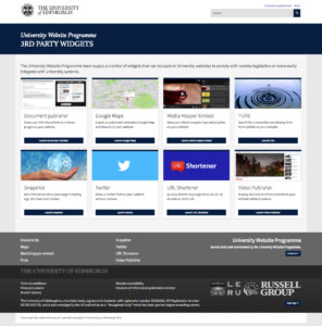
UWP Widgets are web applications that can be used on University websites to comply with cookies legislation or just for better 3rd party content integration.
To follow the EdGEL convention of consistent user experience our widgets needed to be transformed.
UWP widgets worked previously as one big body. They shared resources so changing one of them affected the others. During the “gelling” process each widget’s source code has been separated and saved in a separate Gitlab repository for future developer’s use.
We also started updating existing Widget’s documentation on the Wiki.
EdGEL components in widget pages
Header
A new header contains the University logo, search and new MyEd link the same as the University EdWeb pages.
Footer
New footer as the one on University EdWeb pages consists of subsite footer, discovery footer and copyright information.
Panel
Panels are like smaller versions of pages: they have their own associated responsive image, header and body section. To optimise loading speed three different image sizes are used. EdGEL uses three panel types:
- low priority – without highlighted content
- medium priority – with highlighted title in header section
- high priority – with highlighted header and body content
Panel: example source code
<div class="panel panel-uoe-low"> <div class="associated-image"> <figure class="uoe-panel-image"> <picture> <source srcset="assets/map1200.jpg 1x" media="only screen and (min-width: 1200px)"> <source srcset="assets/map992.jpg 1x" media="(min-width: 992px)"> <source srcset="assets/map768.jpg 1x" media="(min-width: 768px)"> <source srcset="assets/map480.jpg 1x" media="(min-width: 0px)"> <a href="maps/index.php"><img src="assets/map1200.jpg?" alt="artwork" title=""></a> </picture> </figure> </div> <div class="panel-heading"> |
|---|
Form
EdWeb forms use extended Bootstrap form classes. Their look and behaviour is consistent across all input types. All JavaScript code necessary for displaying popup messages is included in the dist folder so if for instance a form field has the “required” property a JavaScript popup shows automatically when a field is empty, without a need to apply any additional code.
Form: example source code
<div class="panel panel-uoe-md"> <div class="panel-body"> <form lpformnum="1" _lpchecked="1"> <div class="form-group"> <label class="label-control" for="edit">Label</label> <input class="form-control input-lg" type="text" id="" name="" value="" required=""> <p class="help-block">This is help text</p> </div> <input class="btn btn-uoe btn-lg" type="submit" name="op" value="Submit"> </form> </div></div> |
|---|
Forms: dropdown list
Dropdown list: example source code
<label class="control-label" for="edit-submitted-selection">Dropdown list</label> |
|---|
Forms: radio buttons
Radio buttons: example source code
<div> |
|---|
Buttons
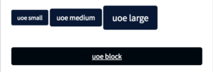
Almost all standard Bootstrap buttons are available in EdGEL. However we extended Bootstrap default button class and created EdGEL “themeable” button types using class btn-uoe. University EdWeb page uses 4 types of buttons:
- small
- medium
- large
- block
Bootstrap buttons examples
Bootstrap buttons: example source code
<button type="button" class="btn btn-primary">Primary</button> |
|---|
UoE buttons: example source code
<input class="btn btn-uoe btn-sm" type="submit" name="op" value="uoe small"> |
|---|
Changes and challenges
Working on this widget’s development was valuable experience. I had the chance to work with many web technologies in one place including HTML, CSS, PHP, JavaScript, andJQuery. There were a lot of challenges, mainly the lack of detailed documentation. To be able to understand a source code workflow I needed a tool that would allow me to run a program and track variables in realtime. I used PHP Storm to debug all the code. At the beginning I wasn’t able to look through JavaScript files but after installing one of the updates PHP Storm began to work as expected.
Some widgets like the Job Reference link generator were pretty easy to transform into EdGEL requiring only dressing them in new CSS raiment and making only minor changes in the code e.g. adding a method to remove white spaces from input. Others, like Google Maps or Twitter required exhaustive workflow analysis line by line to find out what was going on there. Replacing existing panels with the new UoE panels was the first challenge I came across. UoE panels are divided into header and body parts while old ones were just one unit. Images in the new UoE panels are also different, using three different image sizes instead of one to make website more efficient.
UoE forms also have a cleaner structure – dist folder contains all necessary JavaScript files. I needed to remove all existing JavaScript popups and animations in favour of this consistent presentation of messages in EdWeb.
Different CSS techniques used in projects needed to be replaced by clean UoE CSS code placed in dist folder. Many times content wasn’t displayed as expected because inline styling was placed somewhere in a code causing interference with UoE styling.
Another problem was caused by cross-origin resource sharing. When new widgets using HTTPS protocol used images or scripts from insecure HTTP locations, scripts weren’t executed and images weren’t shown on the page.
Document publisher
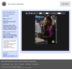
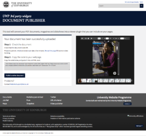
Document publisher shows your PDF documents in a viewer plugin on your website.
 |
 |
|
|---|---|---|
| Old Document publisher | New Document publisher | |
|
Changes:
|
Challenges:
|
|
Maps
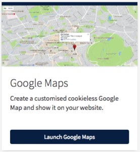
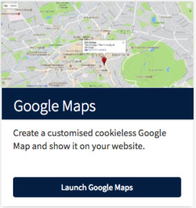
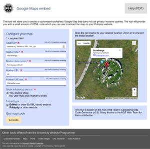
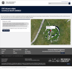
Google Maps creates a customised cookieless Google Map and show it on your website.
Job Reference Link Generator
Job ref finds a job URL from www.vacancies.ed.ac.uk using a job reference number.
Changes:
- Clearer design
- Better navigation
- Using clear panels
- Header with search
- Trimming string spaces
Media Hopper Embed
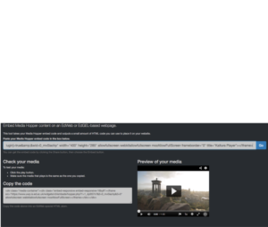
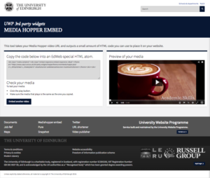
Media Hopper Embed shows your Media Hopper clips and playlists on your website.
PURE, Snapshot, URL shortener
The PURE widget searches for a researcher and displays their PURE profile on your website.
Snapshot shows information about your page including age, structure and cookies.
The URL shortener quickly shortens any large ed.ac.uk URL to an edin.ac short URL.
Changes:
|
Challenges:
|
|---|
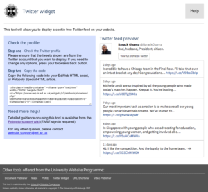
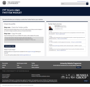
Twitter widget shows a customised Twitter feed on your website without cookies.
Video publisher
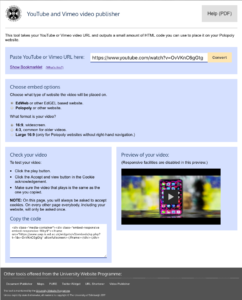
Video publisher displays YouTube or Vimeo content on your website without cookies.
How to use EdGEL
To try EDGEL
- Go to the EdGEL website and download the latest dist folder. This folder contains all necessary CSS files, JavaScript files and fonts.
- Import JS scripts
<script src="dist/js//jquery.min.js"></script> |
|---|
3. Import appropriate CSS stylesheet.
<link rel="stylesheet" href="dist/css/edgel-red.min.css" type="text/css" /> |
|---|
Dist folder contains 10 colour themes:
|
edgel-blue-bright edgel-blue-muted edgel-brown |
edgel-burgundy edgel-dark-green edgel-grey |
edgel-jade edgel-pink edgel-purple edgel-red |
|---|
4. Use appropriate class names to get your HTML elements presented as an EdGEL website. Code examples can be found on the EdGEL website.


