Encouraging self-service at IWMW18
Last week, Duncan MacGruer and I ran a workshop at the IWMW conference in York, demoing the continuous improvement process we’ve been using in our Helpline collaboration project. In this post, I highlight what we did in the workshop and the insights we got from attendees.
Helpline collaboration
After making my conference debut last year at IWMW in Canterbury, I was excited to return to run another workshop, this time focusing on showcasing our work with IS Helpline.
For the past two years, we’ve been working with the Helpline team to help reduce the number of support calls they receive on topics users could answer on their own by reading help pages.
We’ve been doing this by following a process of continuous improvement, where we:
- usability test with students to identify issues with web content and processes
- edit and redraft webpages to help mitigate the usability issues
- measure how successful our changes have been
Read more on the process of continuous improvement (blog post)
Workshop format
We began the workshop with a presentation describing the Helpline project before kicking in to demoing the process.
We showed two usability tests of students interacting with the Getting your first card pages on the IS website. We wanted to see if students could understand the process for getting their card:
- that they need to log onto the University web portal (MyEd) to upload a photo
- what an acceptable photo looks like (passport size, head and shoulders view)
- that they need to pick up their card in the Library during Welcome Week
We followed this with a collaborative review session with the group, where we worked to prioritise the issues we saw the in the usability testing videos.
From these issues, we split the participants into pairs to make their own editorial improvements and redraft the getting your card pages.
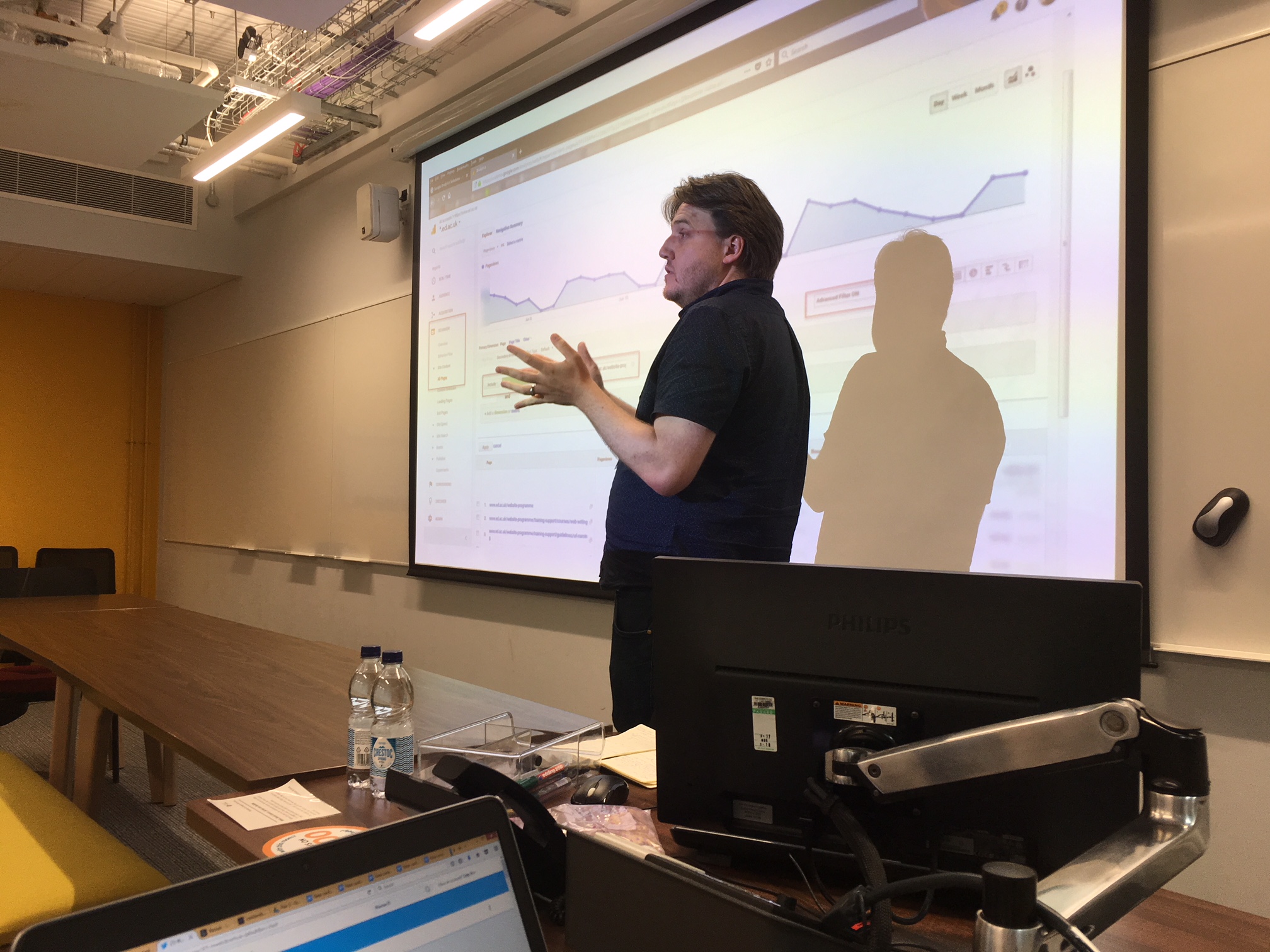
Duncan then wrapped up the workshop presenting on the different analytics and analysis methods we can use to measure improvement and self-service rates.
Workshop abstract and slides (IWMW website)
Highlights and takeaways
This workshop was a mini version of the Shift left-athon one-day workshop I ran for IS web editors back in March, and it was interesting to see the differences between web professionals at other universities and IS staff in interacting with the activities.
Read my Shift left-athon recap
This was most striking when watching the usability testing videos. For most newbies to usability tests, the first one you watch can be an eye-opening experience to the struggles users can face when interacting with web content.
Most of the workshop participants had seen usability tests before, and their experience watching the videos was one of empathy – they could easily relate to issues of poorly structured content tripping up users.

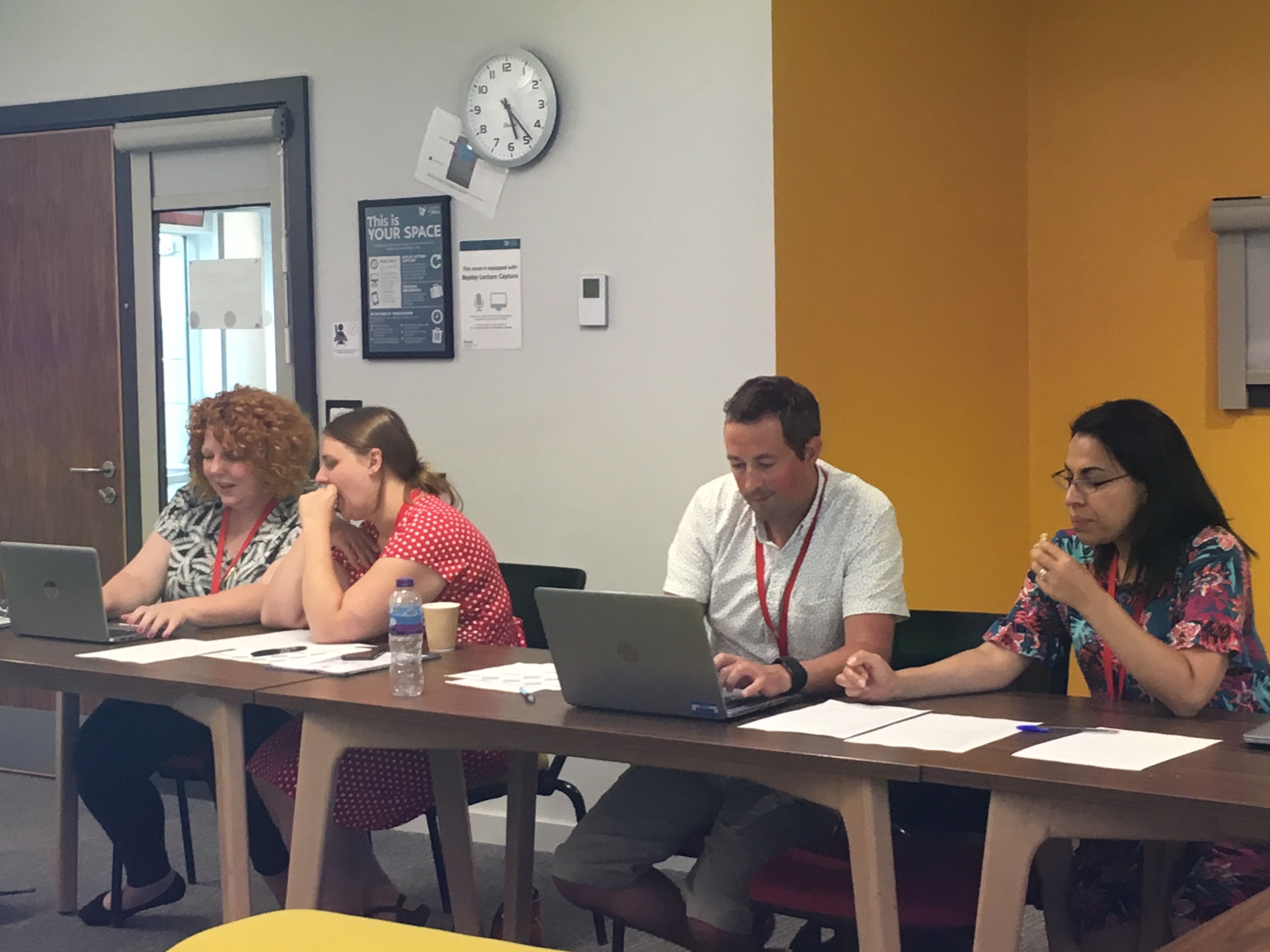
Workshop participants working on the content design challenge while eating cookies baked by Grandma Tormey.
This made the next part of the workshop a lot of fun – giving web experts the chance to dig into the content and make their own changes to it on how they would improve the process.
As I’d expect from the group, the resulting drafts had clear subheadings and call to actions and excess content removed from the page. (This was also a great chance to get others to take care of my work for me as I’ll be updating these page in the near future!)
We even had some participants stay after the session finished to share similar experiences from their institution, including the Head of Digital Communications at St Andrews who shared a very handy blog post on the idea of runners, repeaters and strangers. These are three classifications to distinguish how frequent and consistent processes or tasks are, with the idea being that you design your web content for the ‘runners’, the most frequent and consistent ones.
Runners, repeaters and strangers on the internet (St Andrews Digital communications team blog post)
I think these classifications provide a clear way to think of how to prioritise your web content, so I’ll definitely be sharing this with Helpline staff. (Thanks, Carley!)
And that encapsulates the real value of IWMW – a platform to share stories, learn from others and remind yourself you’re not alone in the HE web world.


1 replies to “Encouraging self-service at IWMW18”