Building the Website Programme blog
Learn about how why we built the blog and what we plan to share in the future.
Why WordPress?
I went with WordPress because it offered the functionality we needed out of the box, and I already had a lot of experience building WordPress driven sites. I knew I would be able to build a good looking, well managed blog in a realistic period of time. I would have loved to use Drupal, but I was afraid it would end up taking months of research.
The theme
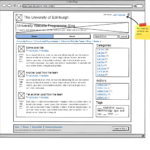
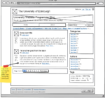
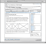
I did some basic prototypes in Balsamiq, an excellent prototyping suite that runs on the University of Edinburgh Wiki. This was useful for feedback from my colleagues, and led to an initial prototype. When developing the theme, I started entirely from scratch, there was no base theme at any point in development. This gave me the flexibility I needed to build a great looking website from the start, and not worry about dragging around something else’s bloatware.
Gallery of some Balsamiq mockups
- Homepage prototype
- Loop prototype
- Single post prototype
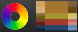
In terms of design, I chose to use an Accented Analogic colour scheme based on the main website blue. I liked the idea of ‘flat design’ – but not too drastic. I felt the use of drop shadows on the main boxes lifted out the content better than without the shadow.
The layout follows normal blogging conventions using a sidebar, search, categories and tags.
Under the hood
There isn’t many heavy modifications to any WordPress core files, the biggest was the comments layout and reply system. I make use of Advanced Custom Fields to enable some extra areas for content, and Easy Author Image to extend the profile picture functions. Akismet keeps a watchful eye comments for any spam, and swiftly exterminates anything that doesn’t make the cut. I also use WP-PageNavi to simplify pagination, and Yoast Breadcrumbs. Google Web Fonts serves one font used in headlines.
I use CSS3 media queries to ensure the blog is fully responsive. It adapts to narrow smartphone screens, and larger monitors to provide a great reading view for most people. Most images are also served in high-resolution for high-DPI displays on smartphones and high-end laptops, so they’ll get very crisp experience!
Technologies
In terms of technologies, there isn’t anything particularly magical or exotic, I just used HTML, CSS and PHP. At some points in development, I used jQuery to provide some extra functions, but they were ultimately cut from the final product.
Reflection
I loved every second of the planning and development. I learned loads of interesting things, and I’ll be taking these lessons and applying them to any future projects.


