
Attending the first Access:Given conference
In September, I attended Access:Given, a new one-day digital accessibility conference. This post covers the four sessions and my takeaways from an insightful event.
Being at the very first Access:Given felt like a real opportunity. Accessibility was central, not just in topic, but in how the event was run. Five speakers across four sessions each explored accessibility from a different angle.
I left with practical tips, ideas to share, and motivation to continue advocating for accessible practices. Here’s a closer look at each of the sessions.
Tapping into creativity to create accessible social media content
Helen Dutson (creativity and accessibility advocate) and Holly Turke (disability advocate, social media accessibility champion at Royal National Institute of Blind people (RNIB) and blogger at Life of a Blind Girl)
Although their work focuses on social media, much of their advice applies to digital content more broadly.
Creating welcoming experiences online
Holly summed it up early on – accessibility is about making people feel welcomed in digital spaces.
On her blog, she asked others about their online experiences and what accessible content means to them. The responses showed that accessibility isn’t just functional. It can bring joy, freedom, and independence. I found it a powerful reminder of the human impact behind every accessibility choice.
Holly’s blog on the impact of accessibility
Familiar examples made it relatable
To consider good and bad practice, Helen and Holly drew on everyday online content: memes, viral trends, and emoji-heavy posts.
They highlighted the importance of not placing emojis between words by showing a post from RNIB where clapping hand emojis had been deliberately inserted between each word. A transcript of how a screen reader would read it aloud, announcing “clapping hands” for each emoji, was also shown. The constant interruptions made the message almost impossible to follow, clearly demonstrating why this approach should be avoided.
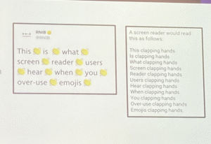
An example of how overused emojis and those placed between words can disrupt the content for screen reader users
Holly shared her own experiences, like the challenges of buying gig tickets online. These stories were powerful because they showed how seemingly ordinary posts or processes can become frustrating or exclusionary. Disabled people may miss out on information and online experiences that many non-disabled people take for granted.
Small details make a big difference
They pointed out that we make accommodations for non-disabled people all the time, providing seating and lighting, or other small considerations. Why not extend the same mindset to digital spaces, using alt text, captions, and other accessibility features to reach a wider audience?
Even something as small as alt text can make a real difference. Helen called it a “gateway” into accessibility and reminded us it can be a rewarding, creative exercise. She shared a pop culture moment she’d written alt text for that sparked media interest.
Helen’s Linkedin post about her alt text going viral
Be the one asking ‘Is this accessible?’
This was the biggest takeaway of the day for me. You don’t need to have the answer immediately, but asking the question ‘Is this accessible?’ is a habit that drives real change and it’s one I’m determined to continue asking in my work.
Should you use Large Language Models (LLMs) for accessibility?
Craig Abbott (former Head of Accessibility at the Department for Work and Pensions (DWP) and the creator of the DWP Accessibility Manual)
Craig explored the growing role of AI in accessibility, approaching the topic with healthy scepticism. I found this perspective valuable, as I’ve not used AI much in this area. His blogs often focus on the intersection of AI and accessibility, offering practical insights and critical reflection.
Experiments with LLMs revealed some of the limits
Craig demonstrated how large language models (LLMs) work, sharing real outputs to show both strengths and weaknesses. LLM-generated alt text handled simple images, but nuance was often missing. One memorable example he shared was where it confidently misidentified a replica of the Statue of Liberty in Las Vegas as the real monument in New York.
Accessibility often depends on nuance, and LLMs struggle as complexity rises. As the number of reasoning steps increases, accuracy decreases, reinforcing that they alone can’t fully manage complex accessibility tasks. You can see the graph he used to illustrate this point in Utkarsh Kanwat’s article.
Utkarsh Kanwat: Why I’m Betting Against AI Agents in 2025 (Despite Building Them)
Combine AI with human oversight
Craig stressed that AI should support humans, not replace them. LLMs can draft alt text or analyse code, but people need to review for accuracy, context, and sensitivity.
In one experiment, an LLM reviewed HTML. It couldn’t correctly pick out all the information, but it did make the task quicker when used alongside human input. Automation can help, but only when paired with human oversight.
The inaccessiblility of LLMs and the web sources it pulls from
Another irony he raised: many LLMs themselves currently may not meet accessibility standards, limiting their usefulness for improving accessibility. And since 95% of the web is inaccessible, LLMs end up being trained on far more bad examples than good ones.
Designing for dignity: upholding human rights in design work
Rachel Edwards (Senior Content Designer at Content Design London)
Rachel brought a legal and human-rights perspective. Her core argument was that access to information isn’t just convenient, it’s a fundamental human right.
Barriers beyond technology
Drawing on legal contexts and case studies, she highlighted barriers like jargon, digital exclusion, and challenges for people with English as an additional language. These examples showed how easily people can be excluded from vital information if accessibility isn’t considered.
Doing things differently
What I really liked was Rachel’s emphasis on practical ways to make access real. She shared concrete examples on doing things differently to address barriers: using videos to simplify processes, prioritising plain language, and focusing on clarity. These felt actionable and grounded in real-world situations rather than abstract guidance. Even with constraints like limited resources or emotional stress, centring understanding can make a tangible difference.
A human rights–based approach
Rachel framed her talk around the PANEL principles:
- Participation
- Accountability
- Non-discrimination
- Empowerment
- Legality.
It was a useful lens, reminding us accessibility isn’t just about readability, but enabling equal participation.
Scottish Human Rights Commission: The PANEL principles
How to cut through the overwhelm and communicate clearly
Ettie Bailey-King (inclusive and accessible communication educator)
Ettie delivered a practical and energising session on clear communication, focusing on people who are overloaded, distracted, or short on time, which, in reality, is most of us.
Design for frazzled brains
Drawing on neuroscience, Ettie explained that our brains often operate in “discover” or “defend” mode, with “defend” being more common given the constant flood of screens and information.
She backed this up with a fact I won’t forget any time soon. In our screen-heavy world, most of us experience “screen apnea,” stopping normal breathing while looking at screens.
Screen apnea: What happens to our breath when we type, tap, scroll
She also highlighted that users are often juggling multiple distractions, feelings and cognitive load, which can leave them feeling ‘frazzled.’
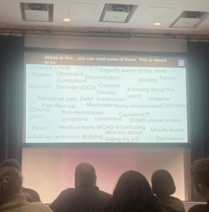
A word cloud, showing the variety and extent of other things users might be contending with or have on their minds
To help users, she recommended strategies many content designers already use:
-
Use shorter sentences and pause more often.
-
Include frequent, meaningful subheadings.
-
Make essential information easy to find.
Headings as navigational tools
Ettie focused on headings in particular, using a metaphor comparing content to water. Structure it so people can paddle, swim, or dive depending on how much detail they want:
-
Paddle: skim the headings.
-
Swim: read the first lines of each section.
-
Dive: explore the full content.
In our own guidance, we recognise that almost everyone scans content, whether sighted or using screen readers, which is why getting headings right is so important. I also learnt that people using BrailleNote Touch assistive tech online have scanning reading habits!
I thought Ettie’s metaphor was a great way to explain this. It’s a clear way to frame the concept, and I’ll be using it in my own work going forward.
Accessibility was embedded into the event itself
The organisers, Michelle O’Connor and Ellen Kate Boyle, made sure the event itself modelled accessibility ina number of ways:
- Clear pre-event communication.
- No overlapping talks (avoiding decision paralysis).
- Live captions and speakers offering visual self-descriptions.
- Regular comfort breaks and an open door policy.
This impressed me just as much as the talks – how thoughtfully and inclusively the event itself was run.
A day of knowledge sharing
Access:Given left me inspired and affirmed. It was motivating to spend a day with others equally committed to accessibility as a shared responsibility. I’m already looking forward to 2026!