
Accessibility testing our Effective Digital Content online course
We’ve been developing a new version of the Effective Digital Content online course. This post looks at how we approached manual accessibility testing and the changes we made as a result.
This is part 5 of our short series on how we built the new version of Effective Digital Content.
Other posts in this series are:
- Part 1: Developing our Effective Digital Content online course
- Part 2: How usability testing helped us to design our Effective Digital Content online course
- Part 3: How we chose Articulate as the platform for Effective Digital Content
- Part 4: Building our Effective Digital Content course in Articulate
Accessibility was a core focus from the start
From day one, accessibility was integral to our course design, shaping both content and the iterative redesign process.
Accessibility is part of good design
Accessibility isn’t a nice-to-have or about ticking boxes, it’s the baseline for good content. It’s about making sure everyone can access, understand, and use the material. Designing with accessibility in mind benefits all learners and is central to effective content.
We built accessibility into the course content
We wanted to demonstrate that accessible content is effective content. We did this by:
- including a dedicated module on creating accessible content
- incorporating accessibility principles in key areas such as headings, link text and structure.
We put our principles into practice
The course needed to reflect the standards it teaches. Manual accessibility testing was key to ensuring it did. It helped us make the course clearer, easier to navigate, and more engaging for all learners, not just those using assistive technologies.
Our approach to accessibility testing
We built checks into our process from the start, testing early and often to catch issues before they became bigger problems. It helped us avoid rework and grow as designers.
We used a mix of Articulate’s built-in tools and manual tests guided by internal templates. Later, we also spoke to people with accessibility expertise, which helped deepen our understanding.
Ideally, we’d have tested with regular users of assistive technology, but time and resources were limited. Running quick, informal tests still gave us useful insights and helped us make better design decisions.
What the platform gave us and what we needed to add
Articulate, gave us a strong starting point, with features like:
- default colour themes that meet contrast standards
- alt text fields for images
- closed captions for videos and the ability to add transcripts
- a consistent, keyboard-friendly layout
When we customised colours, we used external tools like the WebAIM Contrast Checker, which became a useful habit to build into our process.
These features helped us meet a baseline, but not everything worked perfectly out-of-the-box. Some interactive components didn’t work well with screen readers, which we discovered during testing and confirmed by looking at Articulate’s own accessibility report. Making the course truly accessible was an iterative process. The platform helped us start, but testing and feedback were key.
Articulate Accessibility Conformance Report
Key areas we focused on
To make sure our course was as inclusive as possible, we ran manual tests in key areas, guided by the shared accessibility testing template. Here are some of the areas we looked at most closely.
Keyboard-only navigation
We made sure learners could access and use all content (including tabs, quizzes, and accordions) without a mouse.
How do I navigate a website with my keyboard?
Keyboard accessible – WCAG 2.1
Screen reader compatibility
We used the Job Access With Speech (JAWS) screen reader to explore the course like a learner using assistive technology. Among other things, we checked for content access, how it handled dropdowns and quizzes, and clear announcements of buttons, links and headings. This included checking that headings and link text were effective.
Testing with JAWS was one of the most valuable parts of the process. It gave us one of the clearest views of what worked and what didn’t and directly informed changes to our content.
Workbook accessibility
We also tested the downloadable Word workbook using the same accessibility checklist. JAWS and keyboard-only testing helped us spot and fix a number of issues.
Some of the changes we made based on testing
Accessibility testing led to a number of real improvements across both the course and workbook. Here are just a few.
Clearer module headings
JAWS helped us spot where some headings, especially in the main menu, weren’t giving enough context. For example, we changed ‘Make it accessible’ to the clearer ‘Create accessible content’.
Seeing how headings were read out in context helped us realise where the meaning could be clearer for everyone. Small changes like this improve navigation, understanding, and flow across the board.
Reworking interactives
As mentioned, some interactive elements, like drag-and-drop activities, didn’t work well with screen readers. We swapped these out for keyboard and screen reader-friendly alternatives, like multiple-choice formats that still supported the same learning outcomes.
Before: The drag-and-drop interactive that wasn’t screen reader compatible
After: The multiple choice question we replaced the drag-and-drop with
Improved examples within the course
Using JAWS ourselves gave us a better sense of how content sounds to screen reader users. Based on that, we:
- added clearer examples of link and alt text in relevant modules
- included a resource in our further reading pack showcasing screen readers in action
- swapped a written example of screen reader output for an audio clip
Hearing a screen reader in action made the point much more clearly than words alone. Here’s the text we had originally in the course and the replacement audio file:
The screen reader will read out the URL, which sounds like this: “H T T P S colon slash slash W W W dot E D dot A C dot U K slash”.
These changes not only improved the course, but also how we explained principles of accessibility.
Workbook accessibility
We also made the downloadable workbook more accessible by:
- removing inaccessible tables (and redesigning a few tasks as a result)
- changing the font and its size for readability
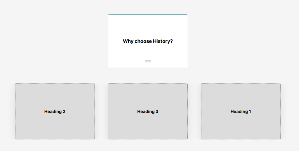
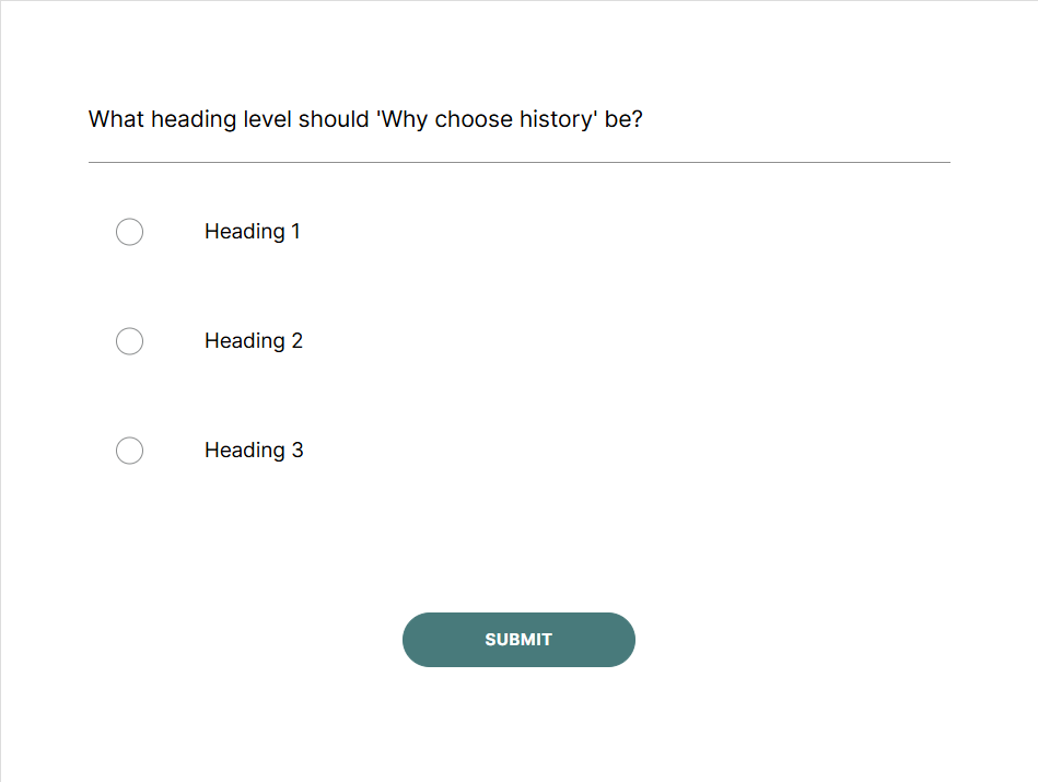
- applying proper heading levels for easier navigation
What we learned
Becoming better designers
Accessibility testing not only improved the course for all learners, but also made us better designers in the process. Taking the lead on this part of the project was a bit of a learning curve, but a valuable one! Using JAWS for the first time took some effort and there was definitely some upskilling involved, especially when it came to navigating headings, interacting with quizzes, and understanding what screen readers prioritise.
The effort was worth it, though, as it gave me a firsthand understanding of what accessible content truly feels like. Even just listening back to a page can highlight issues you might miss when reading. It’s a simple but powerful way to check if your writing really holds up for accessibility and something I’d recommend giving a go.
JAWS hotkey shortcuts to get you started
Overall, the experience has me more aware as a designer, and I’ve already applied what I’ve learned in other projects.
Influencing our content design sessions
Writing effective alt text was a big part of this work, and we tackled it as a team. In doing so, we realised that the topic deserved a deeper dive and decided to run a session on writing meaningful alt text as part of our Content Improvement Club on (our series of meetups aimed at staff who work with web publishing at the University). This helped promote best practices and provide guidance to the wider web publishing community on the topic.
How to write good alt text – Content Improvement Club
Join the UX and Content Design mailing list (University login required)
Find out more about accessible design
If you have questions about assistive technologies and accessible design contact the University Disability Information Team
Looking ahead to the launch
In the coming weeks, we’re preparing to launch the new version of the course. We plan to continue to test and improve things post-launch too, but already, making accessibility central from the start has helped us build a better, more inclusive learning experience.