
Building our Effective Digital Content course in Articulate
We’ve been developing a new version of the Effective Digital Content online course. This post looks at how we built the course using our chosen platform, Articulate Rise 360, and how we found the process.
This is part 4 of our short series on how we built the new version of Effective Digital Content.
Other posts in this series are:
- Part 1: Developing our Effective Digital Content online course
- Part 2: How usability testing helped us to design our Effective Digital Content online course
- Part 3: How we chose Articulate as the platform for Effective Digital Content
Bringing the course to life in Articulate
After deciding to use Articulate Rise 360 as our course platform, the next step was to bring our content to life in a way that was both engaging and easy to navigate. We took the foundational materials from our prototype and transformed them into an interactive digital learning experience using Articulate. Our goal was to build a course that reflected the principles we teach: clear, accessible, and user-focused digital content. We worked collaboratively and used an iterative process, shaped by regular usability testing and feedback.
We built the course together
Only one person could work in Articulate at a time, so to begin with we split the modules between us and took turns placing them in the platform. We’d agreed early on to use one “lesson” block per module, which made it easier to stay consistent and test out different layouts and features. This gave us a chance to explore the platform and build on what we’d learned during our free trial.
Once all the modules were in, we met to review and refine the course. We shared discoveries about what worked best and what we could improve.
As we moved forward, we scheduled collaborative sessions to work together in real time. This helped us stay in sync during usability testing and make decisions based on what we were seeing. We used shared documents to track changes and ideas, and this approach helped us stay aligned while moving quickly.
We used Articulate’s features to build an engaging course
Thanks to its block-based format and our knowledge gained from the free trial, we found Articulate straightforward to use. There was slightly more flexibility and range of options available with full access. The Block Library was well organised and clearly labelled, making it easy to find the right tools for each part of the course.
The interface was intuitive, and it was simple to build out pages and place different types of content. The built-in examples were especially useful for understanding how interactive blocks worked. These included tabs, accordions, labelled graphics, and quiz blocks, which were all easy to customise. They helped break up the content and keep learners engaged without needing any complicated setup.
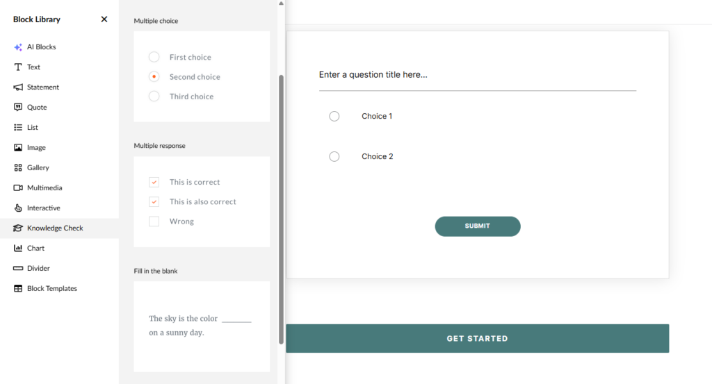
A screengrab of Articulate’s interface, with the Block Library and an inserted Knowledge Check block, showing the placeholder text
We also used “continue” blocks to break the course into manageable sections. Feedback suggested this helped learners move at their own pace and made the course feel structured. The sidebar progress tracker was another positive feature, as it gave learners a clear view of where they were and let them revisit sections easily.
From our prototype testing, we knew that images played an important role in supporting understanding. In Articulate, adding images and pairing them with text was quick and easy. We also used quiz blocks with instant feedback to help check learning. Previewing the course was simple, which made it easy to check how everything looked on both desktop and mobile. Once we were comfortable with the platform, making updates became much quicker.
We created an accompanying workbook
As there was no option to use free text boxes in Articulate, we created a downloadable Word workbook to be completed alongside the couse modules. This was to help learners apply course concepts to their own work. It included practical tasks linked to each module, with prompts to use a real University webpage where possible.
The workbook encouraged reflection and action beyond the course, moving from theory into practice. It was also designed as a resource learners could return to later.
Accessibility was a priority from the start
We wanted to make sure the course met accessibility standards. Articulate includes helpful built-in features and clear guidance on how it aligns with the Web Content Accessibility Guidelines (WCAG).
Rise 360 and Web Content Accessibility Guidelines
We were able to add alt text to images easily, and embedded videos included a caption toggle by default. We used the document block to upload transcripts, giving learners multiple ways to access the content.
Articulate’s default colour schemes meet contrast standards. When we used custom colours, we tested them using WebAIM to make sure they still met accessibility requirements.
While Articulate covers many accessibility basics, we also did our own manual checks to make sure both the course and the workbook met our standards. We’ll share more about that process in our next blog post in the series.
We tested the course and the workbook with users
We ran usability testing throughout development, watching how people used both the course and workbook. This helped us spot areas for improvement, related both to content and the way it was presented.
Learning as we go from users
Watching learners use the course gave us valuable insights and allowed us to make evidence-based improvements. We made a range of changes based on feedback, including:
- refining module summaries to better match the content
- making instructions for in-course interactive tasks clearer, especially where a labelled graphic was paired with a matching exercise
- letting learners know how many quiz questions to expect in advance
Workbook testing focused on three areas
We made sure tasks and instructions made sense
As an essential part of applying their learning, it was important learners understood the activities in the workbook. User testing was beneficial in seeing if our instructions were clear. For example, in one task, learners were asked to break up a block of text using headings. Some struggled at first but referred back to the course for help, which was great to see. We updated the instructions to suggest a suitable number of headings and remind learners of the key principles. We also spotted a terminology mismatch: “chunking” was used in the workbook but not in the course, so we made changes to align the language.
We set clear expectations
Learners appreciated knowing the workbook wasn’t graded but still needed to be completed. We made this clear in both the course and workbook. The phrase “not graded” tested well and helped set the right tone. We also made sure it was clear they’d receive feedback on their submission.
We decided how to manage submissions
We tried out a few options and found Microsoft Forms worked best. It was simple for learners to upload their workbook, and easy for us to manage and review responses. We also created marking guidance to support the reviewing process.
The course and workbook are still a work in progress
We’re continuing to test the course and workbook ahead of launch. This ongoing feedback has helped us spot small issues and refine the overall experience. We’re also encouraging feedback from people completing the course during its soft launch and beyond, so we can continue to improve it as we roll it out more widely.