Global Health Map
Overview
Interactive Content were contacted by CMVM Research Office and Communications and Marketing to create a bespoke, engaging and easy-to-use interactive map. This resource highlights where the University’s research and innovation in health are making a difference around the world.
The map had to be (client) administrator editable and sustainable. We used WordPress for the Content Management System (CMS) and a third-party plugin solution called WP Go Maps for the interactive map. The site went live in January 2024.
Charlie, Jackie and Stewart from the Interactive Content team discuss some of the technical solutions used and how we solved key accessibility and General Data Protection Regulation (GDPR) considerations.
WP Go Maps – Categories Filtering (Charlie Chu)
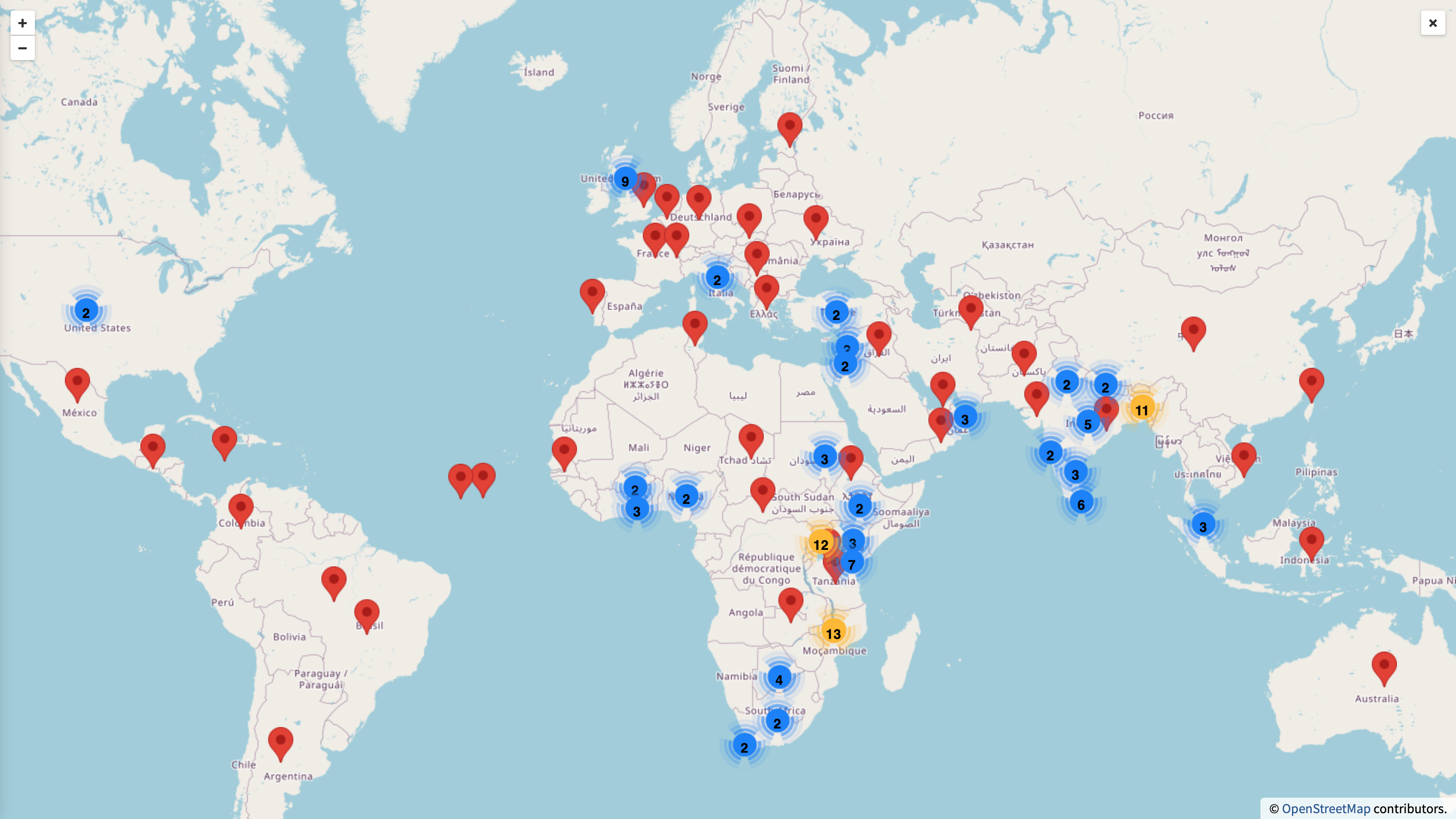
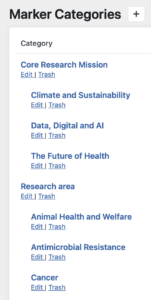
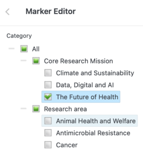
One of the nice built-in features comes with the plugin would be the “Categories Filtering”. This function helps us to set up a neat way to categorise all data into multiple pre-defined categories, and we can then filter the map data based on the categories within the map.
So how easy when we come down to use the built-in feature? The first thing we need to set-up in the map backend was our pre-defined categories, so that we can key in all of them to the plugin (refer to the image on the left). And boom, you can select all your pre-defined categories within the map editor (refer to the image on the right) which means that you are ready to filter your data within the map.
Talking enough about the boring backend setup, you might find that it might be much more interesting to see how the “Categories Filtering” work in the frontend. Below are two screenshots showing how the map data would be changed on-the-fly when a category was picked-up.
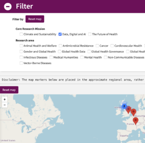
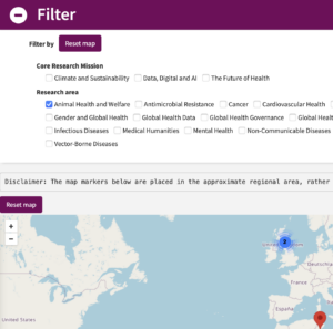
The beauty of this feature is that you can quite easily visualise your map data with your pre-defined categories without touching too much HTML, JavaScript and CSS (of course, if you want some nice presentation, you will need them anyway). And thanks for this fast iteration process, if you are not happy with the categories filtering, you can always change them until you get a nice result.
Accessibility and maps (Jackie Aim)
We are all keen to make our websites and media accessible, so a map is always going to be an interesting challenge. Even though the filters discussed above are accessible, what about the map marker details?
Alternative formats
As it turns out however, the WP Go Maps plugin has an option to display a table below the map with details from the markers. We discussed this with the client and advised them it would be good to have this option presented on the page for improved accessibility.
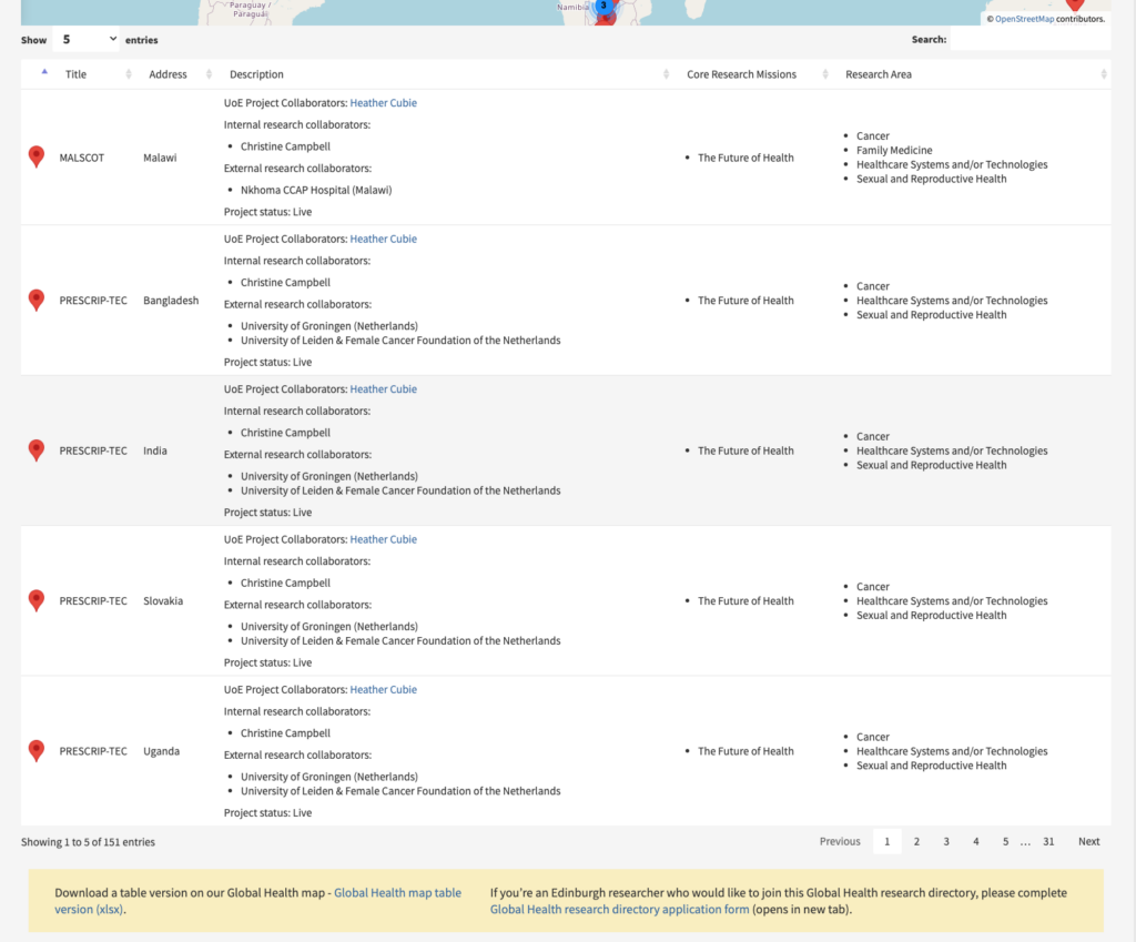
Along the top of the table there is a search function and a ‘number of entries’ dropdown. There are 5 entries set to display on the page as default, but you can choose to have more if you prefer.
You can click on the table rows, and it will take you to that marker on the map. This option doesn’t seem to work without a mouse though. The table is also fully responsive, so works nicely on mobile.
In addition to the table, we included a link underneath to a downloadable spreadsheet of the map details, so if anyone can’t access the map or the table there is another option to see the data.
Data protection and privacy (Stewart Lamb Cromar)
During the early development stages, we raised a few questions with the client regarding data protection and privacy. They subsequently consulted the University’s Data Protection Officer for specific advice on publishing researcher names and locations on a publicly accessible resource.
Lastly, we recommended avoiding the use of precise geographic locations (latitude and longitude coordinates), On the live website, map markers are now placed in the approximate regional area, rather than indicating a specific research location.
Summary
Feedback from the client has been positive, they passed on a thanks from other colleagues to say how useful the map is.
Check out our map and table:
For anyone interested in more about the capabilities of WP Go Maps:
If you require something similar, please get in touch:


N.B. Closing date now extended to 23:59 on Wednesday, 4th of March.
Thanks Stewart for your encouragement!
Thank you Miki. I very much enjoyed reading this with my morning coffee. It was lovely to have such a…
Hi Otis
What an insightful blog post, I've learnt a lot