N.B. Closing date now extended to 23:59 on Wednesday, 4th of March.
Thanks Stewart for your encouragement!
Thank you Miki. I very much enjoyed reading this with my morning coffee. It was lovely to have such a…
Hi Otis
What an insightful blog post, I've learnt a lot
Conveying statistical concepts through animation and data storytelling
July 2020, I had just finished a large-scale migration project so it was good to have different projects to work on, and this was the one I was looking forward to the most.
Normally meeting a client for the first time would be face to face but due to current circumstances this wasn’t possible. So, this was my first project from concept to completion totally online. Dr Glenna Nightingale from the School of Health in Social Science, at the University of Edinburgh approached us looking for an animation that would create a visualisation of an individual’s ‘impact on another in a spatial context’, relating to Covid-19.
I really enjoyed collaborating with Jacqueline on this project. I believe that the idea of conveying statistical concepts through animation and data storytelling is a refreshing approach to teaching statistics.
Our creative journey
After our initial meeting Glenna provided me with a script for ‘Zones of influence’. The script included details of what she wanted to happen in the animation and was to be no longer than 30 seconds. I suggested Glenna record the audio voice over as early as possible to work with the timing of the animation.
As there was no additional budget for bespoke illustrations I had to source open-licenced assets instead. Sourcing images takes enough time in itself, finding not just a nice image but one you can manipulate for animating so the file format is important. I managed to find suitable free vectors from Vecteezy.com which could be used as long as they are given attribution.
I used After Effects to create the animations and Adobe Illustrator to edit the graphics. In this animation one of the characters walks towards another, this meant I had to make sure each joint of the arms e.g. upper arm, lower arm, hand, and the same with the legs all have to be separate parts to make it look like convincing.
Jacqueline and I worked on the animations using an iterative model. It was an exciting, creative collaboration and I appreciate the expertise that Jacqueline brought to capture my ideas on paper into these animations.
We met regularly, I would send a link to the latest version of the video (uploaded to Media Hopper) and Glenna would give me feedback. The final video was completed in October 2020.
‘Spatial distancing and the concept of zones of influence’
This was a really fun project and I had the good luck to work with Glenna again on two further animations at the beginning of 2021.
Further collaboration
As we had done with the first animation Glenna sent me the scripts with details for the animations. I sourced more images and the voice overs were recorded early on.
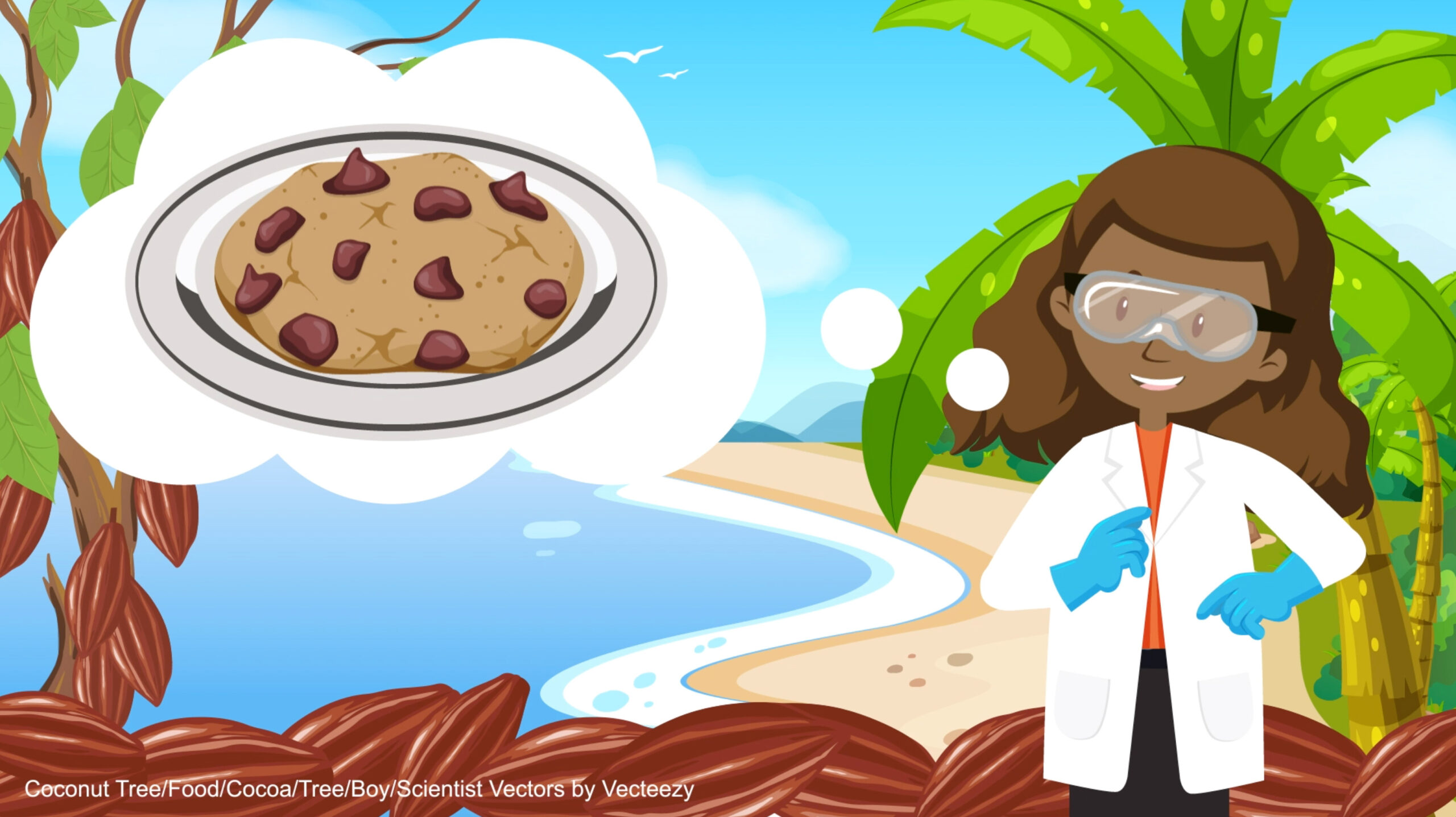
These both start with a tropical theme, it was fun and challenging to use the 3D camera in After Effects. Making the scene look like you are zooming out without running out of image. I also sourced public domain sound effects from Freesound.org to add at the beginning of each of the animations. The ‘Confidence intervals’ animation is about the average number of chocolate chips in biscuits and ‘ANOVA’ looks at the average yield of different cocoa varieties. Because they have a similar topic I was able to reuse some of the images from ‘confidence intervals’ into ‘ANOVA’. They were completed in February and March 2021.
‘Data storyboarding: confidence intervals’
‘Data storyboarding: ANOVA’
Glenna’s research project
You can find Glenna’s project with the animations incorporated in an R Shiny app:
https://bayesiannetworks.shinyapps.io/taking_the_biscuit/.
They can all be found under the tab ‘Animations’. Glenna is also working on another animation with a PhD student which is funded by the University of Edinburgh Futures Institute.
A selection of feedback from staff and students
The animation regarding the ANOVA test was helpful.
… I could potentially use one or two of your tools for a short demo.
Thus thanks a lot for sharing an exciting teaching aid tool.
…I would be interested in this potentially for teaching my third year course (as well as a new course I will be starting next year)…
Copyright & open licence
All these videos are intended to be shared, reused and remixed. In order to encourage this we’ve applied a Creative Commons open licence.
The requirements are to include the following attribution, not use the material for commercial purposes and if you remix the material, you must distribute your contributions under the same license as ours.
Attribution
By Glenna Nightingale and Jacqueline Aim.
Copyright © University of Edinburgh 2021 CC BY-NC-SA
This work is licensed under a Creative Commons Attribution-NonCommercial-ShareAlike 4.0 International License.
Download the videos
Dedicated Media Hopper Create channel

Great little animations about one of my favourite subjects (yes, I’m a statistics geek).
Thanks Karen!
What an amazing post! I always look forward to reading your posts.
They are so engrossing and well-written. The way you consider your readers’ preferences and leave a hint of personally relatable experiences is simply exceptional. There are always a few lines in your posts that stick with me and keep me hooked on your writing. Reading one of your blogs immediately makes visitors want to read another and share it. This post was wonderful, and please continue to share such blogs in the future.
I believe that my expertise in the field in which you write will be very beneficial to you. You can get a sense of my writing style by browsing through my high-quality content.