Any views expressed within media held on this service are those of the contributors, should not be taken as approved or endorsed by the University, and do not necessarily reflect the views of the University in respect of any particular issue.
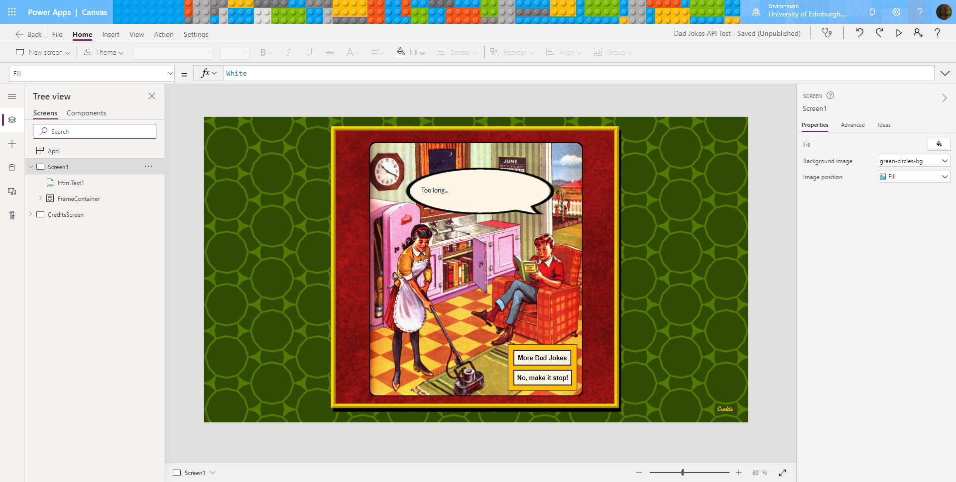
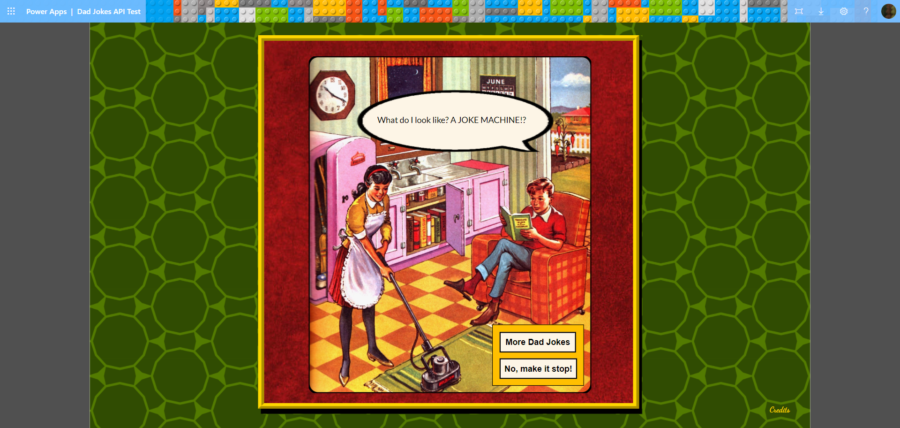
When I was creating a demo Power App to fetch and display Dad Jokes, one of the challenges I faced was to fit the joke text inside a speech bubble graphic. The speech bubble was expandable, but only within limits, so I needed to keep fetching jokes and checking the length of their text until I found one short enough to fit inside the bubble design.
After clicking the button: the app enters the loop and the text changes to ‘Too long’
However, looping in Power Apps turned out to be tricky. Unbelievably, I discovered there is only one kind of loop in Power Apps: ForAll, which is used for looping over tables and collections. Power Apps really doesn’t have any other kind of loops, or even GoTos in the coding it makes available.
Making a While Loop in Power Apps
However, after much research, trial and error, I found a way to do this with just the loop (More Dad jokes) button and a hidden toggle:
The Problem: How could I access data fields from a SharePoint Person column to display in another column?
I’ve been developing a laptop booking system in SharePoint and PowerApps.
As part of the Bookings list, I need to display data columns for the borrower’s name, user id and email address. This data is all included within SharePoint’s ‘Person or Group’ data type, however, I can’t access the Person data fields using lookup or calculated columns.
This post describes a Power App that fetches and displays data from a simple REST API using a custom connector created by importing from Postman. The app also uses a Toggle control to create a While loop in Power Apps.
I’ve recently been working on a project to access our Blackboard Learn Virtual Learning Environment more efficiently using REST APIs. It occurred to me that this might be possible using Microsoft Power Apps, which could allow the development of apps more quickly, if we could get the connection itself figured out. The Dad Jokes app was developed as a proof (or otherwise) of the concept.
A couple of weeks ago I discovered a University document called the New Learning Technologist Development Toolkit. And so I began a new project to follow it and develop my skills in Learning Technology. Obviously a project like this needed some way over the top organising… 😁
A while ago, I developed my own Microsoft Team called ‘Team of Me’, for organising myself and bringing my notes and notifications together in lockdown. This seemed like a good place to organise my training plans, so at first I created a channel in this Team to collect resources for this new project.
I began setting up a plan in Planner, creating lists of links, collecting PDF resources, making a few notes in the OneNote notebook and setting up some helpful Flows to channel messages into the right places, and cheer my progress along.
However, I soon discovered that the New Learning Technologist Toolkit, which looked like a short PDF, was actually a lot bigger than I’d thought. Everything it mentioned sent me down another rabbit hole of links and documents, and I realised it would need several channels in its own right to organise it all.
In fact, I began to suspect that becoming a Learning Technologist would take a lot longer than the 4 weeks listed after all. Who knew🙄. And so I decided to set my project up in a new Team of its own, which I’ve called ‘My New Learning Technologist Toolkit Team’.
The challenge now was to copy across the content I had collected and created in my original Teams channel into this new team.
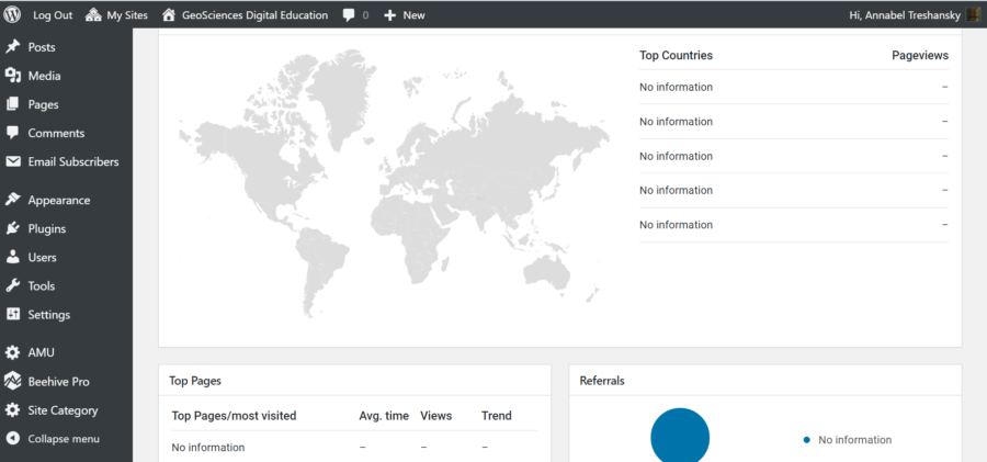
I’ve been having fun with Google Analytics this week😃.
Yesterday, I needed to add statistical tracking to our Digital Education Team blogs on the University’s hosted version of WordPress. This has previously been no problem (eg with this blog), but with the new blogs, it didn’t work.
I created a new Google account for the team with our non-Gmail address, and that turned out to be fine.
I set up a Google Analytics account for the team, and that all seemed to work too.
But when I tried to connect my Analytics account to the Beehive Pro statistics plugin in the blog, it couldn’t find the website listed in my account. It said there wasn’t a ViewID. I was able to authenticate the Google account with the plugin, but the plugin couldn’t find anything in my Analytics account to associate with it.
Here is a summary of the Google Analytics account structure:
Organizations: An organization is an optional way to represent a company, which lets you access your company’s product accounts (e.g., Analytics, Tag Manager, Optimize), and manage product users, permissions, and cross-product integrations.
Accounts: You need at least one account so you can have access to Analytics, and so you can identify the properties you want to track. An account can be used to manage one or more properties.
Properties: A property is a website, mobile application, or device. When you add a property to an account, Analytics generates the tracking code that you use to collect data from that property. The tracking code contains a unique ID that identifies the data from that property, and identifies it in your reports.
Views: a View is (or was) a defined view of data from a property. Users are given access to a view so they can see the reports based on that view’s data. Analytics creates one unfiltered view for each property you add, and allows you to create more defined views using filters.
So, what could have gone wrong?
The first thing I checked was the Analytics account permissions, in case my plugin, although authenticated with Google, wasn’t actually authorised to do anything. But these all appeared to be correct: I had granted the default permission set of "Edit, Collaborate, Read & Analyse, Manage Users", so all the required permissions were there.
However, looking in the Analytics account, many things did look different from the various help and instructions available. They also looked different from my own personal account:
The Tracking info option wasn’t listed under Admin > Property.
There were no Views listed in the Admin panel, and I couldn’t see any way of adding one.
I noticed that the tracking code for my web property began with 'G-' instead of the usual 'UA-'.
There were a lot more interactions available for tracking
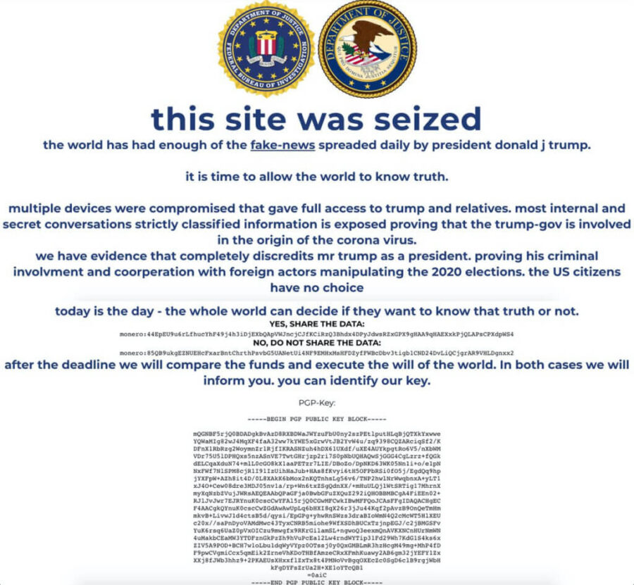
US President Donald Trump: He’s hacked, but is he fired?
I have no idea how the election will go, and I don’t want to comment on politics here, but I’ve just read a very interesting article about the Trump campaign site being hacked.
If you’re looking for how to do this yourself, let me save you some time: there’s a good post about it here: How To Change The Favicon In SharePoint Online, but it does require SharePoint Designer and the last 2 steps didn’t quite work for me.
Fatal Distraction:
Once upon a time…
I was almost making progress on starting a SharePoint project when instead I got annoyed with the enormous number of identical tabs that SharePoint opens in the browser:
Too much, SharePoint, and it all looks the same!
So I wanted to upload a favicon for my subsite. It’s the little icon that goes in the web browser tab to distinguish one site from another. Like this:
My favicon of choice, but bigger
It’s maybe a 10 minute job to change it on ANY NORMAL WEBSITE. So I thought it would be a nice, useful way to find out a little bit more about the workings of SharePoint…🤪
That also looks simultaneously deadly boring and nightmarishly terrible?
(ahem, involves SharePoint, obvs)
If SharePoint was having a bath it would be like this
To recap my previous posts on this, I am starting work on a big project to tidy up the filing system on a big shared network drive that has been used by many different people in different ways over many years. As well as sorting out the files themselves, the filing procedures used by the office staff will also have to be rationalised, standardised and brought in line with data protection regulations, using metadata, SharePoint, possibly PowerApps, and Flows, which are the new version of SharePoint Workflows. And the office staff will hate that.
For those who have managed to avoid it, SharePoint is what happened when Microsoft sent their Trainspotting and Alphabetisation Club to learn bureaucracy from every big organisation in the world. I fully expect someone from Microsoft to land in my comments someday and say that’s true.


