
I’ve just spent an interesting evening attending a meetup / webinar called “Let’s Talk Content Design,” hosted by the UX Glasgow Meetup group.
Defining Content Design
Several speakers talked about this quote from Sarah Winters, defining content design:
Content design is a way of thinking… It’s about using data and evidence to give the audience what they need, at the time they need it, and in a way they expect.
— Sarah Winters, Content Design
Mapping the content design process to the definition
Lauren Tormey, a content designer from the University of Edinburgh’s web content and marketing team, spoke first, on the subject of content design and the university’s website for student recruitment.
She described some key considerations in mapping the content design process to the definition:
- Research, using data and evidence
- User needs (to provide what the user wants)
- Channel and journey mapping (to give the audience the information they need at the time when they need it)
- Language and emotion (to provide the information in a way the user expects)
- creation
- sharing
The Double Diamond Design Methodology
She described the ‘Double Diamond’ process used by the Prospective Student Web Content team to optimise to experience of students using the university website to discover their course costs.
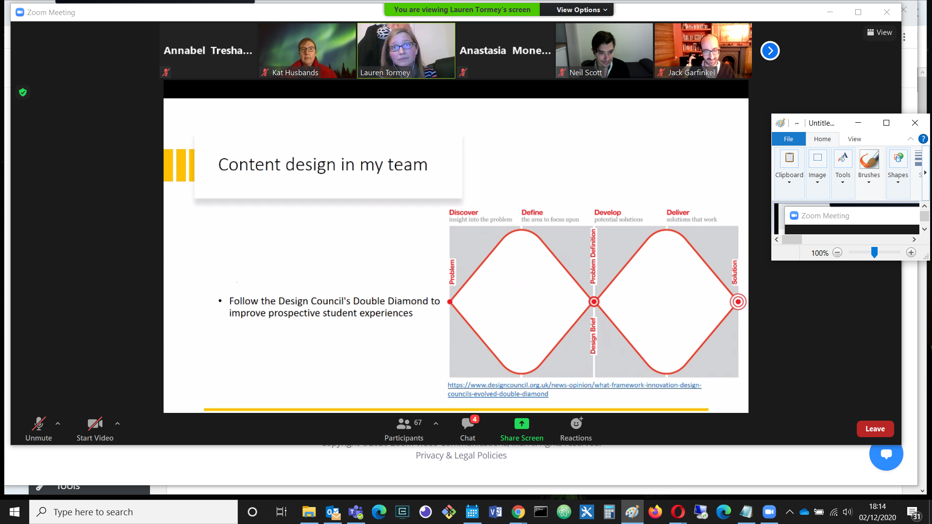
The Design Council’s Double Diamond process, as used in user interaction research and content design by the University’s Prospective Student Web Team.
The design process moves through stages of discovery, definition, development and delivery. The wide stages indicate divergence: gathering information, and considering different possibilities, while the narrow points are stages of convergence, in which the many options are narrowed down to a choice or a certainty.
More information about the Design Council’s Double Diamond design methodology can be found here: https://www.designcouncil.org.uk/news-opinion/what-framework-innovation-design-councils-evolved-double-diamond
Here are some photos of the usability research process in action. I attended the session with the post-its myself and found it an interesting experience, so this was a nice reminder. The Post-its were for questions raised, and the dots were votes for the importance of the issues on each Post-it:
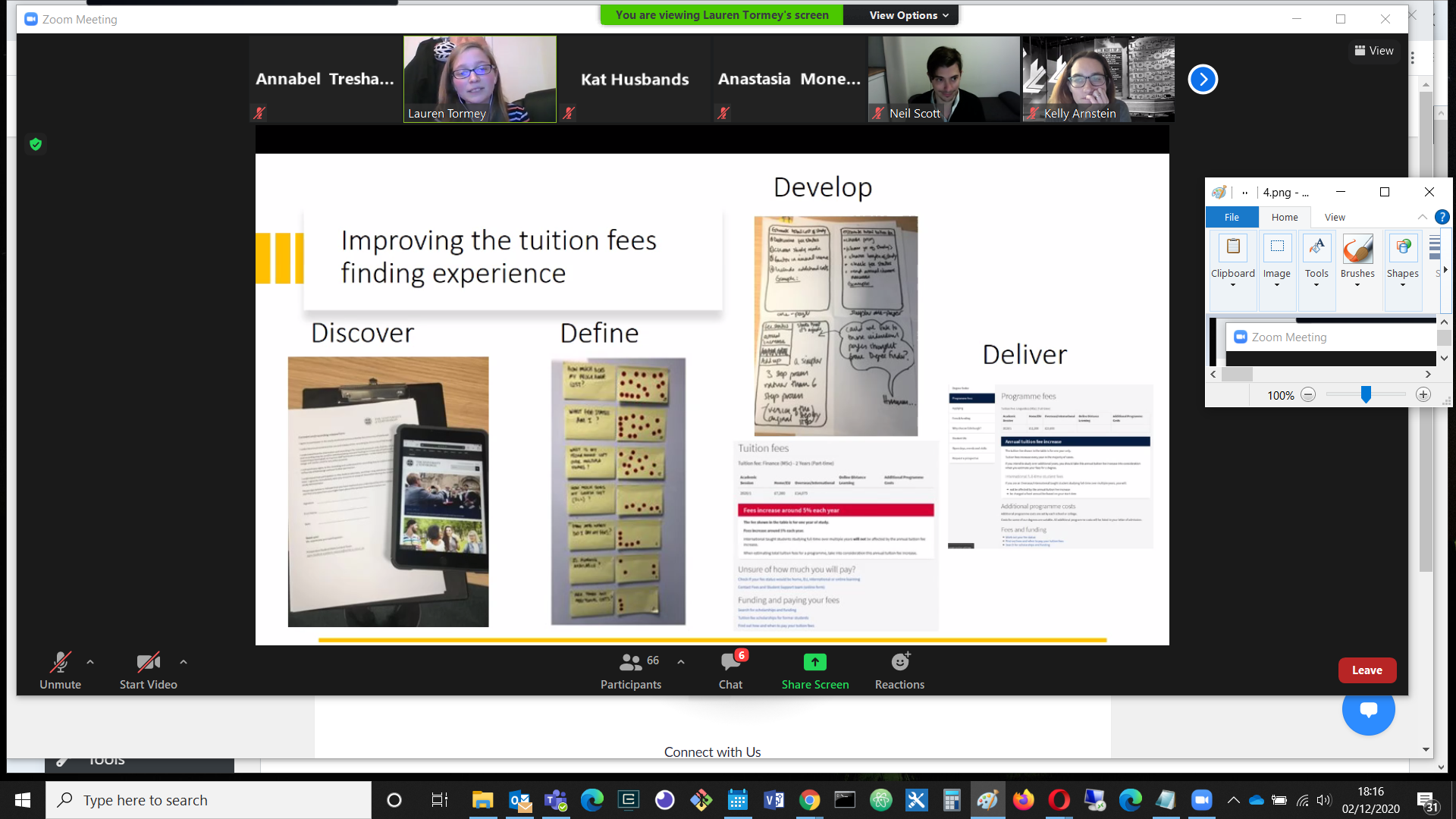
Usability research: it might look low tech with its Post-its, but it makes for a better end product!
The importance of UX writing
Lauren also spoke about the importance of UX writing in developing content design and an overall content strategy.
The following example from Twitter demonstrates the importance of getting the wording right:
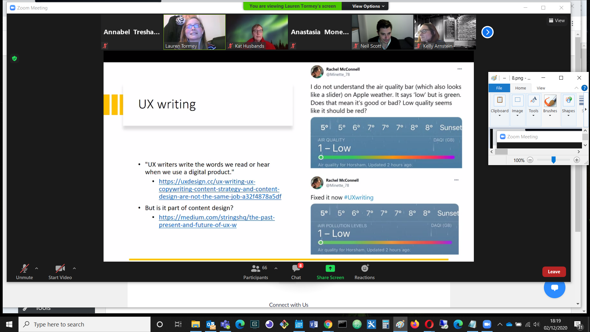
The scale is labelled ‘Air Quality’, but the ‘Low’ end is green, which looks like the safe end when compared with red. Changing the title to ‘Air Pollution Levels’ makes more sense.
The Readability Guidelines website offers an evidence based style guide for writing usable, inclusive content at https://readabilityguidelines.co.uk
Tips for writing usable, inclusive content
Some key suggestions from Lauren include:
- Breaking up content with short paragraphs, subheadings and lists
- Using respectful language in relation to mental health and disabilities
- Choosing plain English instead of jargon or long words
Kelly Arnstein, a UX Designer from the University of Glasgow, also spoke about UX writing, recommending pair writing and team crits, and made the following specific recommendations:
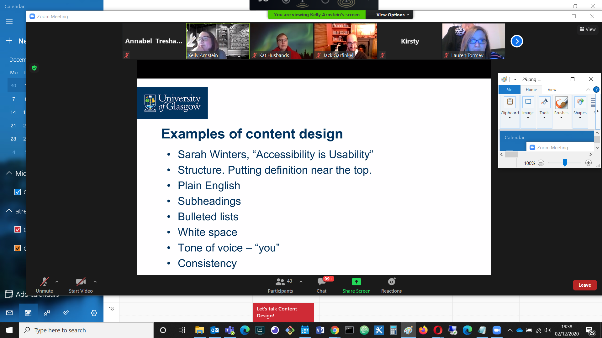
This list itself looks like a good example of clearly structured written content design!
An app called Hemingway was also recommended for checking the readability of writing.
UX Challenges: Introducing a Complex New System
Kelly Arnstein also spoke about the user interaction challenges of implementing a new multi-factor authentication system for the University of Glasgow.
University services like Office365 are frequently targeted in brute force and phishing attacks, resulting in compromised accounts.
Multi-factor authentication was introduced with the aim of reducing the 95% of information security incidents at the University that were caused by compromised user accounts.
Multi-factor authentication involves combining two factors to verify identity:
- Something you know (eg username, password)
- Something you have (a device: phone / tablet)
The design context
The following slide describes the design context, and the problem:
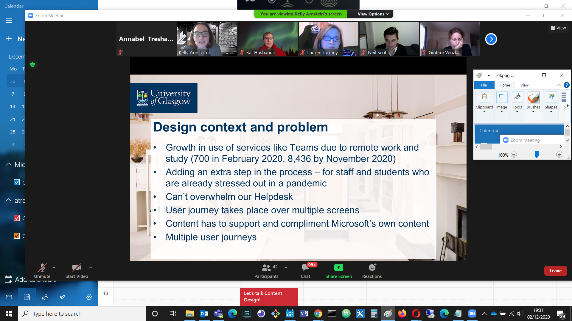
Massive growth in service use, finite helpdesk resources, Microsoft design constraints and extreme variability among already stressed users all contributed to the challenge.
User journeys
The team identified several different possible user journeys:
- Users who didn’t have the app
- Users who did have the app
- Users who didn’t know if they had the app or not
- Users who didn’t have a device
- Users who didn’t want to download the app
It sounds like a very mixed group of people to provide for! Here is how they managed the challenge:
- The team started work in Word and Google docs to reduce distractions.
- They checked the writing with Hemingway.
- They used the CMS to check for structural issues.
- They used wireframing to test out alternative layouts and structures.
- They used moderated and unmoderated testing.
Getting a job in UX Design
Jack Garfinkel, a Content Designer for Scope, posted this user story that describes what a hiring manager would look for in a UX design hire:
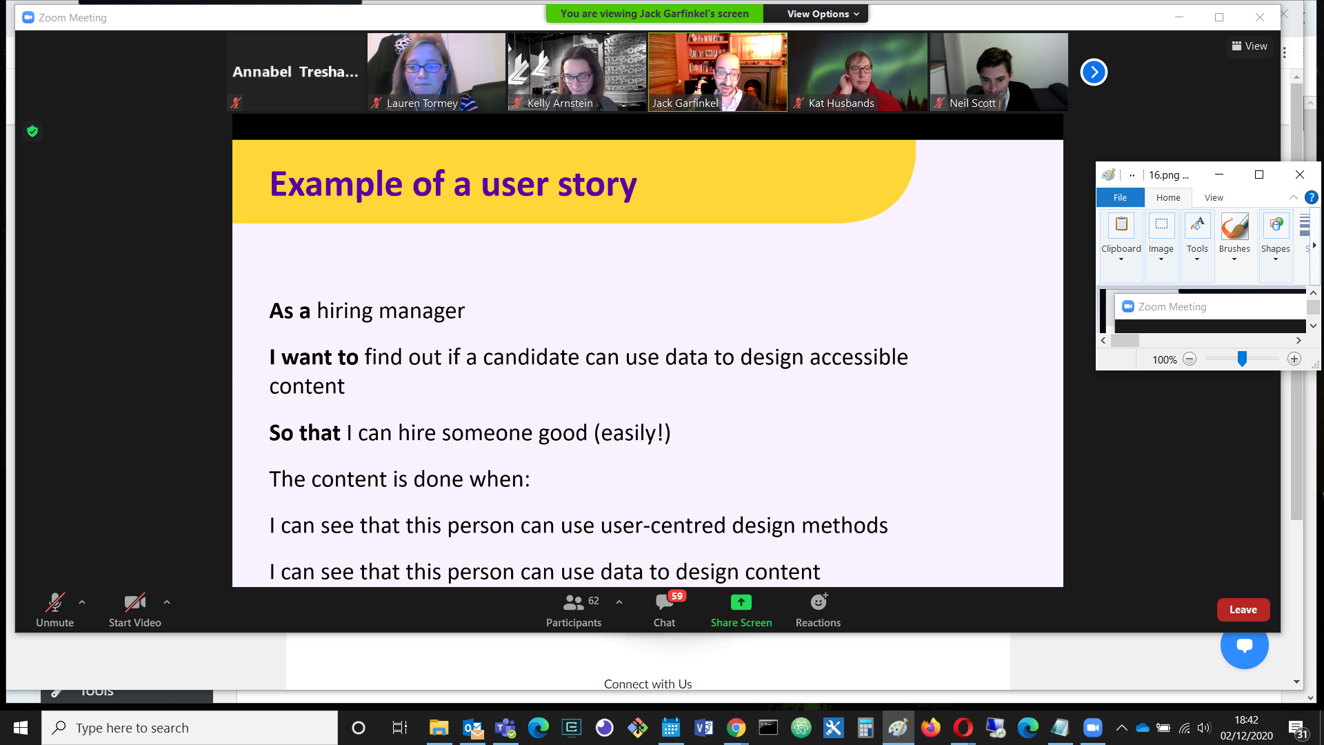
A very relevant user story! It’s interesting to see the importance of combining user centred design methods with the use of data to inform that design.
In particular, he said,
I want to see you tell a story like this:
- My research showed that users needed X, so I did X
- When I tested it, I found out Y
- Because of Y, I changed Z
One interesting use of data that was mentioned was the use of Google Analytics for search engine optimisation. Google’s own Analytics Academy was recommended as the best resource for learning the skills to work with that.
What can we all do to help create user-focused content?
I’ll let Lauren Tormey have the last word with these recommendations:
- Carry out user research
- Develop prototypes of interfaces
- Collaborate more closely with content practitioners
- Follow the Readability Guidelines in our writing
And – don’t let content be an afterthought, be an advocate for it!
Links
- UX Glasgow
- UX Glasgow Meetup Events on Eventbrite
- Jack Garfinkel’s slides
- Lauren Tormey’s slides
- UX Scotland Facebook Group
- The Design Council’s Double Diamond design methodology
- Readability Guidelines
- Google Analytics Academy
- Hemingway Editor
- What is Content Design?
- Content Strategy
- UX Writing, UX Copywriting, Content Strategy, and Content Design are not the same job
- Service design and the Mario complex
- Free Content Design course on Future Learn
- Plain English: The A-Z of Alternative Words
- Grammarly
- Readability Guidelines app
- Content design at Scope
- Best UX Writing Portfolios (2020 update)
- Just Enough Research
- Multi-hyphenates
- Writing is Designing
- Sarah Richards – Accessibility is usability
(Screenshot from UX Glasgow's meetup, slide by Lauren Tormey.)


Leave a Reply