Any views expressed within media held on this service are those of the contributors, should not be taken as approved or endorsed by the University, and do not necessarily reflect the views of the University in respect of any particular issue.
After presenting the two earlier passport concepts, we received feedback that both directions had valuable qualities worth preserving. Rather than choosing one over the other, we decided to combine elements from both and develop a final hybrid design.
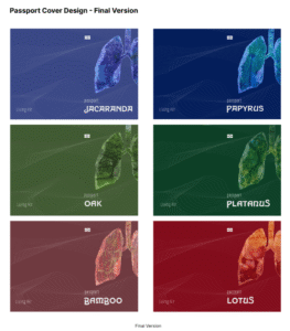
The final passport covers integrate the official structure and atmospheric line patterns from Version A with the symbolic lung imagery from Version B. The flowing lines were retained to suggest air currents and movement, while the lungs became a central visual motif representing breath, environmental conditions, and the identity of each virtual nation. Each country was further distinguished through a unique colour palette and environmental imagery embedded within the lungs, linking national identity to different atmospheric ecologies.
This final design allowed the passports to function both as believable travel documents and as speculative artefacts, balancing realism with conceptual storytelling. By merging the strengths of both earlier versions, the final covers more fully reflected the core idea of the project: imagining citizenship and mobility through the lens of air.
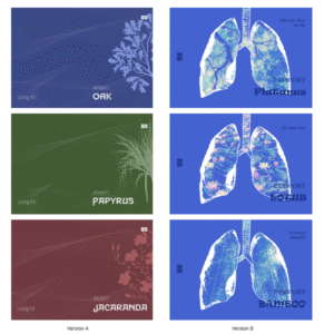
We developed two different design directions for the passports of our virtual nations.
Version A took inspiration from real-world passports, focusing on a more conventional and official aesthetic. Each passport used a distinct colour associated with its nation, combined with botanical motifs representing the country’s symbolic plant identity. Flowing line patterns across the cover were designed to suggest moving air currents, reinforcing the project’s connection to atmosphere and air mobility. This version aimed to feel believable and familiar, echoing the visual language of existing travel documents.
Version B, in contrast, moved towards a more speculative and symbolic approach. Instead of following traditional passport graphics, we placed illustrated lungs at the centre of the cover, treating breathing and air as the core identity of each nation. The lungs were filled with environmental imagery—such as forests, bamboo, and lotus ponds—to connect each country’s ecological qualities with respiratory metaphors. This version felt more experimental and concept-driven, foregrounding the project’s fictional narrative rather than mimicking reality.
By developing these two versions in parallel, we explored the tension between realism and speculation: one making the passports appear credible, the other pushing them closer to artistic artefacts. This comparison later helped us refine the final design by combining elements from both approaches.
Unlike traditional architecture, which depends on form and structure, Blur Building by Diller Scofidio + Renfro replaces solidity with atmosphere. Built for the Swiss Expo on Lake Neuchâtel, the structure exists as a cloud of artificial fog, continuously forming and dissolving in response to environmental conditions.
From a distance, the building appears as a vague mass. As visitors enter, visibility rapidly collapses. Edges disappear, depth becomes uncertain, and spatial orientation is no longer reliable. Movement through the space depends on partial and constantly shifting information.
This instability forces a change in how the body navigates. Vision, typically the dominant sense in spatial understanding, becomes insufficient. Instead, perception is distributed across multiple sensory inputs: humidity on the skin, resistance in the air, sound of water pressure, and the presence of nearby bodies.
Proximity becomes the only reliable indicator of space. Objects and people emerge suddenly at close range, often without clear boundaries. This creates a continuous state of anticipation, where each step is exploratory rather than confirmatory.
Sound plays a subtle but important role. Mechanical noise, wind, and distant movement replace visual clarity as orientation cues. These elements do not provide precise information, but they contribute to a shifting sense of location.
Another key aspect is the absence of fixed form. The building does not maintain a stable outline; its shape depends on wind, temperature, and water pressure. As a result, the architecture feels less like an object and more like a condition—something experienced moment by moment rather than observed as a whole.
What makes this work particularly compelling is how it redistributes attention. Without clear visual structure, awareness shifts toward micro-level sensations: slight changes in temperature, density, and sound. The body becomes more active in constructing meaning from incomplete information.
For design practice, this project suggests that clarity is not always necessary for engagement. By removing stability and predictability, it is possible to create experiences that require active participation. Instead of presenting a fixed environment, the design can invite people to continuously negotiate their relationship with space.
In relation to my own work, this reinforces the idea that interaction can emerge through uncertainty. Rather than guiding users toward a clear interpretation, the experience can remain open, allowing meaning to form through movement, hesitation, and sensory adjustment.
Reference work:
Blur Building (2002), Diller Scofidio + Renfro, Lake Neuchâtel
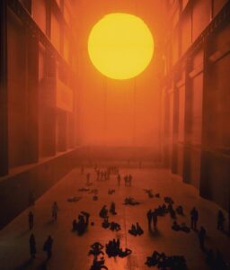
It is often assumed that perception is a direct response to what we see. This assumption is subtly challenged in The Weather Project by Olafur Eliasson, installed at Tate Modern.
At a formal level, the work is minimal: a glowing semicircle, reflected by a mirrored ceiling, completes the illusion of a full sun. Mist fills the space, diffusing light and flattening contrast. However, the work does not end at what is seen. Its impact emerges gradually through how people begin to behave within it.
Over time, visitors slow down, lie on the floor, and gather in groups. Many look upward, not only at the artificial sun but also at their own reflections above. Without any explicit instruction, the installation reorganises behaviour. The space becomes less about observing an artwork and more about inhabiting a shared condition.
What is particularly interesting is that there is no direct interaction system—no sensors, no feedback loop in the conventional sense. Instead, the environment itself operates as a soft form of interaction. Light, scale, and atmosphere guide attention and movement without making this guidance visible.
The mirrored ceiling plays a crucial role. It introduces a secondary layer of awareness: people see themselves as part of the environment they are experiencing. This creates a subtle feedback loop between body and space, where observation shifts toward self-observation. The participant is no longer just looking, but also being seen within the same visual field.
The strength of the work lies in its restraint. Rather than overwhelming the audience with complex media, it relies on a limited set of elements to produce a gradual shift in awareness. This experience unfolds over time, making subtle behavioral changes become obvious.
For my own project, this reference suggests that interaction does not always need to be explicit or reactive. Instead of designing clear instructions or outcomes, it is possible to construct conditions that influence how people move, pause, and attend to their surroundings. In this sense, interaction can exist in atmosphere rather than interface.
Reference work:
The Weather Project (2003), Olafur Eliasson, Tate Modern
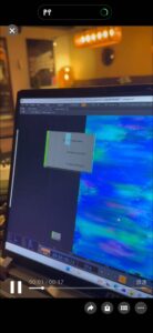
During the development process, we worked with sensors to capture interaction data, particularly subtle changes related to breathing and pressure.
At an early stage, we expected the sensor data to be straightforward and easy to use. However, the actual output appeared as continuous, fluctuating waveforms rather than clear, discrete values. This made it difficult to directly integrate the data into our interaction system.
When connecting the sensors to TouchDesigner, this issue became more apparent. Our interaction logic required stable and readable inputs, but the raw data was too complex and inconsistent to be used effectively.
Instead of trying to preserve all the original data, we decided to simplify it. We translated the continuous signals into basic numerical values by defining thresholds. For example, certain ranges of data were converted into distinct states, such as different levels of intensity.
This process was not just a technical adjustment, but also a conceptual decision. By simplifying the data, we were effectively deciding what aspects of the interaction were important and what could be ignored.
Through this, I realized that data in interactive systems is not neutral. It is always shaped, filtered, and interpreted before becoming part of an experience. What the audience encounters is not raw data, but a designed version of it.
Throughout the project, my contributions focused on device design and assembly, user testing observation, data organisation, and on-site installation.
Working on the physical construction of the installation required translating abstract ideas into tangible structures. At the same time, dealing with sensors and data meant constantly negotiating between technical limitations and desired interaction outcomes.
During user testing and the exhibition, observing participants became an important part of the process. Rather than evaluating whether the system worked “correctly,” I focused on how people behaved within it—how they hesitated, explored, or adapted to uncertainty.
Looking back, the project was not only about building a functioning system, but also about shaping an experience through a combination of material, technical, and behavioural decisions. Each part of the process influenced how the final interaction was perceived.
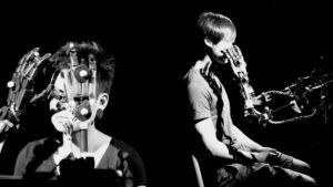
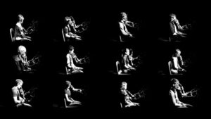
Reference work: Blind Robot (2005), Louis-Philippe Demers & Bill Vorn
This installation presents an interaction between a robotic arm and a human participant, where the robot explores the participant’s face through touch.
What stands out in this work is the shift in roles. Instead of controlling or observing the machine, the participant becomes the subject being explored. This creates a sense of uncertainty, as the interaction is slow, physical, and not entirely predictable.
There is no visual interface or clear explanation of what is happening. As a result, the experience relies on bodily awareness rather than interpretation through instructions or screens.
This made me reconsider how interaction can be structured. In many digital systems, clarity and control are prioritised, but this work shows that removing these elements can create a more intense and memorable experience.
In relation to our project, this reference highlights the importance of hesitation and subtle interaction. Rather than guiding users towards a fixed outcome, interaction can remain open, allowing meaning to emerge through small actions and personal interpretation.
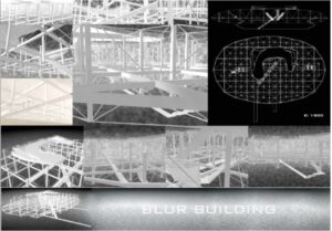
At the beginning of the project, our group focused on developing a concept before deciding to build a physical installation. Once the direction became clear, we started exploring how to realise it materially.
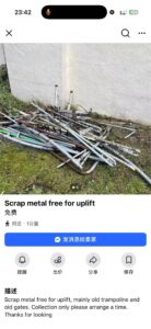
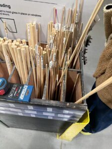
Initially, we tried to find discarded metal rods as a way to reduce cost and reuse materials. We visited three different places, hoping to source scrap metal, but found that these locations only accepted materials rather than selling them. This forced us to reconsider our approach.
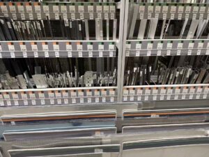
We then looked into purchasing metal rods, but quickly realised that they were difficult to cut and work with using the tools available to us. This introduced a practical limitation that directly affected the feasibility of our design.
n response, we made a compromise: instead of using real metal, we chose wooden rods and spray-painted them with metallic paint. This allowed us to achieve a similar visual effect while making the structure much easier to build and adjust.
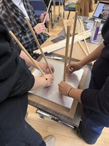
After selecting the materials, we moved on to assembly and installation. We cut, arranged, and fixed the wooden rods into the desired structure, and carefully set up the space to support the overall experience.
This process highlighted how material decisions are often shaped by constraints rather than initial intention. The final outcome was not a direct execution of our original idea, but a result of adapting to available resources, tools, and time. The installation became a negotiation between concept and practicality.
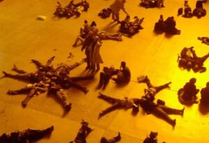
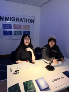
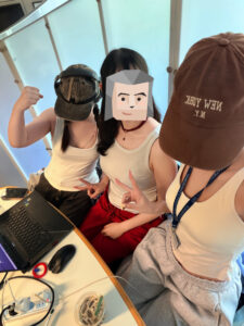
During the exhibition, I was positioned at the “customs” checkpoint of our installation, where the interaction between participants and the system first began.
There were two of us managing this stage. My partner was responsible for communicating with visitors and stamping their passports, guiding them into the experience. My role was more observational and responsive. I monitored the colour of each participant’s passport and adjusted the type of “air” they would receive accordingly, which directly influenced their breathing experience in the next stage.
This role required constant attention rather than direct instruction. Instead of guiding participants verbally, I had to interpret small visual cues and translate them into system responses. This created a subtle layer of control that was mostly invisible to the participants.
What became interesting during this process was how differently people behaved when entering the space. Some participants tried to speak or ask questions, while others remained silent and simply followed the situation. Without clear instructions, people began to rely on their own assumptions, which shaped how they experienced the installation.
This made me realise that interaction does not always need to be explicitly guided. By reducing instructions, the system created space for uncertainty, where participants became more aware of their own actions and decisions. My role, although simple on the surface, was part of maintaining this balance between structure and ambiguity.
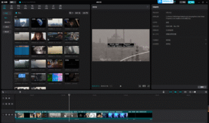
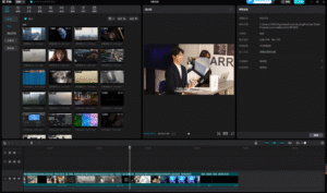
For our final documentation, we produced a video that captures “the actual thing in action” alongside the key resources used to create it. Our team divided the workload into specific modules: while one member handled the overall editing and structure, the rest of us provided content based on our areas of expertise.
It was a funny coincidence that the three of us editing the video all showed up wearing white tank tops that day, without planning it.
I was responsible for documenting the fabrication and sound segments. This included the construction of the breathing apparatus, the modification of the masks, and the intricate process of connecting our sensors to TouchDesigner. By combining footage of our work-in-progress experiments with clips from the actual exhibition day—showing the setup and real-time interaction—we created a comprehensive record of the project’s development. These materials effectively demonstrate how our technical resources, from 3D models to processed audio, converged into a singular, immersive experience.
Before editing this video, I understood “circulation” mainly as a spatial problem—
where visitors enter, how they move, and how they are guided through an installation.
But during the editing process, I began to realise something else:
Circulation does not only exist in space.
It also exists in time.
And editing, in this sense, becomes a way of redesigning the experience.
Translating Space into Time
The video documents the full journey of our installation:
From receiving a passport, to watching the introduction film, passing through customs, entering the interactive installation, and finally arriving at the feedback area.
In the physical space, this unfolds as a continuous sequence of actions.
In video form, however, it must be compressed, reorganised, and narrated differently.
This raised an important question for me:
If the audience no longer walks through the experience, but watches it—does the experience still exist?
While editing, I constantly adjusted the rhythm:
What needs to be shown first?
What must remain?
What should be emphasised?
At some point, I realised that I was no longer documenting the journey—
I was reconstructing it.
From Concept to Sensation: Passport, Smell, and Body
When I reached the core installation section, I paused repeatedly to reflect:
Is the idea actually being communicated?
The mechanism of the installation is relatively simple:
Each visitor receives a passport representing a country
Each country corresponds to a different level of air pollution
The gas they smell is determined by this identity
Meanwhile, their breathing is recorded and visualised in real time
But the project is not really about this system itself.
It is about the question behind it:
If air quality is unequal, can breathing still be considered equal?
During editing, I deliberately broke the logic into short, direct sentences:
“The gas you smell is determined by your passport”
“Different countries, different pollution levels”
“Your breathing is being recorded”
These statements are simple, but they create a gradual shift—
from understanding information to sensing it physically.
Because ultimately, the work does not happen inside the installation.
It happens inside the body of the viewer.
Making the Invisible Perceptible
One of the fundamental challenges of air pollution is that it is difficult to perceive directly.
We may see smog, but not PM2.5.
We may smell something, but cannot measure its risk.
We breathe constantly, yet rarely question the quality of air.
In the installation, we used smell, devices, and data
to make air perceptible.
But in video editing, I faced a similar challenge:
How can someone “feel” air through a screen?
Instead of simulating air, I chose to emphasise difference:
Different passports
Different smells
Different breathing patterns
As these differences accumulate,
they begin to form a realisation:
Air is not a neutral background.
It is a condition that is unevenly distributed.
From Experience Design to System Awareness
Through editing, I also began to see the project differently.
It is not only about pollution itself.
It points toward a larger system:
Why are some regions exposed to higher levels of pollution?
How are air quality and inequality connected?
Why does something as basic as breathing become unevenly distributed?
These questions are implicit in the installation,
but in the video, I wanted them to surface more clearly.
That is why I chose to end with a direct statement:
Breathing is not equally shared.
It is not a conclusion.
It is an opening.
Editing as Re-Design
This process changed how I think about editing.
A video is not just documentation. It is an extension of the work.
In space, the audience moves through the installation.
In video, the audience moves through time.
Editing becomes the bridge between the two.
It translates, but it also reshapes.
Conclusion
When I placed the final subtitle on the timeline,
I realised something quite simple:
We cannot bring everyone into the installation.
But we can make more people aware of what it reveals.
Breathing has never been entirely free.
It is shaped by environment, infrastructure,
and the uneven conditions of the world we live in.
Design may not immediately solve these problems.
But it can make them visible, perceptible, and discussable.