Any views expressed within media held on this service are those of the contributors, should not be taken as approved or endorsed by the University, and do not necessarily reflect the views of the University in respect of any particular issue.
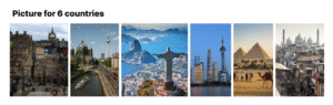
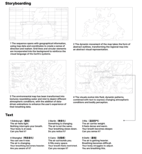
This blog documents the production process of a video set across six countries, which aims to guide viewers through an exploration of the sensory experiences evoked by air and breathing.
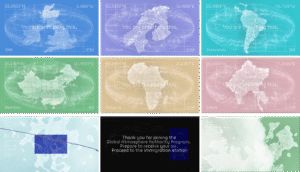
The video unfolds across six distinct locations, each representing a different air quality environment. These locations are not presented as objective facts, but rather as part of a sequence depicting the perception of polluted environments.
The visual elements draw on geographical references and are transformed into abstract forms, whilst text and sound are used to guide the viewer’s experience.
The pattern-making process
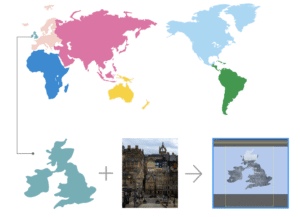
Create vector maps for each region to provide a clear visual representation of geographical distribution, facilitating subsequent visualisation of data across different regions
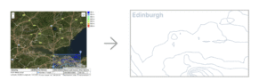
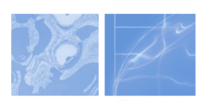
Each selected location has been transformed into a simplified visual form; using Illustrator, cut-out masks were created from photographs of the city and its respective districts to produce the main visuals.
As air quality is influenced by environmental factors such as rainfall and terrain, contour lines are used to enhance the visual representation of atmospheric conditions.
Issue
One key issue identified in David’s feedback was that the entire process felt too monotonous; although the six countries were categorised by pollution levels, this was not reflected in the video.
Furthermore, some of the text was overly prescriptive, thereby undermining the sense of openness that is essential to an experiential video’s ability to engage the audience.
Consequently, the text has been reworked so that each section conveys a distinct tone and intensity. Rather than relying on repetitive, fixed structures, the language now evolves gradually, allowing the reader to experience a progressive journey rather than a static narrative.
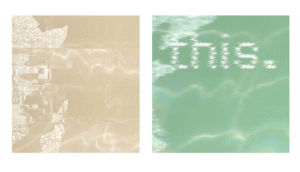
To enhance the experimental nature of the video, disruptive visual elements have been incorporated into the work, including inverted split-screen effects.
This fragmented effect creates moments of instability and unease, shifting the work from ‘representation’ towards ‘perception’ and ‘experience’.
Visual Effects
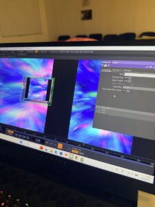
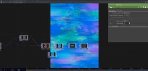
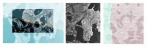
1. Turbulent Displace: The transformation is achieved using After Effects, primarily through the Turbulent Displace effect, which distorts the original map shapes into fluid, organic forms. Changes in distortion intensity simulate variations in air conditions.
2. Motion blur: A combination of motion blur and subtle distortion is applied to the main visuals to simulate instability in the atmosphere. The intensity of the effect increases progressively across different regions, where higher levels of pollution result in heavier blur and more pronounced visual vibration.
3. Inverted Split: An inverted split-screen effect is introduced to fragment the image, creating moments of visual disruption. The duration and frequency of this effect increase in relation to pollution levels, reinforcing a sense of environmental imbalance and perceptual interference.
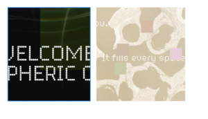
4. Randomised Colour Blocks: Random blocks of colour have been incorporated into the text to simulate digital noise and atmospheric interference. This effect heightens sensory tension and impairs the text’s legibility, thereby reflecting the difficulties encountered in perceiving and processing information under conditions of air pollution.
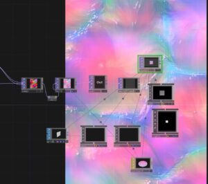
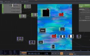
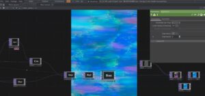
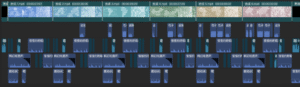
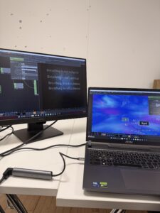
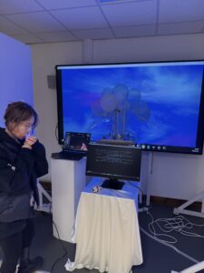
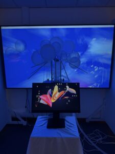
The After Effects video production process
Iterations focus on improving visual clarity, cohesion, and the perception of atmospheric density.
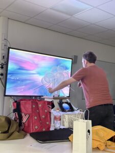
The visual system is realised through After Effects compositing and motion graphics, blending map data with atmospheric texture transitions.
Sound effects
Using sound design assets from CapCut, this piece blends breathing sounds, ambient effects and electronic noise to create an immersive auditory experience. These elements have been layered and modulated to reflect the ever-changing atmosphere whilst enhancing the audience’s physical perception of air.
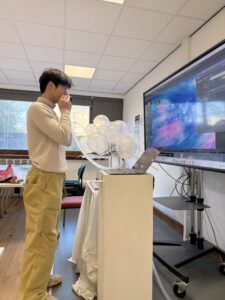
During the critical project push over the past two weeks, we have focused on advancing three core optimization tasks.
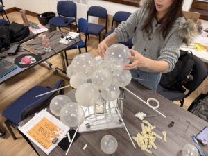
In response to the potential hazards existing in the airbag system, the team conducted comprehensive testing and repair work. Through multi-step operations such as disassembly inspection, seal reinforcement and pressure testing, the airbag is ensured to respond stably under various working conditions and fully comply with safety standards.
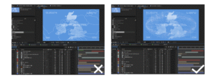
Meanwhile, we have actively adopted David’s professional advice — combining user visual experience research data with interface interaction logic, we have precisely adjusted the key components to the visual center of the screen, which not only improves operational convenience but also optimizes the overall visual balance.
Furthermore, for the presentation effect of the video section, we have made systematic modifications, including optimizing the main visual colors, adjusting the narrative rhythm, adding key information annotations, and resolving the audio-video synchronization issues. Through multiple rounds of refinement, the video content has become more in line with the usage scenarios, and the information transmission has become more intuitive and efficient. All the optimizations have been repeatedly verified to ensure they meet the requirements of project progress.
On March 10, our group had a detailed discussion about how to divide the work. We clarified each person’s role and made sure that both the visual and technical parts of the project can move forward smoothly. The video will be one of the main outputs.
The very important part of our discussion was developing the concept of six virtual countries based on different air quality conditions. Instead of using real-world countries, we decided to create fictional ones.
Each country represents a different type of air environment. For example, some countries have clean, fresh air, while others are polluted, heavy, or artificial. We also started to connect these air qualities with emotions and lifestyles. For instance, a country with “living air” might feel open, natural, and healthy, while a country with polluted air might feel oppressive and industrial.
Based on these ideas, we began designing passports for each country. The passports are not just visual objects, but also part of the storytelling. Each one reflects the identity of its country through color, symbols, and typography. We aim to keep a consistent design system across all six passports, while still giving each country its own unique feeling.
We also plan to include a universal stamp system, similar to customs stamps, to strengthen the idea of “traveling” between different air conditions. This helps turn the project into an immersive experience rather than just a visual presentation.