Any views expressed within media held on this service are those of the contributors, should not be taken as approved or endorsed by the University, and do not necessarily reflect the views of the University in respect of any particular issue.
This group project focused on creating a short video based on a given source, with the aim of communicating a clear and engaging message about air pollution as a global environmental issue. My responsibility was to produce the first one-minute segment, specifically the project background introduction. The goal of this section was to establish context, introduce the problem, and set the tone for the rest of the video. To achieve this, I structured the opening around a gradual narrative progression—from a global perspective to individual human experience.
Through this project, I realized that video editing is not just technical work, but a form of storytelling. Every shot, transition, and timing decision contributes to how the audience understands the message.
One key insight was the importance of visual metaphor. For example, starting with Earth from space helped communicate scale instantly, while ending with breathing emphasized vulnerability. This contrast strengthened the overall narrative without relying on excessive explanation.
I also learned that finding the right footage is as important as editing itself. Selecting clips that are consistent in tone, quality, and meaning significantly improves the final result.
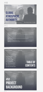
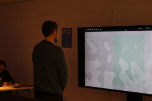
This blog documents the layout process of our final report, focusing on how I organised a large amount of material into a coherent visual structure. Rather than treating the report as a collection of separate outcomes, I approached it as an extension of the installation itself — using layout, hierarchy, and pacing to communicate the project’s atmosphere, system logic, and sensory experience.
One of the main layout decisions was to organise the report by project logic rather than by team member contribution. I wanted the reader to move through the report in the same way they would move through the installation: first understanding the problem, then encountering the framework, then seeing how the device, interaction, video, and graphic systems work together.
A key priority in the layout process was visual consistency. Because the project involved multiple outputs — installation, sensor testing, TouchDesigner, video, passport and poster design — the report could easily become fragmented. To avoid this, I used repeated layout structures, consistent header positioning, section title pages, and a restrained visual palette to make all parts feel like they belonged to the same project world.
Another important challenge was hierarchy. The report contains conceptual writing, technical explanations, diagrams, process screenshots, and visual outputs. I had to decide what should be read first, what should function as support, and what should remain secondary. For this reason, I used different layout densities across the report: more spacious pages for concept and atmosphere, and more structured pages for technical systems and process documentation.
In the sections I was most involved in, especially video visualisation and graphic output, I tried to avoid presenting only final images. Instead, I structured these pages around process: from visual references, to pattern generation, storyboard development, text variation, effects testing, and final screenshots. This made the report feel more reflective and transparent, rather than simply outcome-based.
Through this process, I realised that report layout is not just about arranging content neatly. It is also a way of constructing meaning. In a team project especially, layout becomes the tool that turns separate outputs into one coherent narrative. Designing the final report helped me understand how graphic structure, pacing, and visual consistency can extend the experience of the project itself.
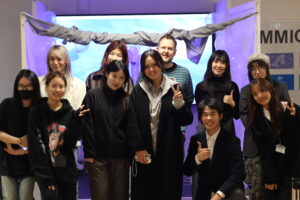
This project was my first time working in a group with eleven people. Before this, most of my previous projects were individual work or small team collaborations. Because of this, joining such a large group was both exciting and challenging for me. It gave me a new understanding of teamwork, communication, and collaborative design.
At the beginning, I felt a little nervous. In a large group, there are many different personalities, ideas, and working styles. Everyone has their own strengths and opinions, so it can be difficult at first to find a common direction. Compared with small groups, discussions took longer and decisions were sometimes slower because more people needed to agree.
However, I also quickly saw the advantages of working with many people. Since our team included students with different skills, we were able to divide the project into several parts such as graphic design, technical development, concept research, visuals, sound, and exhibition setup. This made the project more ambitious than something one or two people could create alone.
My role was mainly in the graphic design area, so I focused on visual identity, passport design, and exhibition graphics. At the same time, I needed to communicate with members from other areas to make sure our work connected well together. For example, graphic design needed to match the concept team’s narrative, and also fit the technical team’s interactive system. This helped me understand that in group projects, no part works alone.
One challenge was communication. With eleven people, it is easy for information to become unclear or missed. Sometimes different members had different expectations about deadlines or design direction. Because of this, regular meetings and updates became very important. I learned that clear communication can save a lot of time and reduce misunderstandings.
Another challenge was balancing ideas. In a big group, many people want to contribute creative suggestions. Sometimes ideas were very different from each other. At first, I thought disagreement was a problem, but later I understood it can also be useful. Discussion and debate often helped us improve the concept and see possibilities we did not notice before.
What I appreciated most was learning from others. I could observe how technical members solved problems, how others presented concepts, and how people organised tasks under pressure. Everyone brought something valuable to the project. This made me feel that collaboration is also a learning process.
Personally, this experience helped me become more open and adaptable. In individual projects, I usually control all decisions myself. In a large group, I needed to listen more, compromise sometimes, and trust other people’s skills. This was not always easy, but it helped me grow.
Looking back, working in an eleven-person team was challenging, sometimes messy, but also rewarding. It showed me that strong projects often come from collective effort rather than one person alone. Different skills, different ideas, and shared responsibility can create something much larger than individual work.
As my first experience in such a big team, it taught me not only about design, but also about patience, cooperation, and communication. I believe these are skills that will be very important in my future study and career.
After finishing our project Breathing Is Not a Choice, our group also thought about how the installation could continue developing in the future. The current version already allows visitors to experience air pollution through breathing, visuals, and sound. However, we feel the project still has strong potential to become more immersive, interactive, and emotionally powerful.
One future direction is to add more game elements into the experience. In the exhibition version, visitors mainly enter the space and observe how their breathing changes the environment. This creates reflection, but some users may become passive after a short time. If goals and rewards are introduced, the interaction could feel more active and memorable.
For example, we imagined a breathing challenge where visitors try to keep a stable breathing rhythm for several seconds. If they succeed, the polluted visual environment would slowly transform into a cleaner and calmer space. Chaotic particles could become smooth, dark colours could turn into bright green light, and the screen could glow softly as a reward. This would create a direct relationship between controlled breathing and environmental recovery.
We also discussed another mode where breathing becomes a kind of energy. Strong exhalation could push particles across the screen and hit floating pollution targets. When the target is reached, it would break apart with an explosion effect. In this way, breathing is no longer only something needed for survival, but also becomes a force for action. The visitor changes from passive observer into active participant.
Another important future direction is stronger physical immersion. We want users not only to see pollution, but also feel pressure and discomfort more clearly. For example, when breathing becomes too fast or unstable, the screen could suddenly flash with light. This may create feelings of stress, dizziness, or loss of control. It would help visitors become more aware of their own breathing condition.
We also considered using real urban soundscapes inside the installation. Sounds such as traffic, construction, alarms, or industrial noise could respond to the visitor’s breathing state. When breathing is calm, the environment remains quieter. When breathing becomes fast, the city sounds become louder and more chaotic. This could create the feeling that outside systems and environments are pressing onto the body.
Another idea is to build the installation as a two-part narrative. The first stage would focus on personal anxiety. Visitors enter an unstable polluted environment and try to calm their breathing to restore balance. The second stage would then shift toward action. Visitors would use breath as power to destroy pollution targets or clean the digital space. This creates a journey from private awareness to collective resistance.
Through thinking about these future developments, I learned that interactive design projects are never completely finished. The exhibition outcome is often only one version of a bigger concept. After presenting the work, new possibilities become clearer.
For me, the future of Breathing Is Not a Choice is not only about adding more technology. It is about creating stronger connection between body, emotion, and environmental politics. Breathing is something small and everyday, but it can also become a symbol of power, awareness, and social responsibility. If the project continues, I hope visitors will not only feel pollution, but also feel that their breath can create change.
In our project Breathing Is Not a Choice, I was part of the graphic design team. My main job was to help create the visual identity of the project. Our installation talked about air pollution, breathing, and environmental inequality, so the graphic design needed to help visitors understand these ideas clearly and quickly.
I worked on materials such as passports, posters, visual elements, and exhibition graphics. This experience helped me understand that graphic design is not only for decoration, but also an important way to communicate ideas.
Early Design Thinking
At the start, our group discussed how air pollution is usually shown to the public. Many campaigns use statistics, warning signs, or photos of polluted cities. These ways are useful, but sometimes they feel too distant and not personal enough.
We wanted to create a stronger emotional connection. Because our project was about breathing, we wanted the visual language to feel close to the human body, but also connected to social systems and control.
So we developed three main visual directions:
Official systems, such as passports and government documents
Organic elements, such as lungs, plants, and air flow
Distortion and unstable forms, to show pollution and discomfort
These ideas became the base of our design process.
Designing the Air Passport
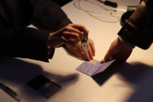
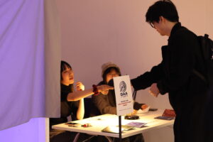
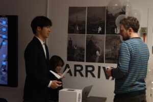
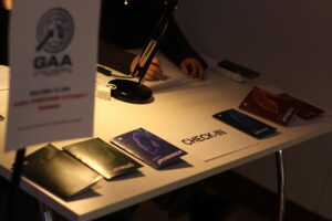
One of the main tasks for me was helping design the Living Air Passport. Every visitor received a passport before entering the installation. It assigned them to one of six fictional countries with different air quality levels.
The passport was important because it introduced the story of the installation. It also showed that clean air is not equal for everyone, and many people are placed into environmental conditions without choice.
For the design, we used the structure of a real passport, but added fictional and symbolic elements. We included:
Different colours for each country
Plant symbols connected to each place
Air quality information
Identity stamps
A logo combining lungs and plants
This helped visitors quickly understand the concept while also feeling curious about the experience.
Posters and Visual Promotion
I also joined the design of posters and exhibition visuals. We wanted these graphics to catch attention and introduce the topic before visitors entered the room.
We used clean and bold typography, inspired by public signs and official information systems. At the same time, we added blur, broken textures, and distortion effects to represent unstable air conditions.
For colour, we used contrast between:
Light and calm colours for clean air
Dark or heavy colours for polluted air
This also matched the emotional journey inside the installation.
Challenges During Design
One challenge was finding balance between creativity and clarity. Sometimes experimental graphics look interesting, but people may not understand the meaning.
Because of this, we changed many layouts and simplified some ideas after feedback. We tried to make the information easy to read and easy to understand in a short time.
Another challenge was teamwork. Different people created different materials, so we needed regular communication to keep one consistent visual style.
What I Learned
From this project, I learned that graphic design can have a deeper role in interactive exhibitions. It can guide visitors, build atmosphere, and support the main concept.
I also learned that design should match the context. Exhibition graphics are different from social media or branding design. They need to work in physical space and communicate fast.
Most importantly, I learned that graphic design can also question social issues. By using the passport format, we showed how systems can classify people and create inequality.
Reflection
Working in the graphic design team was a valuable experience for me. It allowed me to combine creativity with critical thinking. I was not only making visuals, but helping express an important message about air pollution and justice.
Air is something invisible, so our challenge was to give it a visible form. Through passports, posters, and graphic language, I think we helped make this hidden issue easier to feel and understand.
Before beginning the design and technical development of Breathing Is Not a Choice, our group carried out an extended period of research to understand the wider environmental, social, and experiential context of air pollution. This early stage was essential in helping us move beyond creating a visually interesting installation toward producing a project grounded in critical thinking, public relevance, and meaningful interaction design.
Why Air Pollution?
We were initially drawn to air pollution because it is both universal and invisible. Every person breathes, yet many people rarely think about the systems that shape the quality of the air around them. Unlike waste or water contamination, polluted air often cannot be immediately seen, making it easier to ignore despite its serious health consequences.
Through our research, we found that air pollution is linked to respiratory disease, cardiovascular illness, reduced life expectancy, and wider environmental damage. However, these impacts are not distributed equally. Urban populations, lower-income communities, and heavily industrialised regions often experience worse air quality than others. This introduced an important theme for our project: environmental inequality.
We became interested not only in pollution itself, but in the question of access. If breathing is necessary for survival, why is clean air still unequally distributed?
Investigating Existing Projects
To understand how artists and designers have previously approached environmental issues, we reviewed a range of speculative design, installation art, and data visualisation projects.
One key reference was The Breathing Game by Rohan Kakad. This project presents air as a limited commodity controlled through competitive systems. We were inspired by how it reframed breathing as something political rather than natural.
Another important precedent was Air of the Anthropocene by Aerocene Foundation. This work uses pollution data to reveal invisible atmospheric conditions through visual forms. It demonstrated how environmental data can become tangible and emotionally engaging.
From these case studies, we recognised two common strategies:
Making invisible systems visible
Turning abstract environmental issues into personal experiences
These became guiding principles for our own concept development.
User Experience Research
We also explored how people normally perceive air quality in everyday life. Informal interviews and peer discussions showed that most people only notice air pollution when conditions become extreme—for example, heavy traffic fumes, smoke, or visible haze. In cleaner environments, air is often taken for granted.
This insight was important. It suggested that awareness does not come from data alone, but from bodily sensation. People respond when breathing feels difficult, when smell changes, or when the atmosphere creates discomfort.
As a result, we began shifting our project away from purely screen-based information and toward a multisensory experience that would involve breath, sound, movement, and spatial immersion.
Scientific and Technical Research
To support the concept, we also researched the physiology of breathing and available sensing technologies. We examined how respiratory sensors can detect inhalation and exhalation through pressure change, airflow, or chest movement.
Our early prototypes considered wearable fabric sensors, but research showed these might be intrusive and unreliable during movement. We therefore explored mask-mounted pressure sensors as a more direct and stable method of collecting breath data.
We also studied real-time interaction platforms such as TouchDesigner, which could transform sensor input into dynamic visuals and sound environments. This helped us imagine how visitors’ own breathing could become the central control mechanism of the installation.
Defining the Core Concept
After combining environmental, artistic, user, and technical research, we identified the core idea of the project:
To transform invisible air inequality into a direct bodily experience.
Rather than telling visitors about pollution through facts or statistics, we wanted them to feel how atmosphere changes emotion, comfort, and behaviour. This led to the later development of the passport system, fictional countries, and pollution-based immersive environments.
Reflection on the Research Phase
Looking back, the research stage was one of the most important parts of the project. It prevented us from producing a superficial installation focused only on aesthetics. Instead, it helped us connect interaction design with environmental justice, sensory perception, and social critique.
Personally, I learned that strong design concepts often emerge not from one idea, but from combining multiple forms of research: scientific evidence, cultural references, user behaviour, and technical experimentation.
The pre-research phase gave our final installation depth, direction, and purpose. It transformed the topic of pollution from a distant global issue into something intimate, political, and immediate—something felt with every breath.
Today, we had a creative discussion around public space and social interaction. We compared three early project ideas: visualising urban social relationships, modelling the effect of pollution on plants, and exploring psychogeography in public space. What these ideas had in common was that they all focused on invisible factors — the social structures, emotions, and unwritten rules that quietly shape how people move, meet, and avoid each other.
We discussed that public space is not neutral. Factors such as where people live, wealth, background, and occupation can influence how safe they feel and what kind of interaction is possible. We not only thought about making visual maps, but also explored multisensory ways to express these forces, such as using sound, light, or touch to turn atmosphere and power dynamics into something people can experience.
One important concept was “body grammar.” Patterns of distance, direction, walking speed, pauses, and gathering can reveal relationship structures in public space. We also discussed different possible methods to build the project, such as sensors, augmented reality, and interactive screens. At the same time, we considered ethical issues, especially around surveillance, so lower-tech methods like guided walks and voice notes may be a better starting point.
After voting, the group decided to prioritise the psychogeography project (5 votes), followed by air pollution (3 votes) and plant growth (1 vote). Next, we plan to choose a location, create a small prototype walking study, and then explore how to translate people’s movement and feelings into a shared public experience.
Breathing is often understood as a deeply personal and automatic act. Yet the air we inhale is shaped by forces far beyond individual control. Pollution, infrastructure, industrial systems, transport networks, and environmental policy all determine the quality of the atmosphere around us. Our group project, Breathing Is Not a Choice, was developed as an interactive installation that transforms invisible air pollution into a bodily and sensory experience. Rather than presenting environmental data through charts or statistics alone, the installation invites visitors to feel how unequal atmospheric conditions affect the body, encouraging reflection on air as a shared and politicised resource.
Project Concept
The project began with a simple but urgent question: if breathing is essential for life, why do so many people have no control over the quality of the air they breathe?
Air pollution is often discussed through numbers such as AQI levels, carbon emissions, or concentrations of sulfur dioxide (SO₂). While such measurements are important, they can feel distant and abstract. Our aim was to make these invisible systems immediate and experiential. We wanted visitors to recognise that breathing is not purely individual, but connected to wider social, economic, and political structures.
The project was influenced by two precedent works. The Breathing Game by Rohan Kakad imagines air as a commodified resource distributed through competition, exposing environmental inequality. Air of the Anthropocene by Aerocene Foundation translates pollution data into visible forms, revealing the presence of contaminated atmospheres. Inspired by these approaches, our installation sought to move beyond visualisation and into embodied interaction.
Visitor Experience
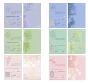
The installation was structured around the idea of atmospheric citizenship. Upon entering the space, each visitor received a Living Air Passport. The passport assigned them to one of six fictional countries, each representing a different level of air quality and linked to a symbolic plant species:
Edinburgh – Oak (clean and stable air)
Berlin – Platanus (mildly industrialised air)
Rio – Jacaranda (humid and dense atmosphere)
Shanghai – Bamboo (polluted and hazy conditions)
Cairo – Papyrus (dry and oppressive air)
Delhi – Lotus (toxic and suffocating atmosphere)
Passports were distributed according to visitors’ clothing colours. This intentionally arbitrary system reflected how environmental inequality is often assigned through geography, class, or circumstance rather than personal choice.
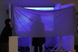
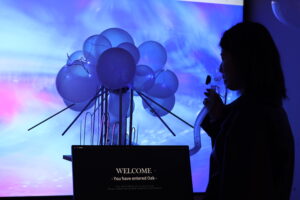
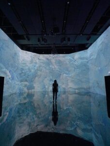
After receiving their passport, visitors entered an enclosed installation space and wore a breathing mask containing a respiratory sensor. The experience lasted approximately ninety seconds. During this time, their own breathing controlled the audiovisual environment surrounding them.
Technical Process
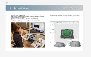
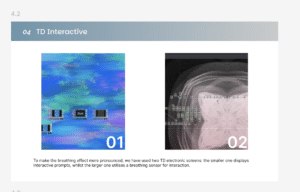
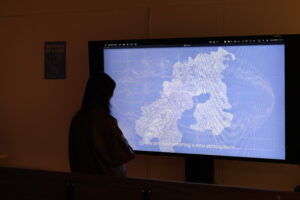
The breathing mask used a pressure sensor to detect subtle inhalation and exhalation patterns. Data was sampled in real time and transmitted through Bluetooth Low Energy to a system built with Python and TouchDesigner. This allowed each visitor’s breath to directly shape the installation environment.
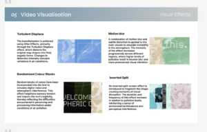
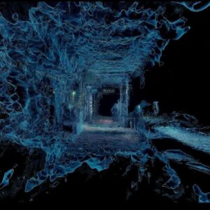
Visual output included moving particles, ripples, and distortions projected onto the surrounding surfaces. At an early stage, we mapped pollution data primarily through colour and brightness. However, user testing showed that these changes were not immediately perceptible or emotionally engaging. We therefore redesigned the system to focus on motion speed, spatial distortion, and rhythmic transformation. These qualities were much more effective in producing bodily awareness.
Sound design followed the same logic. Cleaner atmospheric zones featured soft ambient tones and stable breathing rhythms, while polluted zones introduced mechanical noise, distortion, and irregular pulses. Audio became an important tool for guiding emotional response and creating tension.
To deepen immersion further, we introduced airflow, humidity, and subtle scents into the installation space. These environmental cues encouraged visitors to notice their own breathing more consciously. What is usually automatic became suddenly present.
Design Challenges and Learning
One of the most important lessons from the project was that technical accuracy alone does not guarantee meaningful interaction. Initially, we prioritised precise data translation, but the results felt visually weak and emotionally distant. Through iteration, we learned that perceptual clarity matters more than literal representation. Visitors responded strongly when data was translated into movement, instability, rhythm, and sensory discomfort.
Another challenge involved the sensor system. Our first prototype used fabric-embedded force sensors, but these produced inconsistent readings and restricted movement. We replaced them with a lightweight mask-mounted pressure sensor, which offered cleaner data while preserving comfort and immersion.
We also had to consider hygiene and safety because multiple participants used the installation. Between sessions, masks and surfaces were disinfected, the space was ventilated, and odours were neutralised.
Reflection
This project demonstrated that interaction design can function as both communication and critique. Breathing Is Not a Choice is not simply an artwork about pollution; it is a sensory intervention that asks visitors to reconsider their relationship with the atmosphere.
For me, the most valuable insight was understanding how bodies process information differently from screens. Data becomes more powerful when it is felt rather than only seen. Movement communicates faster than text, rhythm creates awareness, and discomfort can generate empathy.
The installation also raised wider questions about environmental justice. Clean air is often treated as normal or invisible by those who have access to it, while others experience pollution as an unavoidable daily condition. By placing visitors inside changing atmospheric realities, the project encouraged reflection on inequality and collective responsibility.
When people left the space, we hoped they would carry one simple thought with them: breathing may feel personal, but clean air is a shared political issue.
On average, humans take 23,000 breaths each day of their lives. Yet this most essential life-sustaining physiological activity has become a background sound we tend to ignore most easily. We care about our physical health and muscle fatigue, but we forget the most direct and fragile connection between our lungs and the outside world.
This installation is designed to break this physiological inertia. By providing the audience with a closed and pure 90-second immersive space, it draws breathing out from the subconscious and turns it into a visible form. Combined with performing arts, it simulates the breathing rhythm of the world and offers the audience an immersive performance experience.
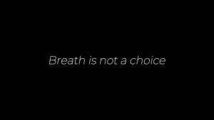
Breathing is not a choice.
We set up a lottery box to randomly assign identities and countries. This aims to simulate the reality that people cannot choose their own birth, origin, or social background. Through this random mechanism, participants are encouraged to directly experience the fact that identity is not a matter of personal choice, thereby reflecting on issues of fairness and the randomness of fate.
Focus on breathing.
For the 90-second enclosed environment experience, we specifically designed a small, confined space to eliminate visual distractions. Surround sound is used to create an immersive environment for the audience. Feel the breathing.
feel about breathing.
We used six different concentrations of safe odor solutions, diffused through air humidifiers so that the scents spread with visible mist in the space. By visualizing the “air,” participants can not only smell the scents but also see the movement of their breath, enhancing both sensory perception and immersion. See the breath.
Thinking about breathing
In this part, we added a reflection on breathing, encouraging the audience to feel the meaning of each breath. At the same time, it invites gentle awareness that people live in different environments and experience air quality in different ways.
The video provides a complete introduction to our process
photo
FUTURE PLAN
Gameification development
By introducing a “Challenge-Reward” mechanism, the installation transforms the audience from passive observers into active participants:
1. Stability Quest
Goal-Oriented: Sets an ideal breathing range to provide clear operational guidance.
Flow Feedback: Uses visual purification (color shifts) to induce a “Flow” state, enabling proactive physical and mental regulation.
2. Energy Collection
Embodiment: Translates abstract breath into physical “thrust,” making the interaction feel tangible.
Immersion: Particle explosions upon hitting targets create “peak experiences,” ensuring high engagement throughout the 90-second session.
Immersive Scenarization
Multi-sensory Immersive Environment Construction
Enhancing user presence within specific narrative scenarios through visual interference and ambient soundscapes.
1. Visual Feedback: Screen Flash
Trigger: Linked to peaks in breathing frequency or system anomalies (e.g., hyperventilation).
Function: Establishing physical-grade sensory pressure to reinforce the real-time feedback of respiratory actions.
2. Spatial: Urban Ambience
Soundscape Design: Introducing authentic urban samples, including industrial noise floor, distant sirens, and wind.
Dynamic Control: The urban ambient sound scales dynamically according to the user’s respiratory state:
Focus State: Background noise gradually fades out, leaving only the user breath.
Anxiety State: Urban ambience volume rises , creating a “swallowed” environment.
After this exhibition, I began to consider the relationship between the interaction of the field space and people.
Because this exbihition, i further realized that audience participation is not an optional addition to an exhibition, but a crucial element that enables the entire event to take shape and become complete. It is precisely the audience’s engagement within the space that activates what would otherwise be a static display, transforming it into a continuous process of meaning-making. Interaction itself becomes part of the content, and in some ways even goes beyond the intended expression of the exhibits.
At the same time, this participation is not merely a form of physical involvement; more importantly, it generates focus and reflection throughout the process. As viewers pause, experience, and respond within the space, an internal awareness is gradually awakened—they begin to reflect on their relationship with the environment and recognize themselves as both participants and constructors of meaning. It is through this focused engagement that thought deepens and emotions begin to settle.
Therefore, the value of an exhibition lies not only in its visual or formal impact, but in its ability to encourage viewers to enter a state of active perception and reflection. The interaction between space, installations, and people forms an open system in which each act of participation continuously enriches its meaning. In this sense, the understanding and experience generated through the process are often more significant than the final outcome itself.
REFERENCE:
Classen, C., Howes, D. and Synnott, A. (2002) Aroma. Routledge. Available at: https://doi.org/10.4324/9780203428887.
Smells can awaken people’s self-awareness, environmental awareness and reflection on social identity
《Notes on Sculpture Part I & II》
The better new work takes relationships out of the work and makes them a function of space, light, and the viewer’s field of vision. The object is but one of the terms in the newer aesthetic.
Art and Objecthood
Theatricality as the essence of installation
After finalizing the passport covers, I moved on to designing the inner pages, focusing on making them feel closer to real passports. I wanted the passports to function not only as visual props, but as believable objects participants could interact with. To achieve this, I referenced the layout and structure of actual passports, including personal information fields, issuing authority, and identification details.
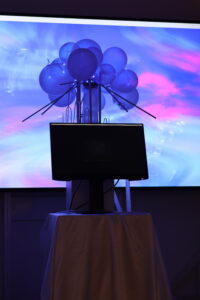
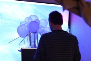
One important decision was to leave the photo section blank so participants could attach their own portrait. Rather than using a generic placeholder, I designed a white bubble-like form inside the grey photo box. This was intended to mimic a human silhouette, but it also connects conceptually to the white balloons used in our installation. Since the balloons represent air and movement in the physical space, echoing them in the passport became a small design detail that ties the graphic and spatial elements together.
I also developed the fictional issuing authority for the passports — The Ministry of Atmospheric Affairs — which appears on each country’s information page. This helped reinforce the idea that these virtual nations are governed through atmospheric conditions rather than conventional political structures, making the passports feel part of a coherent fictional system.
Another interactive element was leaving the name field empty, allowing participants to write in their own names. Similar to signing a real passport, this gives the object a more personal and participatory quality, encouraging users to imagine themselves as citizens of these air-defined countries.
Originally, I also designed a second inner page for visa stamps, inspired by the stamp pages found in real passports. However, after considering how the passports would function within the final exhibition, this began to feel redundant. Following further refinement, I removed the separate stamp page and instead moved the stamping interaction onto the first information page. This simplified the design while keeping the travel metaphor intact, and made the interaction clearer during the exhibition.